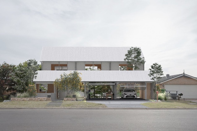
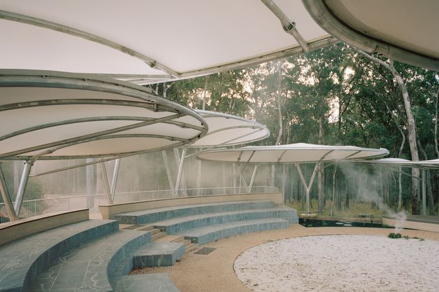
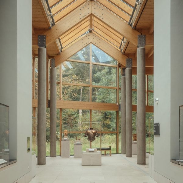
I kinda want to give this a serious review. Which … is very nerdy and weird of me. But, if it makes this any better, I wanna review it seriously because there’s stuff here that I really like and I feel obliged to analyze it critically as a mark of respect. Um so I’m gonna get really nerdy here, please don’t judge me. On one hand, passion is cringe, and I’m about to express a lot of personal passions of mine. On the other hand, this town must have taken a ton of passion from you, so I figure that passion probably respects passion. Anyways, here’s my totally nonprofessional opinion as someone who just enjoys architecture …
I love the buildings in those two pictures from the middle. The one of the left reminds me a lot of church architecture in the minimalist style. My mind immediately went to two buildings, Tadao Ando’s Church of the Light, and the chapel at Illinois Institute of Technology by Mies Van Der Rohe. Both projects use austerity in reference to classical proportions or symbols to convey a grand serenity in a not-grand space. I feel that this building, while not religious in character, has a similar effect to it. The glass section breaks the front facade into two columns, one of concrete and one of glass. I find that evocative of a columned facade. The wraparound of the glass to the side extends the shape and breaks up the pattern. To me it feels very stately, but in a deconstructed way. Like you’ve distilled stately architecture into its most basic proportions. So when I compare it to those two churches, it’s less in the sense that the building feels religious, and more in the sense that you’ve done with the stately home what those other two architects had done with the church. In my head, I picture this building as being like a governor’s mansion or a city hall. Like, it evokes the classical motifs of stately architecture, but simplifies them to make it more about the ideas behind the belief. I like to imagine that building as carrying a civic symbolism to it.
The one on the middle-right is almost the exact opposite. I think that’s one reason why I like those two images put next to each other so much. Whereas the middle-left building feels more like classical proportions distilled to their basic elements, the middle-right building feels like it breaks from classical design to treat the structure more as sculpture. I love the setback on the upper level, and the asymmetry between lower level and upper level. I’m also genuinely curious to know how it looks on the inside, and how people are meant to move through the space. Is it broken down into units on the inside? Or can people move freely through? My first assumption was the former, that it’s basically a modular building of seven units. But the more I thought about it, the more I realized that I actually find the second possibility to be even more intriguing. I like the tension between an open interior space which leads outward into these little isolated exterior spaces. I like it a lot. I can imagine the design as drawing people outside for a breath of fresh air and solitude, and connecting people to the outside environment in a way that conveys serenity. There’s a narrative to the space which I enjoy. I feel connected to the space because I can picture myself stepping outside for a breath of fresh air in much the same fashion as I just described.
The top image has stuff that I both like and dislike. As for stuff I like: the landscaping is cool, I like how the eye gets drawn to the building in the center and then follows down the two arms, and I like the asymmetry of the two arms leading off at different angles. I especially like how the linear path of the landscaping helps to underscore the asymmetry of the two arms of buildings. That being said, I might be totally off and the two wings might actually be symmetrical. I can’t be entirely sure what’s the architecture and what’s just the angle of the shot. In terms of the buildings, I really like the right-side arm of buildings and how they interact with each other. I especially like how the rightmost building presents a clear visual marker to cap off the ‘end’ of that arm. And, in general, the other buildings play off each other in interesting ways. As for the left-side arm, it feels a bit too homogenous. There are a few quirks present on the different individual buildings, but they just don’t stand out as much to me.
The building in the picture on the bottom I don’t like very much. I can’t quite place why, but I think that’s kind of the problem. There isn’t much for me to grasp onto as far as guiding ideas behind the design, and so I’m not sure how I’m supposed to interpret it. That being said, I might just be missing something.
So, a little bit of context. I’m a professional writer, and I have no professional training in architecture. But I do enjoy studying architecture as an amateur, and it was writing which initially drew me to the subject. A lot of building design follows much the same patterns as narrative structure does. Design is meant to draw people through space in a sequential fashion, and to shape people’s interactions with space as though part of a story. I actually find that studying architecture has made me a more sophisticated writer, in some regards. For instance, there’s two ways of approaching structure in writing, and these are called positional structure and sequential structure. People tend to write more naturally in sequential structure, but I’ve always had a knack for positional structure. Previously, I used to split the difference and go half-and-half, which already is quite unorthodox (people really do lean way more towards sequential structure). But the cool thing about architecture is that it’s three dimensional, and therefore much more analogous to positional structure. Architecture inspired me to make the leap into writing predominantly with positional structure, and that ended up being a really big deal for me. Since then, my use of positional structure has grown into one of the main hallmarks of my writing style.
Anyways, point is, I really like architecture, and I do have a sincere attachment to architecture, but I’m also a total amateur at it. Like, if you’re an actual architect or designer, you might end up reading through this reply and thinking that I come across as a total idiot. Which, I mean, very possible. Mea culpa! But like honestly I just liked a lot of stuff in what you were doing here, and I wanted to show my appreciation by walking through my reaction. Even if my responses to the architecture don’t carry much value, I hope that you can at least pick up on the respect and appreciation that I wanted to convey. Cheers!
EDIT: Oh, I just saw your video and watched it. I take back what I said about the left-side arm of buildings. I like the two interior buildings a lot, and I just couldn’t get a very clear view of them in the static picture. I don’t love the leftmost building. In my amateur opinion, I think it would be cool if that leftmost building had some kind of starker horizontal feature to play against the square visual marker on the end of the right-most building of the right-most wing. Maybe like a T shape that’s rotated to the left? That way it’s a horizontal shape that draws the eye to a visual marker of the ‘end’ of the row. But also, like, I have no idea what I’m talking about. Anyways, I actually really like the other two buildings on that arm, they’re quite visually interesting. And I’m more okay with the center building, now that I’ve seen it in context. Like I still don’t ‘get it’, per se, but I also understand why it needs to be more nondescript. If the middle building was more visually arresting, then it would make the town as a whole look way too visually cluttered.
SECOND EDIT: I love your “raider capital” settlement too!
THIRD EDIT: Weird thought here, I know. But are you familiar with the architectural works of Mary Coulter? In particular I’m thinking here of Lookout Studio, Desert View Watchtower, and Hermit’s Rest. She’s a fascinating architect in her own right, as she often worked closely with indigenous artisans and explored a sort of indigenous modernism that showed a lot of respect to the cultures she borrowed from. Also, her designs for the Fred Harvey group helped to pioneer the pueblo revivalist style that now dominates the Santa Fe area. But anyways, I mention those three particular buildings from her because they were all experiments by Coulter in making buildings which appeared in a state of ruin. Coulter was fascinated by the ability of ruins to stimulate our imagination, because it leads us to imagine what might have been there. I dunno, in my head, something about what you’re doing made me think of Coulter’s ideas about ‘artificial’ ruin. It’s the same sort of uncheckable “what if?”. The other building which your stuff really reminds me of is La Fábrica, the home which Ricardo Bofill designed for himself. Actually a lot of your stuff gives me Bofill vibes. Again, I honestly don’t know what I’m talking about here, but I figured I’d mention those two architects because, who knows? Their stuff might serve as inspiration!


