What was Arvida looking for in its new space?
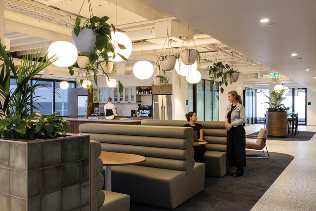
Lauren Scott (LS): Firstly, the business was amalgamating three levels into one so they wanted a space that could comfortably accommodate up to 100 employees. And, post-Covid, they also wanted to take the opportunity to look at the ways in which the teams worked together. We needed to create spaces for natural cross-over and conversations between all facets of the business (finance, developers, operations, sales), to encourage a more cohesive flow of information across the company. Our initial workshopping revealed that we should design a home for Arvida’s people, which, given it is a support office, had a ‘heartbeat’, and provided a welcoming sense of place and community.
Mark Scowen
Tell us about the process and any challenges.
Mark Scowen
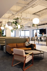
LS: It was a truly collaborative journey. Along the way, Arvida encouraged us to explore specific aspects of the design and to consider them in a new light. They’re in the business of designing spaces for people so, in effect, we were designing for designers. It was a fairly tight programme in a slightly older building with quite an intensive services core. We positioned the meeting spaces around the core and gave the window views to the employees’ desk-sharing.
What did you base the overall look and feel on?
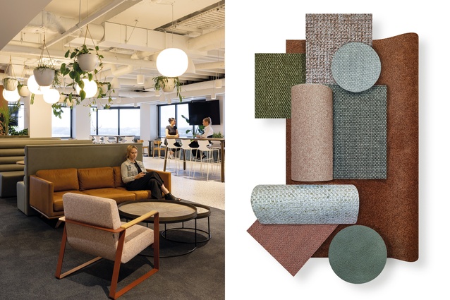
LS: The underlying concept was the creation of a ‘village’, with a design that enables the employees to make it their own, not dissimilar from the Arvida retirement community offering. This has changed the way people are behaving in the space and they’re really enjoying it – they even brought in a rowing machine recently. The café is a big drawcard, acting as a hybrid work, lounge and break-out space. We wanted a ‘resimercial’ look (residential meets commercial) so we chose a soft palette with sage greens and pink terracotta tiles. Sustainability was also important so you’ll see cork through the walls and New Zealand-made furniture crafted from wood from sustainably grown forests.
Art Direction by André Kini
What drove your choice of fabrics?
Mark Scowen
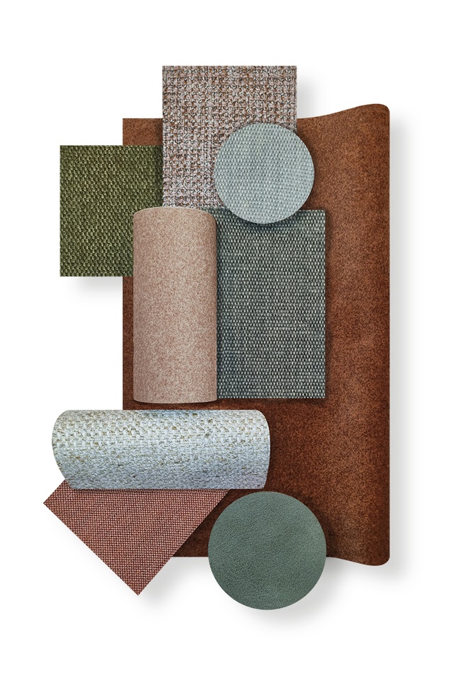
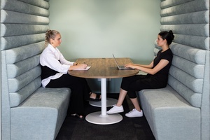
LS: We needed a variety of colour and depth, to give a domestic feel, without compromising on quality. Not only were Warwick Fabrics cost effective but, also, they have high commercial durability. We used Pelle in Sage on the booth seating, running through the open-plan café and into the boardroom. The occasional chairs feature textured Noyack in Orchid and we chose Copeland in Mallard for the full-height booth seating. Desk screens were made up of Gravity, in Ice and Brick, and the feature chairs were upholstered in Zinnia Midnight. Our feedback is that the interiors have made a big impact on the overall culture at Arvida so we’re very happy with the result.
See more in the Material Focus series, including inspiration from Gulf Rise by Urban Lounge, SemiCreative’s Seven restaurant, Cachet Group’s 205Q Hive and Lobby and more, here.
ArchitectureNow and Architecture NZ work with a range of partners in the A&D supply sector to create appropriate content for the site. This article has been supported by Warwick Fabrics.
If your brand or clients are interested in similar creative content email [email protected] to enquire.

