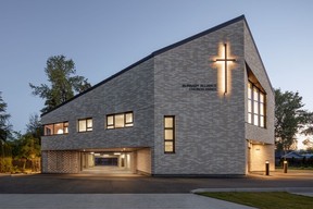
Careful attention was paid to how the annex interacts with the school, park and pathways around it

Reviews and recommendations are unbiased and products are independently selected. Postmedia may earn an affiliate commission from purchases made through links on this page.
Article content
Architects Peeroj Thakre and Henning Knoetzele of Ph5 Architecture began designing an annex for the Burnaby Alliance Church in 2019, with the building completed this past spring. The annex (an extension of the main Burnaby Alliance Church found a few doors down on Armstrong Ave, Burnaby) is set in a residential neighbourhood.
One of the biggest challenges was finding ways to make a large, institutional building fit in seamlessly with the scale and form of the other (much smaller) houses on the street, and it took some work, says Thakre.
Advertisement 2
Article content
Site integration and urban design
Situated on a residential lot, the architects paid careful attention to how the annex interacts with the local school, park and pathways around it.
Pathways were incorporated into the design, integrating the church into the neighbourhood’s daily rhythms — connecting pedestrians to the school set behind the church.

Multi-functional design
The annex has been designed to be more than a place of worship but a multi-functional community space used seven days a week.
“Most churches today are funded by their congregation, so there’s a focus on getting the most value from the space,” explained Thakre.
They want these buildings to be used not just on Sundays but seven days a week.
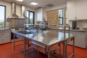
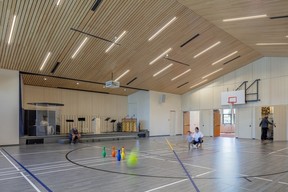
The design includes a large multi-purpose room that doubles as a sanctuary, auditorium, community hall and gymnasium. It also includes a large community kitchen, meeting rooms, youth spaces and a lounge. These spaces are used for worship services, children’s programs and community events.
Often an afterthought, the parking for this church became a design challenge for the Ph5 architects. Rather than creating a sea of surface parking, they cleverly concealed part of it beneath the building.
Article content
Advertisement 3
Article content
“Half the surface parking is covered under the structure,” noted Knoetzele. The rest is designed with a light green glass grid, avoiding the typical look of a church surrounded by asphalt.
The parking structure, with its open brick screen and natural ventilation, became an integral part of the architecture, blurring the lines between interior and exterior.


Built to last and easy to maintain
A key consideration in the design was the longevity and maintenance of the building.
Churches often don’t have the resources for continuous upkeep, so they focused on durability, explained Knoetzele.
“The facade is brick, so basically you never have to touch it again. Maybe in 20 years, you power wash it once, and you’re done,” he says.
The architects struck a balance between a robust, low-maintenance structure and one that still feels welcoming and warm.
Warm, light and flexible interior
The church’s interior is designed to be as versatile as its exterior. The sanctuary accommodates up to 350 people, but the real success lies in the flexible spaces that support various community activities.
Advertisement 4
Article content
They brought the brick from the exterior inside to create a connection between the outdoor and indoor spaces, said Knoetzele. Tall windows flood the space with natural light, making it warm and inviting.
The warmth of the brick, with the red carpet and the natural wood, creates a general feeling of wellness.
Community-driven design process
Community involvement is a huge part of their design process, says Thakre.
“We had a big engagement evening with the congregation,” she explains. They went through what would be ideal in terms of programs and the needs and challenges of different spaces.
This collaborative approach ensured that the design reflected the group’s aspirations, creating a space where they could see themselves and their community activities, says Thakre.
“They’re looking at trying to develop a whole set of new programs so they use this the best that they can,” she says.
Recommended from Editorial
-

Penthouse sweet: Award-winning transformation of Yaletown property
-

Kamloops home renovation: Modern lines and a minimalist palette meet 1930s charm and Danish details
Article content


