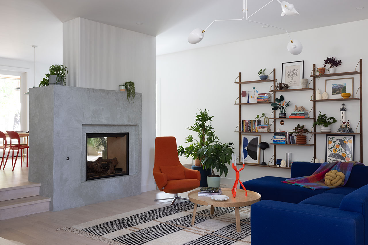
Amy Pigliacampo’s recent renovation of a 3,713-square-foot home in Durango, Colorado showcases her ability to blend client preferences with innovative design approaches. This four-bedroom, four-bathroom residence underwent a complete transformation, with Pigliacampo overseeing changes to nearly every aspect of the home while retaining key elements of its original structure. The client, who is originally from Venezuelan, sought a fresh aesthetic for the home – one that integrated vibrant color, particularly yellow, while maintaining as much of the existing cabinetry as possible.
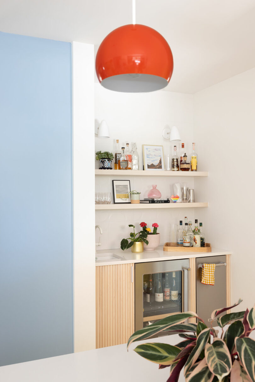
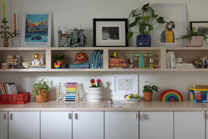
The original house had a muted “50 shades of brown” color palette, which Pigliacampo dramatically altered. Her goal was to retain 70% of the millwork, reducing waste, while giving the space a bright and modern update. Nowhere was this transformation more evident than in the kitchen and mudroom, which became Pigliacampo’s favorite parts of the project. These spaces saw the inclusion of a dedicated bar area, a coffee station, and a family-friendly mudroom, all while infusing bold color choices that brought the rooms to life.
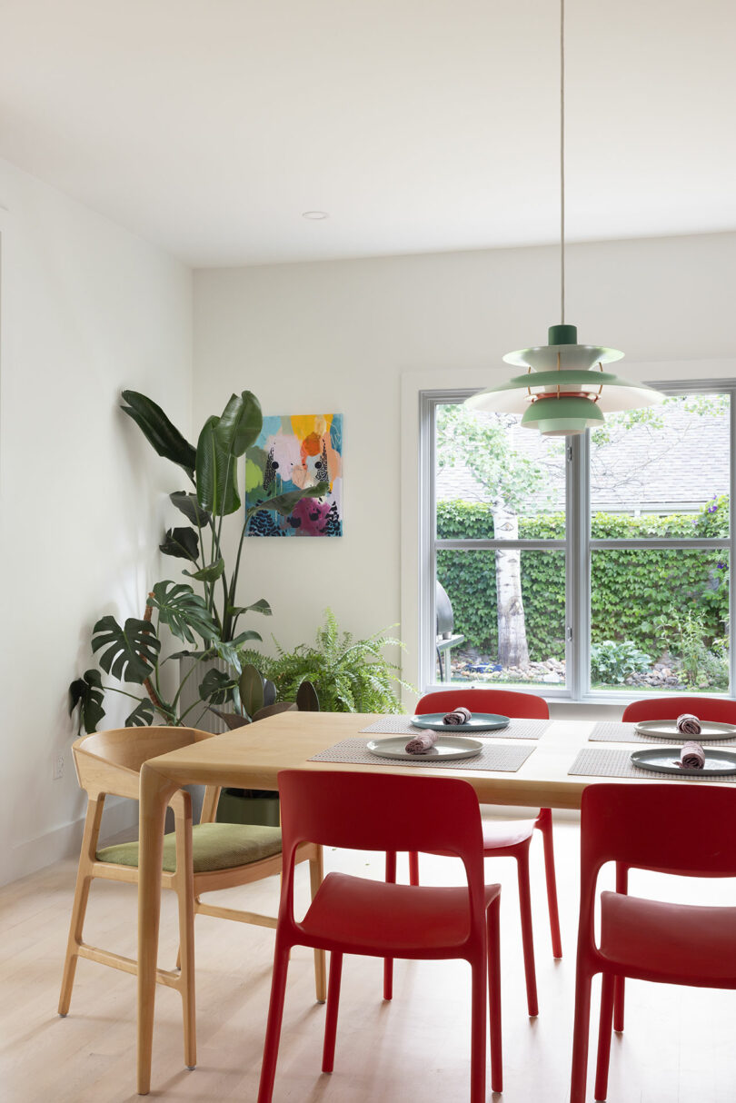
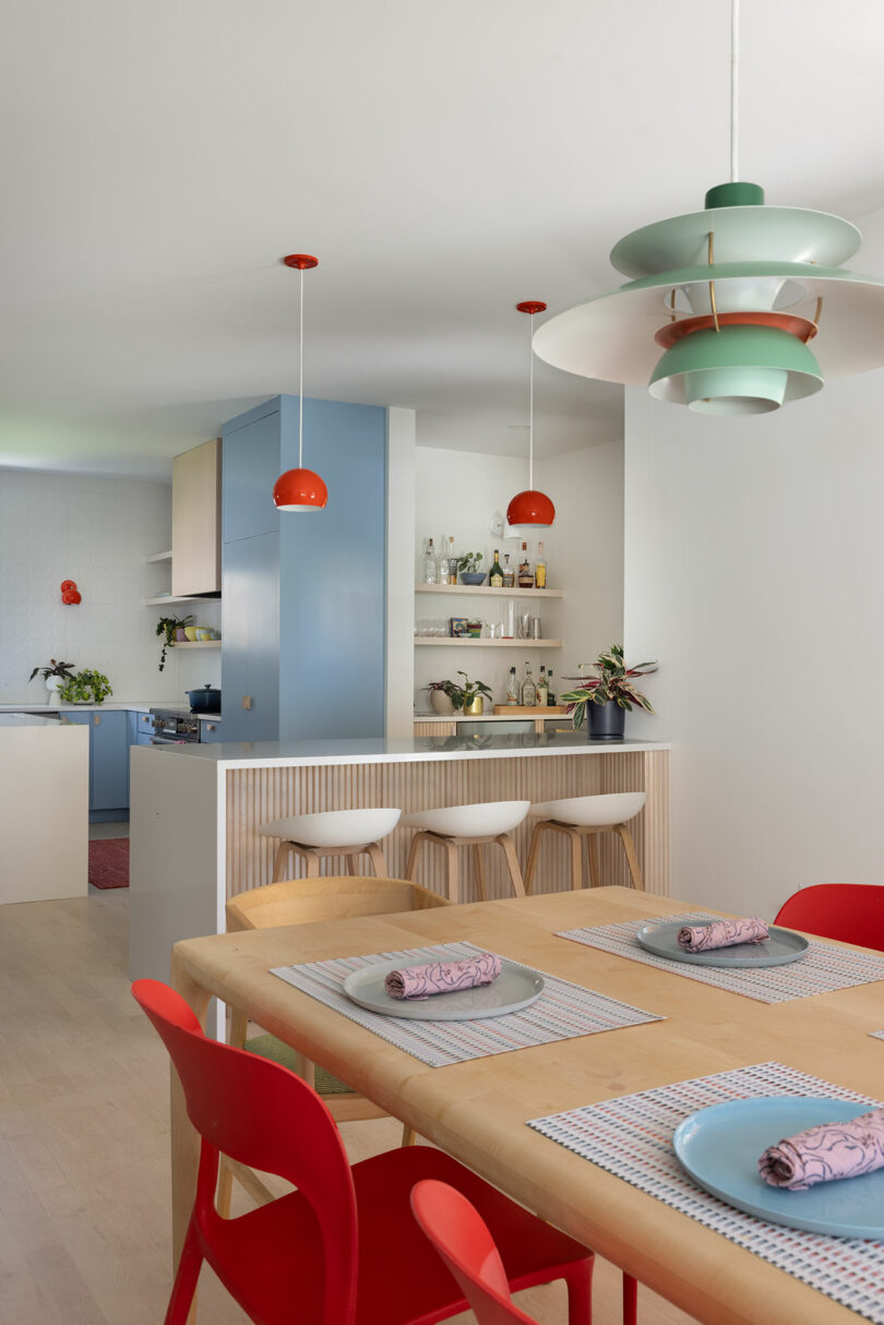
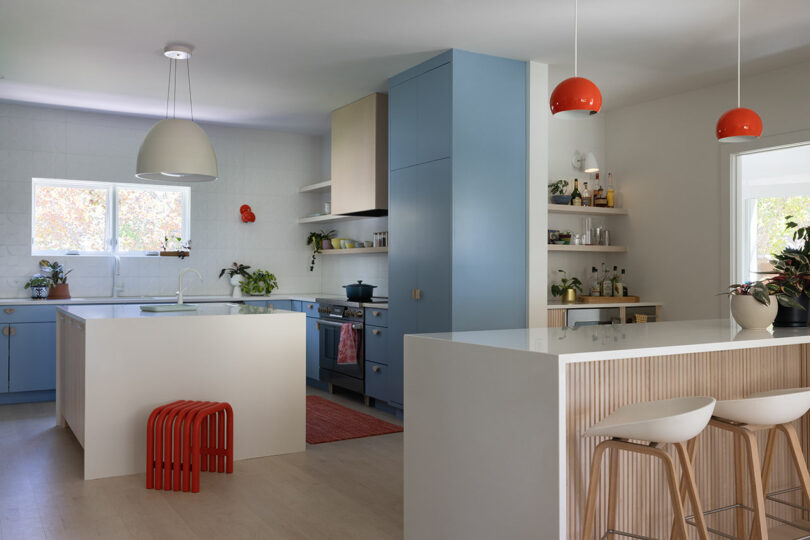
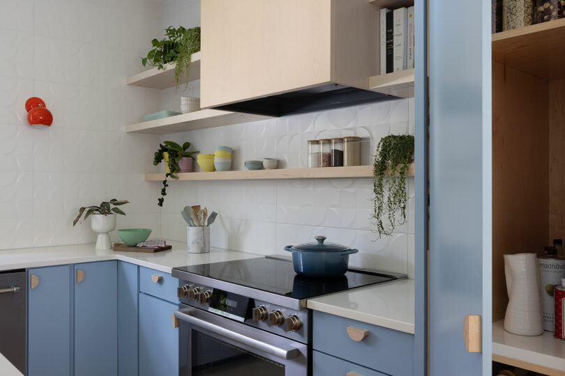
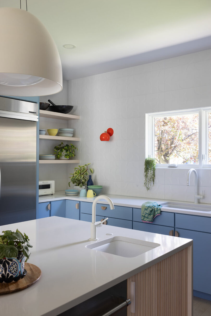
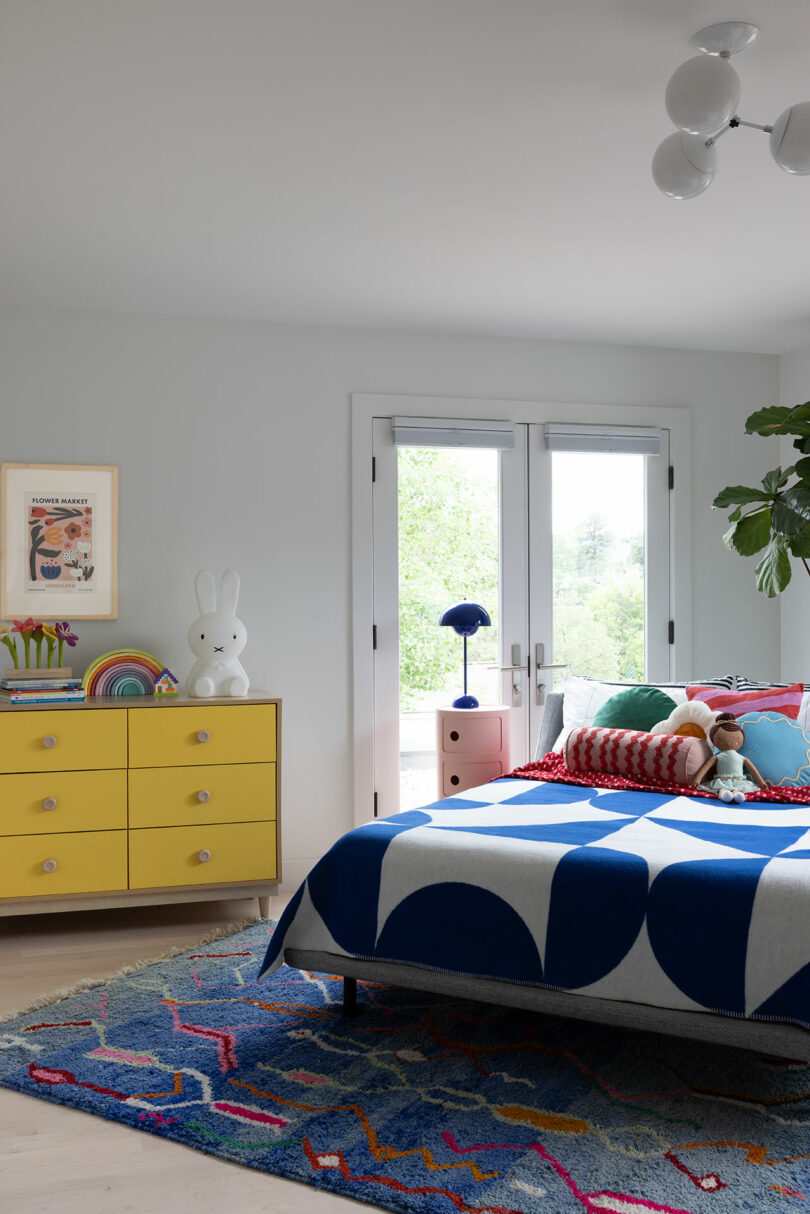
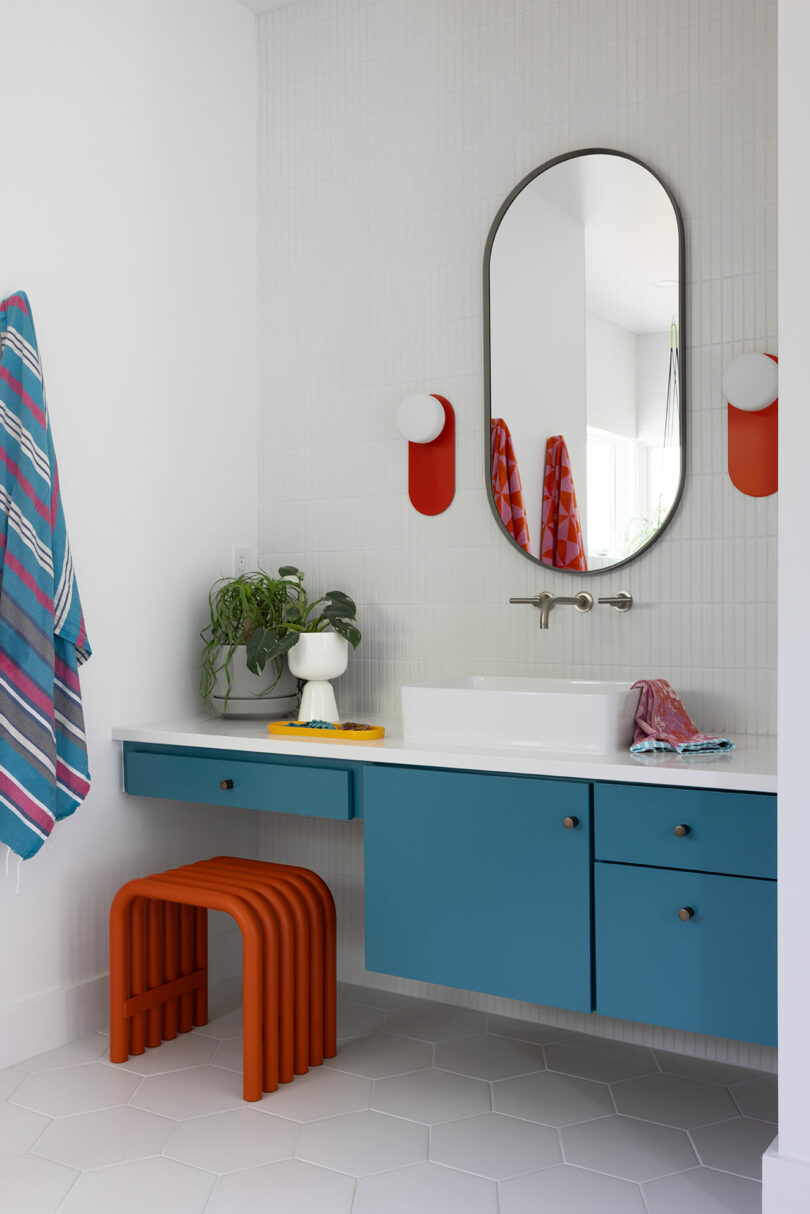
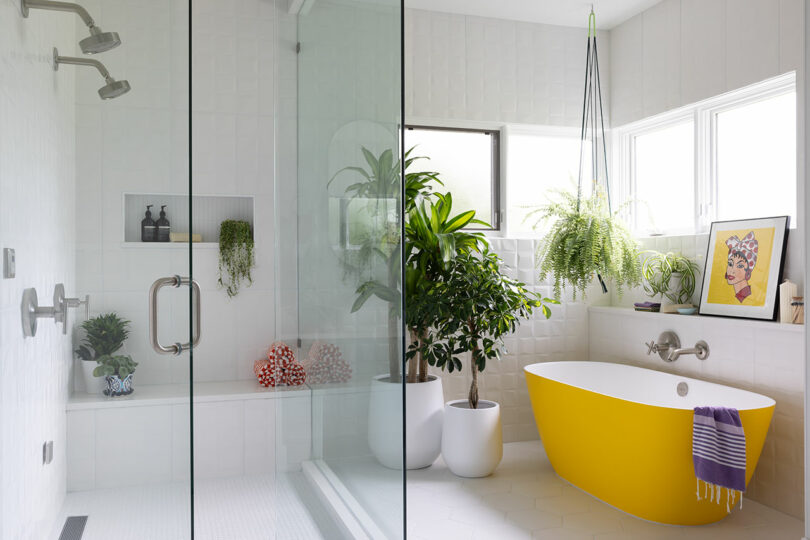
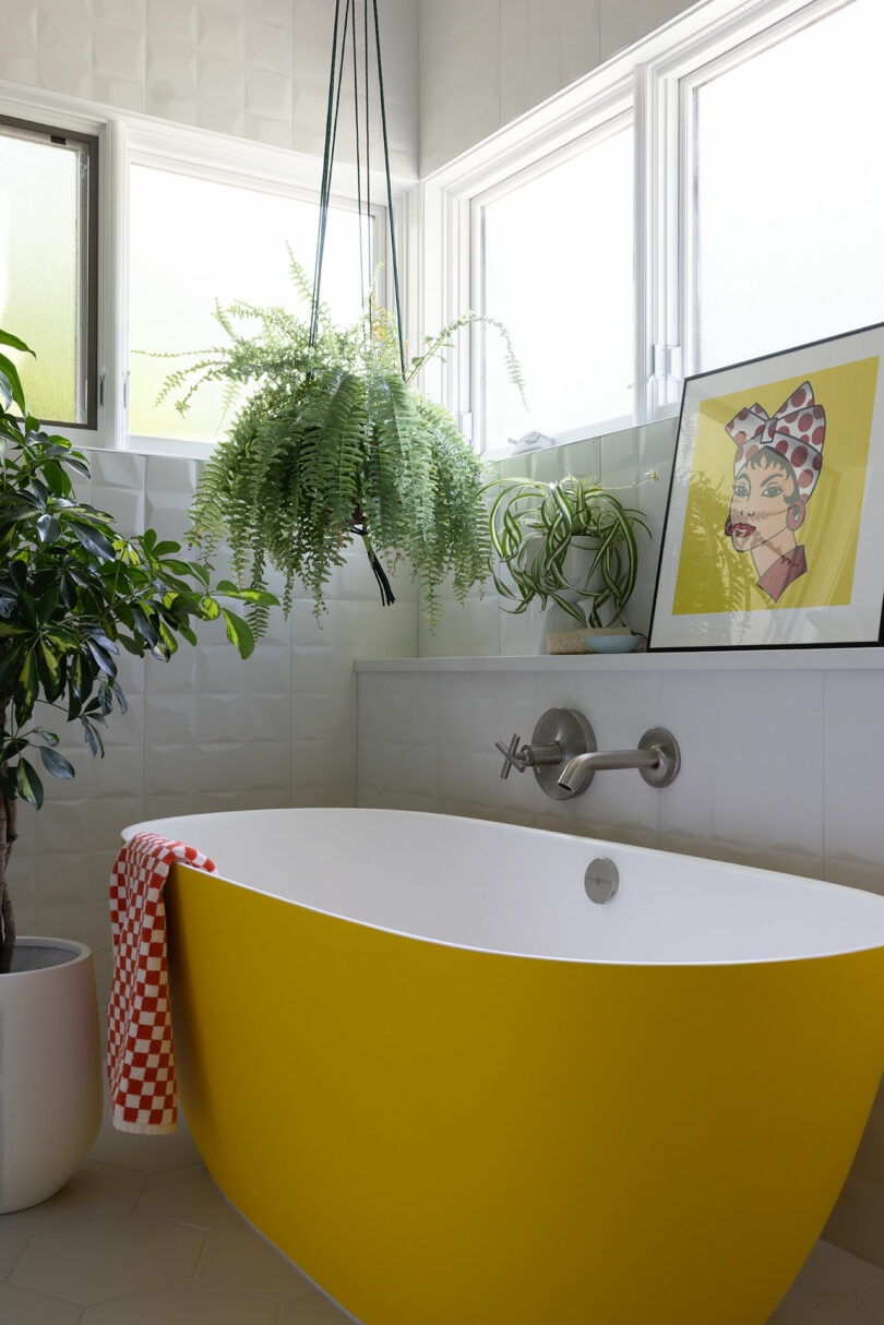
Yellow, requested by the client’s eldest child, Vincent, became a key inspiration throughout the design (check out the yellow bathtub below!). The challenge lay in using this vivid color without overpowering the overall palette, and Pigliacampo’s approach succeeded in bringing in warmth and energy, while keeping the design cohesive.
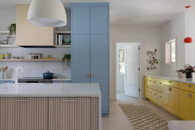
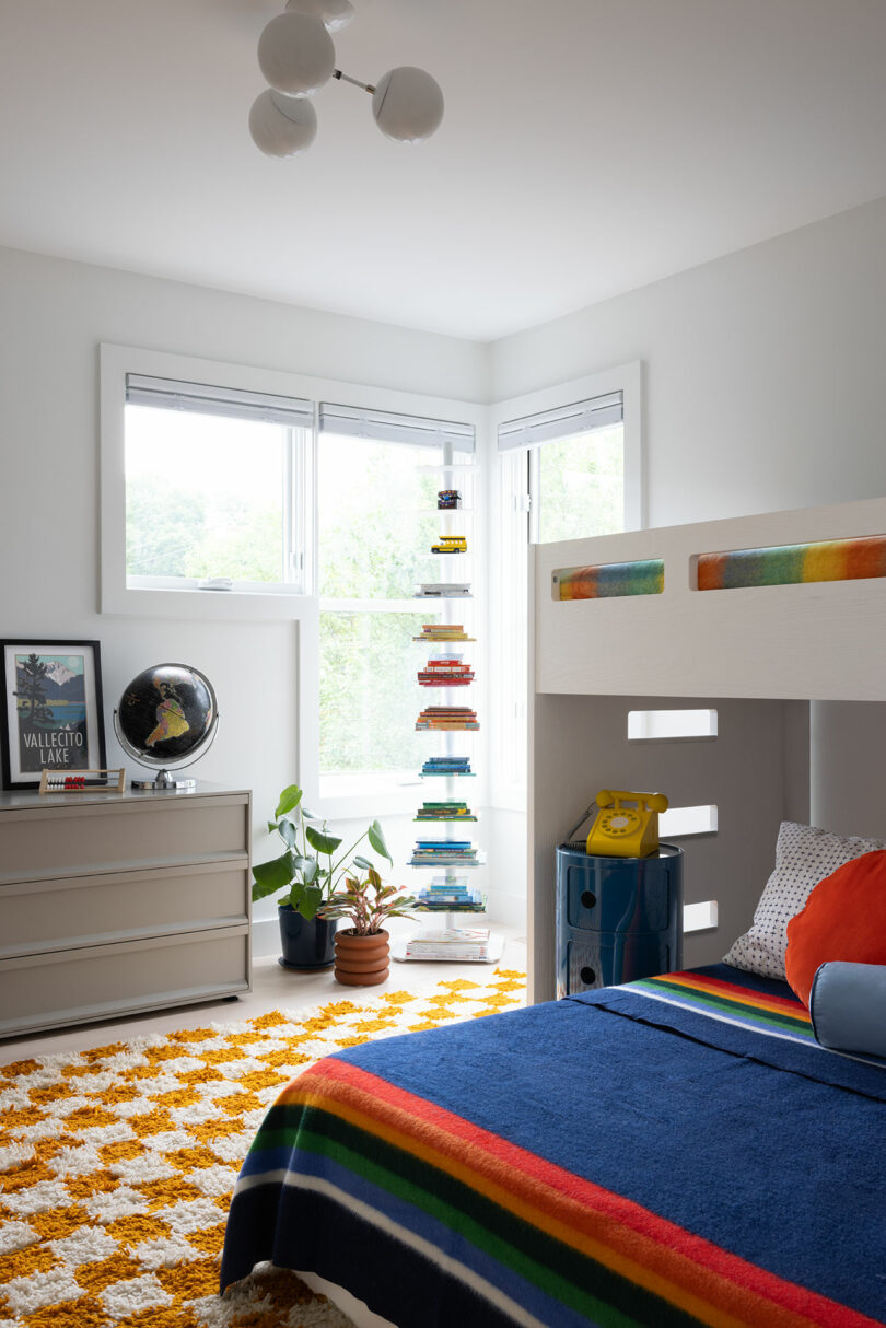
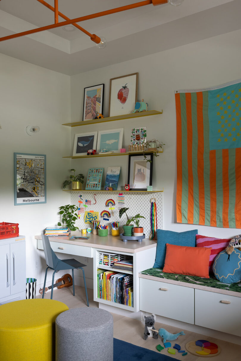
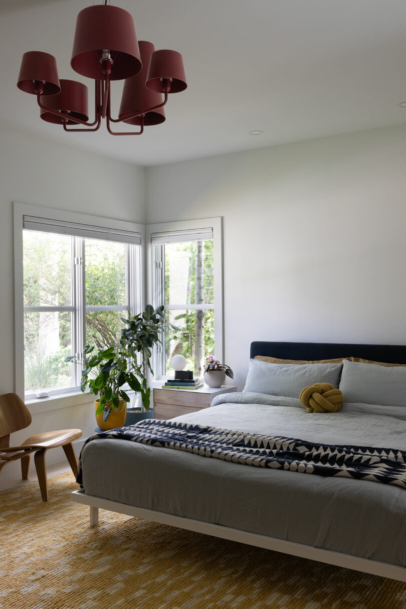
The project also embraced practical, cost-effective strategies, such as refinishing the original hardwood floors with a sheer white stain to neutralize their yellow tone and updating the carpeted bedrooms with matching wood flooring. Pigliacampo and her contractor repurposed cabinetry in the kitchen, playroom, mudroom, and primary bedroom, saving on material costs while preserving quality.
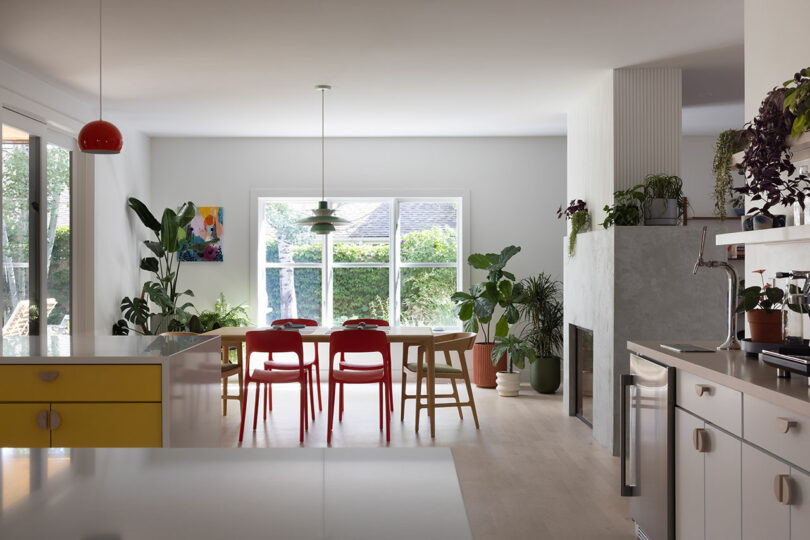
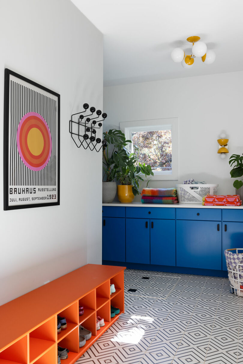
Despite Pigliacampo’s physical distance from the project, with her being up to 17 hours away at times, the renovation was completed with impressive craftsmanship thanks to a dedicated contractor and collaborative tradespeople. Some of the design elements were new to the team, including the use of tambour and concrete skim materials, but these were executed successfully, adding unique textures and finishes to the home.
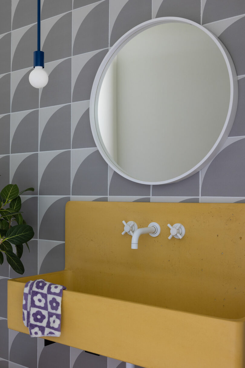
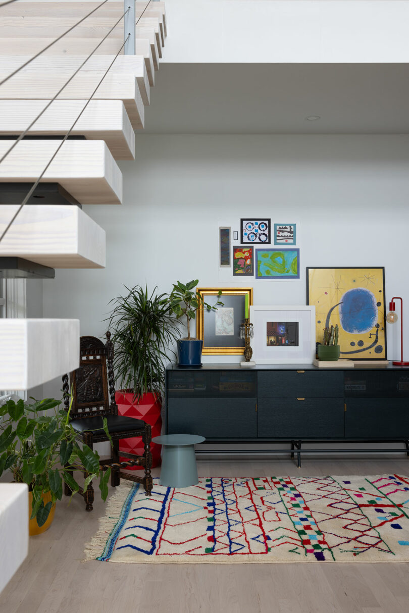
One of the more unexpected challenges in the project came from updating the home’s outdated technology. The existing lighting and sound system, state-of-the-art when installed in 2007, required a substantial investment to integrate with the new fixtures and design changes. This experience left Pigliacampo with a cautionary lesson about the risks of embedding too much technology in a home’s infrastructure, which can quickly become obsolete.
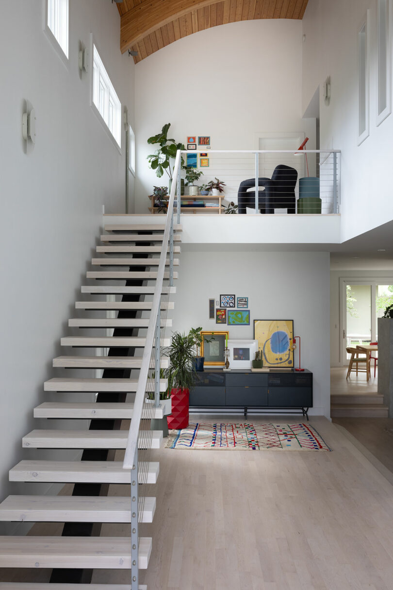
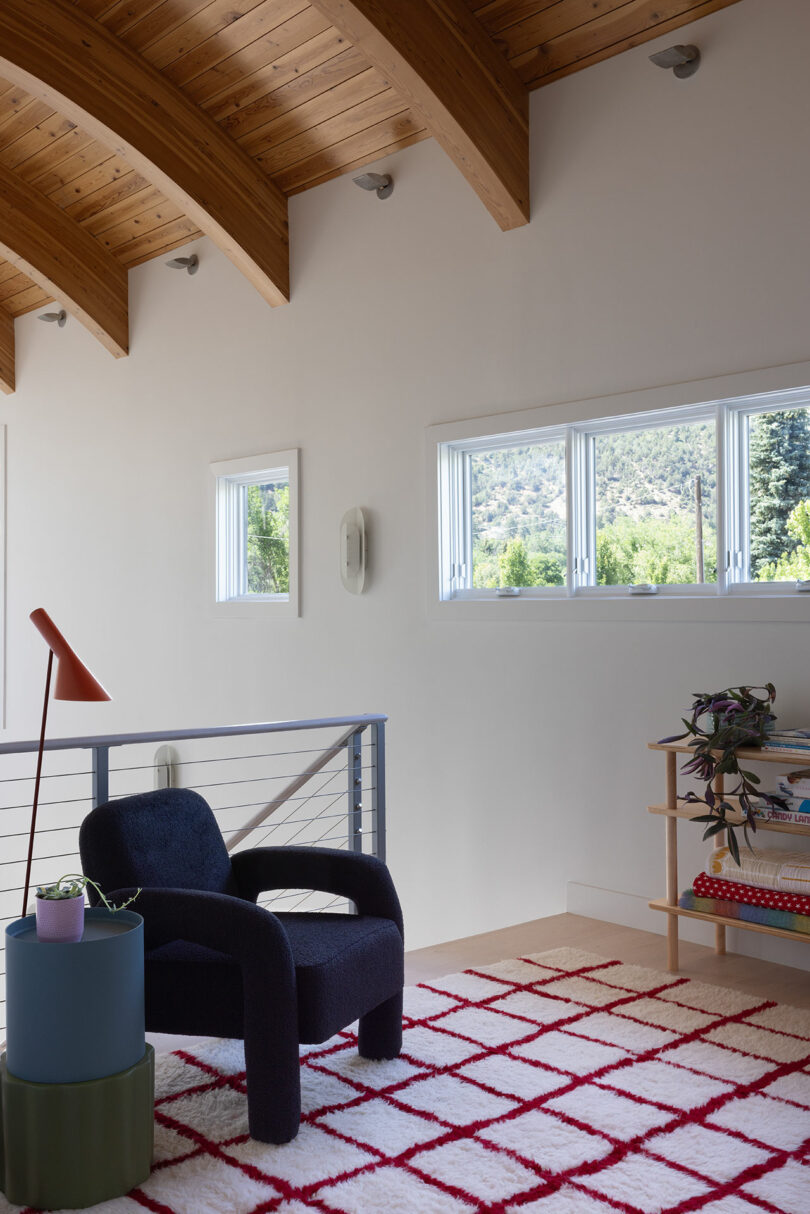
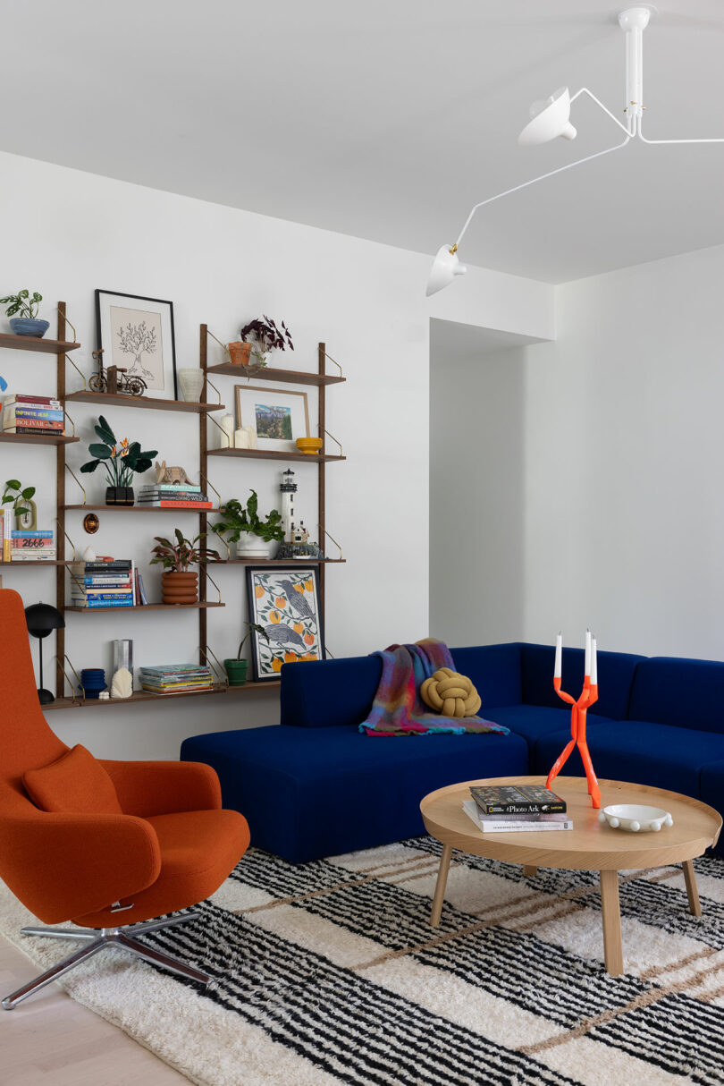
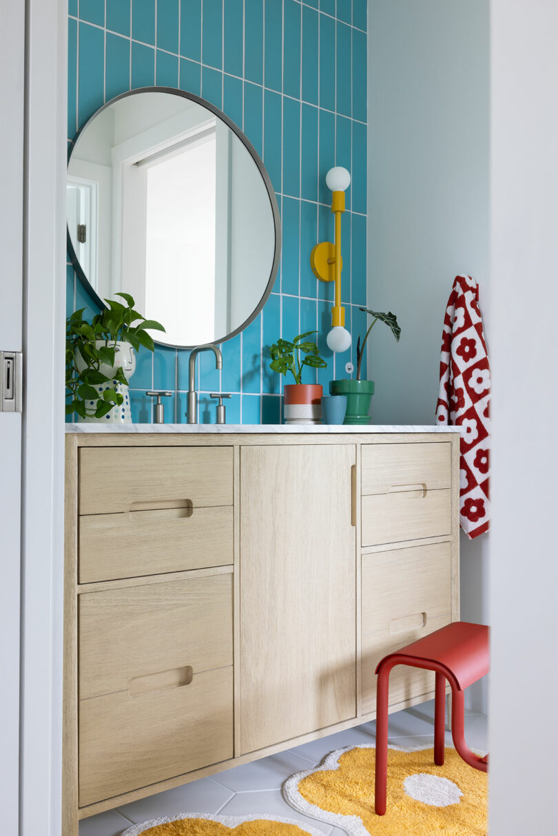
The finished home now reflects a blend of the client’s love for bold colors and Pigliacampo’s clever design ideas. The use of Schoolhouse Electric and Dutton Brown lighting, Fireclay and Florida tiles, and custom furniture pieces like the striking Vitra chair in the living room, all contribute to the home’s modern yet personalized feel. Ultimately, this project exemplifies how thoughtful collaboration and creative reuse of materials can result in a home that feels both fresh and familiar.
For more on Amy Pigliacampo, visit amypigliacampo.com.
Photography by Amy Pigliacampo and Corey Szopinski.

