

I finally got started on our bedroom suite yesterday! As in, I did more than just plan and dream. I actually got to work and got stuff done.
The project I worked on yesterday was getting the French doors to fit into the cased opening. If you’ll remember, I’m working with an opening that’s 45.75″ wide, and I didn’t want to have to reframe this opening and take a chance of messing up the music room walls. So I decided to buy two 24″-wide doors and cut them down. So the doors have looked like this ever since I installed them, with the doors overlapping and not being able to close…

So yesterday, I took the doors off and cut them down so that they actually fit. They won’t stay closed because I don’t have ball catches on either door yet, but you can at least tell that they fit now.
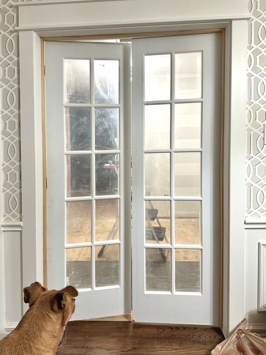
That was a bigger job than I thought it was going to be. Of course, it didn’t help that when I went to re-install the door on the right, I fought with that door for a long time, trying to get it back on the hinges, before I realized that I was trying to install it upside down. 😀 So by the time I got those down, cut, and re-installed, it took way more time that I thought it would. I hope to get them finished today, but then the door pulls I ordered won’t be in until next Tuesday. So it’ll be next week before we have fully functioning French doors on our bedroom suite.
But while I was at Home Depot getting the supplies I needed to finish the doors, I walked by the paint aisle and decided on a whim to grab every paint color they had in the orange/coral section to start narrowing down paint colors for the closet. I came home with quite a stack of colors.

I was really hopeful that with such a big stack of colors, I’d have plenty of options to choose from, but almost all of them were duds. I realized really quickly that (1) the fluorescent lighting at Home Depot really distorts the colors, and (2) both Behr and Glidden have a real gap in their colors when it comes to anything in the coral range. Most of the colors, once I got them home, looked way too yellow or burnt orange, and those just won’t do. I was certain that some of these would work when looking at them under those fluorescent lights, but they were a big disappointment once I got them home.

Almost every single one looked way more yellow once I got them home. And I don’t need yellow. I need the perfect mix of orange and pink.

So finding a color that has that perfect ratio of orange and pink is probably going to be way more difficult than I had anticipated.
Another issue that I knew I was going to have is finding the perfect color that gives me that perfect ratio of orange and pink that also looks good with the area rug that I bought for the bedroom. I don’t need them to match, but I also can’t have them clash. The good thing is that all of the oranges looked terrible with the rug, so it has a lot more red in it than I remembered. The rug has been boxed up in the studio since I bought it, so when I pulled it out yesterday, I was kind of relieved to see how much red it has in it. Here’s an example of a truer orange against the rug. You can see how they clash because the rug has way more red in it.

So that was a relief, because I really don’t want an orange closet. It has to be coral. I don’t mind a coral that leans more towards orange than pink, but there has to be some hint of pink in it, at least. While the wallpaper some very bold orange in it, I just can’t imagine having an orange closet.
In that whole stack, I did find three colors that may work. These two are Glidden colors. The darker one is called Coral Serenade. I think the actual paint swatch looks a little brighter than it’s showing in this picture. The lighter color is called Sweet Angel, and it was the color right above Coral Serenade on the paint strip. It also reads slightly brighter and pinker in person than it’s showing here.

I think both complement the rug nicely. Here’s Coral Serenade against the rug. Of course, these will actually be in different rooms, but they’ll both be seen from the bedroom foyer, so they need to at least complement each other.

I googled these paint color names to see the photos of the colors, and I found this one of Coral Serenade…

And this is Sweet Angel.

I think Coral Serenade might be a bit too saturated/dark for a closet. I was really hoping for something in the Sweet Angel hue to cover such a large amount of cabinets.
And then there were two Behr colors that were more in the coral range. The one on the left is Watermelon Punch, and the one on the right is Indian Sunset. I like the Watermelon Punch better because it has more pink in it.

But I’m afraid that both of these colors are too saturated as well. I was really hoping for a lighter hue for the closet.
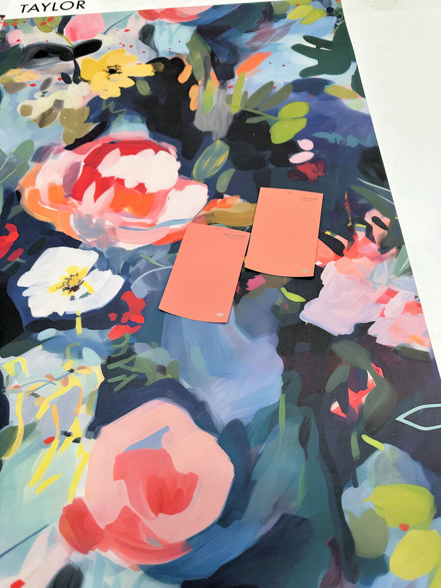
Here’s one of the pictures from Behr of Watermelon Punch.

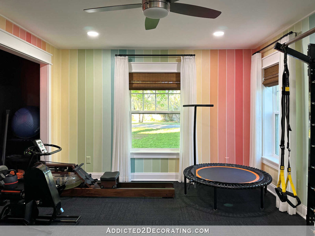
I’ve actually used that color before. It was the darkest/boldest reddish coral stripe on our home gym walls, and it looked way more saturated in that room than it does in the photo above.
Even as much as I love color, I might be a bit intimidated to paint an entire closet that color since there won’t be a whole lot of white in the room to tame that color.
So of the three from that huge stack that I think would work, Sweet Angel seems to be the frontrunner.
I’m going to look at other brands, but this is the hue I had in mind for my closet. I’m not sure if this is the one. I do think it’s close, though. Or maybe I should just go bold and do Watermelon Punch! 😀
UPDATE: I just googled “walk-in closet with colorful cabinets” and I found this. Y’all, I’m so tempted to GO BOLD!!! 😀 But I also really love this one in the mid-range hue. That actually looks similar in hue to the Sweet Angel color from Glidden.

Addicted 2 Decorating is where I share my DIY and decorating journey as I remodel and decorate the 1948 fixer upper that my husband, Matt, and I bought in 2013. Matt has M.S. and is unable to do physical work, so I do the majority of the work on the house by myself. You can learn more about me here.


 Of The BEFORE Of Our Master Bedroom Suite")


