The way we live our lives has changed considerably over the past century, yet our cultural notions of the “home” have remained broadly the same: a refuge for ourselves and our families and a repository for the objects that we value that represents elements of who we are. The concept of the home as a refuge dates back at least to the Victorian era, with a growing awareness that individuals and their children needed protection from the chaotic metropolis. The advent of modernism at the turn of the twentieth century, however, introduced a contradictory tendency, that of prospect: the home became a place from which occupants could apprehend the world and connect with nature.
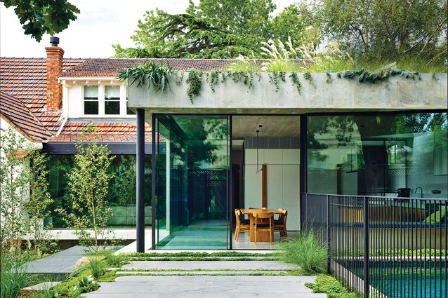
Designed by Taylor Knights, this elegant renovation of a 1930s heritage home in a leafy pocket of Melbourne is at the intersection of these two competing inclinations: it is a sanctuary, hidden from the street with a multitude of different spaces to inhabit, and it is a glazed pavilion that dissolves into a lush garden, saturated with light and air.
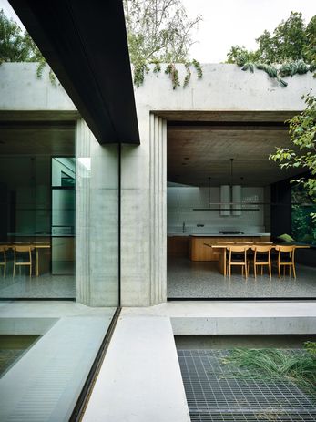
Stepped ‘ziggurat’ mouldings in the cast concrete corners of the pavilion conjure references to Venetian architect Carlo Scarpa.
Image:
Derek Swalwell
Positioned on a steeply sloping site that falls from west to east, the original house was comprised of a series of cellular rooms with a discrete kitchen at the east end, high above the garden below. The brief for this young professional couple and their (soon-to-be) three children was to reposition the living areas to provide better connection to the garden beyond and to update the heritage fabric to suit the demands of a modern, growing family. The bedrooms upstairs – remnant of a 1980s renovation – were to be reconfigured, with new bathrooms and ceilings to take advantage of the volume within the existing attic space. The lower ground was to be updated to accommodate visiting family members and friends in a manner that provided them with privacy and separation from the rest of the house. A home office would be accommodated within the mix, enabling both parents to work part time or work from home as required.
The key design strategy was to reposition the kitchen and dining areas in a new pavilion-like structure at the north-western corner of the site. Projecting out from the highest point of the land, the addition could open directly onto the garden at grade and benefit from an abundance of eastern and northern light over the course of the day. Formally, the pavilion appears almost as a modernist relic – a glazed volume sandwiched between two off-form concrete slabs, with native grasses shimmering over a concrete parapet. Stepped ziggurat mouldings in the opposing cast concrete corners of the pavilion conjure references to Venetian modernist Carlo Scarpa, while a deep aperture in the concrete ceiling of the kitchen nods to Le Corbusier’s late modernist experiments with béton brut. Simultaneously, the pavilion responds directly to the language and geometry of the existing heritage house, referencing its corbelled brick eaves and the heavy, textural and crafted quality of its brick and render facade. Heavy and light, textural and abstract, the pavilion represents tendencies toward both the notions of “refuge” and “prospect,” which can be modified though the opening or closing of the pavilion’s glazed corner.
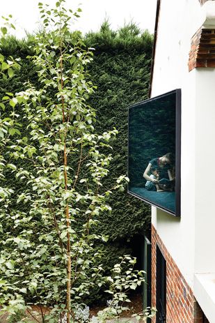
Protruding window seats in the kitchen and children’s playroom orient themselves to the yard, allowing inhabitants to sit ‘in’ the garden.
Image:
Derek Swalwell
In both the formal composition and materiality of the house, a tendency towards reduction is paired with careful detailing. A single fixed pane of glazing adjacent the pavilion illuminates the living space with northern light, and provides an elegant transition between the new and existing structures, allowing the pavilion to be read against the field of Marseilles terracotta tiles on the existing roof. Internally, concrete, American oak, steel and glass predominate, complemented with neutral terrazzo and marble. Taylor Knights was at pains to provide material consistency throughout the house, using American oak boards as formwork for the pavilion’s concrete ceiling, for instance, in a textural echo of the adjacent living room’s timber ceiling.
According to director James Taylor, the landscape is conceived of with equal importance, spatially and experientially, to the architecture throughout their projects. At Malvern Garden House, much of the magic lies in the relationship between the two. From the first step through the front door, the visitor is greeted by a view out onto lush and varied vegetation. Landscape architect Ben Scott has provided a scheme of zoned planting that offers a birch forest canopy to the ground floor windows, a fern garden to the lower ground and a dichondra-covered terrace at the upper level. A galvanized steel platform hovers in-between, providing a permeable place to sit among the tree tops and native grasses, while a whimsical steel slide offers a fast way to make your way to the bottom. Internally, window seats in the kitchen and children’s playroom orient themselves to the yard and allow the inhabitants to sit out “in” the garden from within, and a concealed courtyard that opens onto the main ensuite provides a bathing experience among the ferns. Carefully considered and deliberately executed, this thoughtful renovation provides a sanctuary that facilitates respectful engagement with the natural world.

