I’ve been thinking about Spring collections and what they’ll look like for 2022 given how little outside impressions we’ve been able to make over the past two years due to Covid-19. With fairs canceled, parties at home being frowned upon and in some countries, not allowed, and most travel prohibited or severely restricted, how can we get excited for Spring decor in the same way as before?
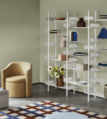
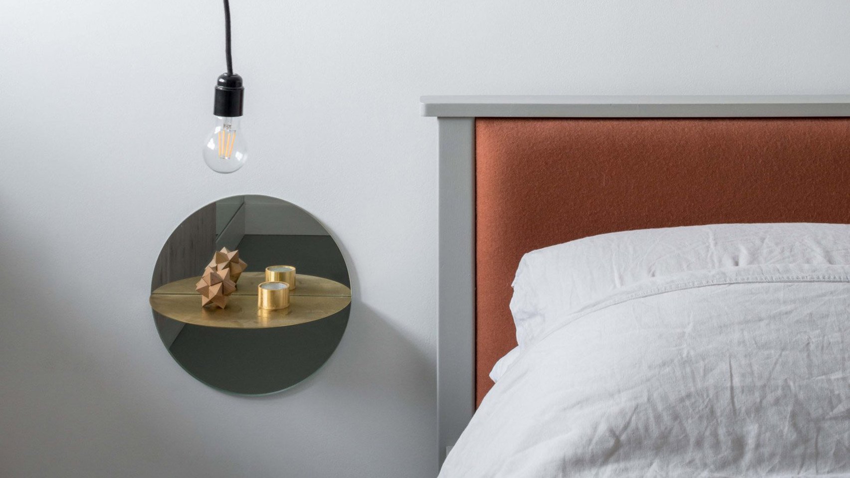
Broste Copenhagen catalog for S/S 2022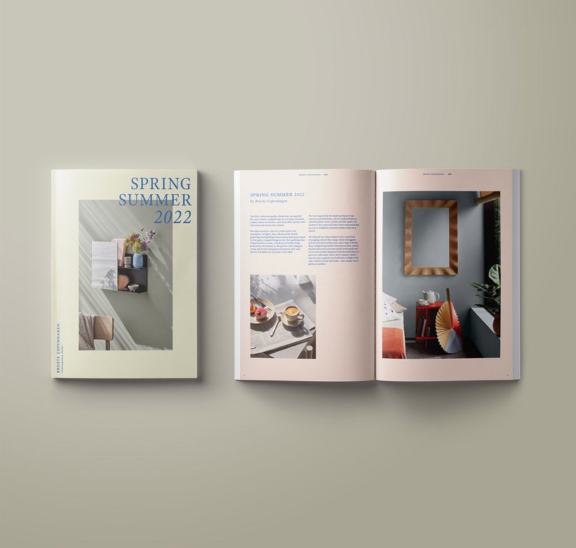
I’m planning the 8th birthday party of my son next month and it looks like the same as 2021 – he’ll have his best friend come over and we’ll make a special day together. My birthday is in March and most likely I’ll have a very few friends over for a private, small dinner. When I used to throw parties pre-Corona, I had no less than 20 people in my home, sometimes up to 50. But on the flip side, maybe we all needed a break though I can’t help but think of how so many are not so inspired to decorate currently – who will see it?
That’s why Instagram and blogs are still relevant and keep us inspired. I decorate, for myself and my family first, but then for my fans and friends online. Having these online spaces to share what’s on my radar at the moment keep me going. I recently renovated my entry room and my son’s bedroom, I’ll share the before and afters in the weeks to come here on decor8.
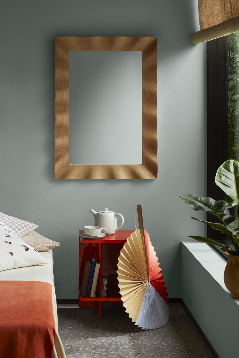
Let’s look at the new interiors collection out of Denmark by Broste Copenhagen. “With spring, we welcome brighter and longer days with a color palette that uses warm earth tones, like ochre, on everything from furniture to tableware and subtle pastels on candles, textiles and vases. Inspired by the simple beauty of ripe cherries and fresh fruit, we’ve transformed them into cheerful pillowcases, textiles and decadent candles. Looking to the sea, we’ve found oysters and mussels that are as lovely when used as interior motifs as they are in nature.”
The Spring 2022 collection is broad but the aim was for them to make it easy to gather loved ones and enjoy a certain coziness in your home, to make it feel warm and loving, to give us an emotional lift in hard times.
I notice lots of blue and green, mostly pastel tones, paired with vibrant red and yellow tones, punctuated with black. It seems that color is becoming the trend of the moment across many of the brands here in Europe as color has a psychological impact on us – it can help pull us from the darkness we may feel – color can energize, uplift and brighten the home and then, the emotional state of those living there.
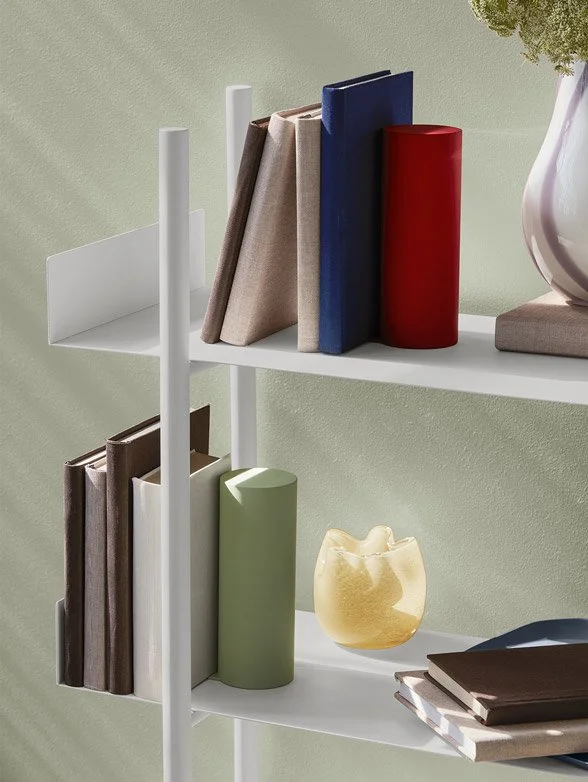
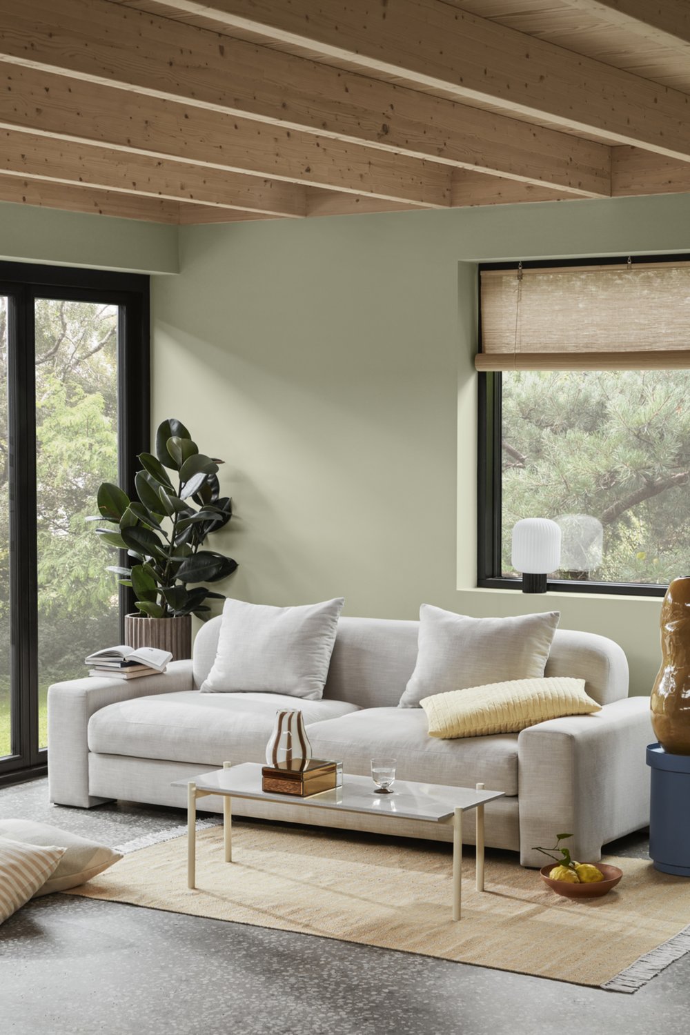
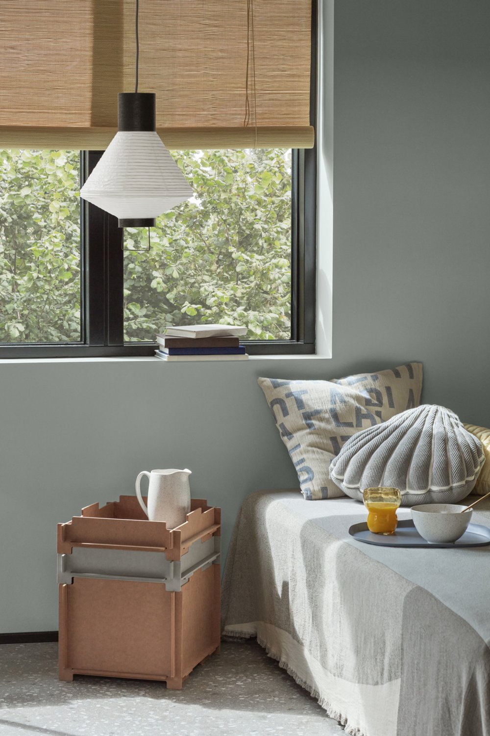
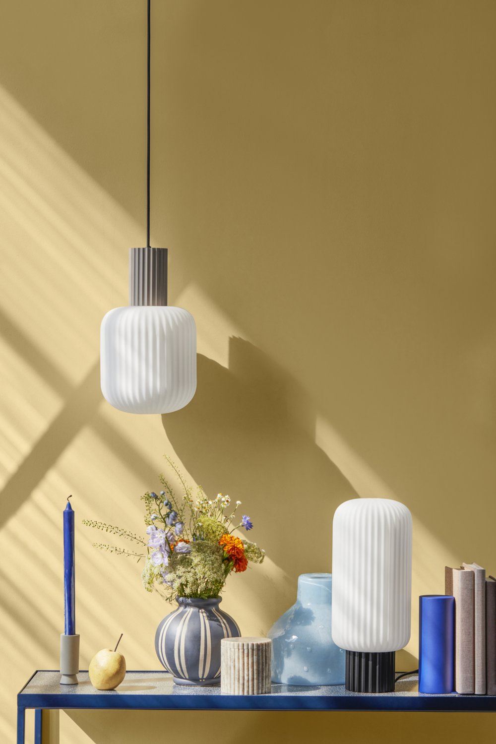
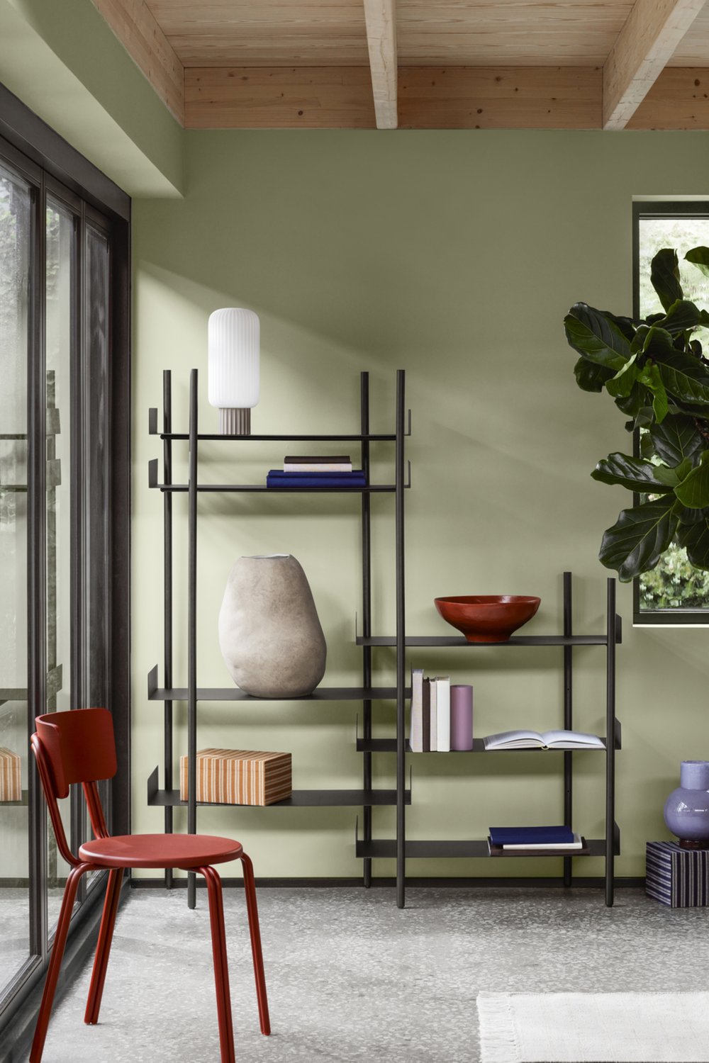
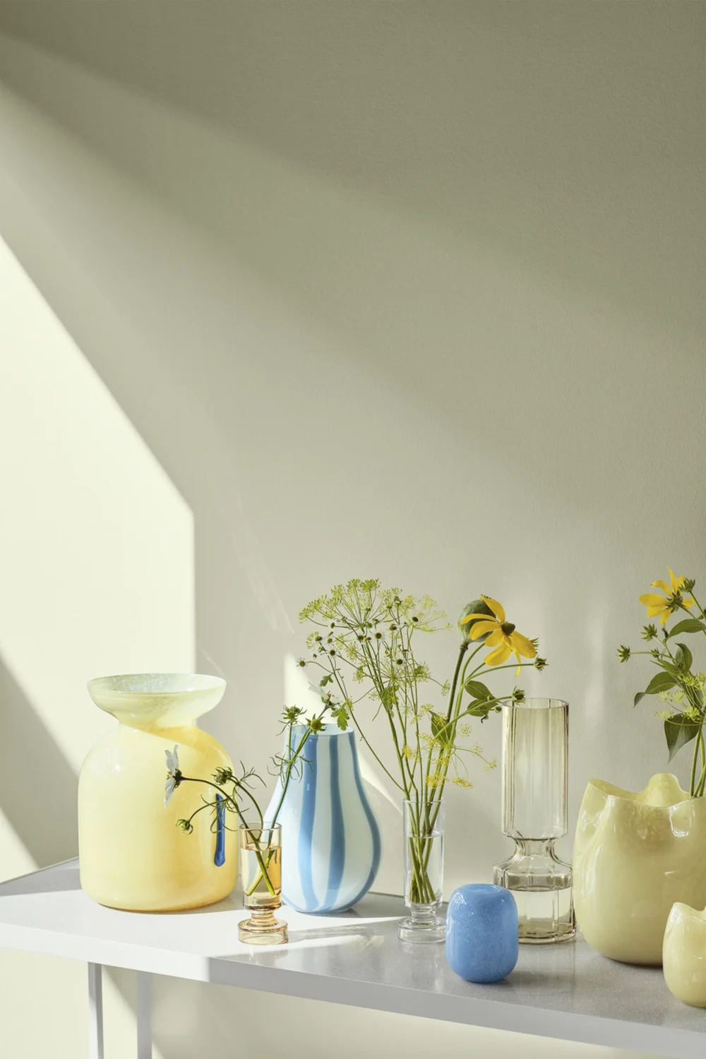
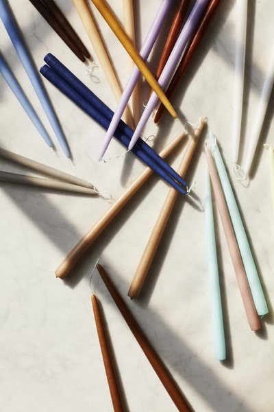
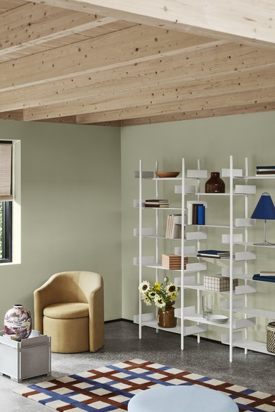
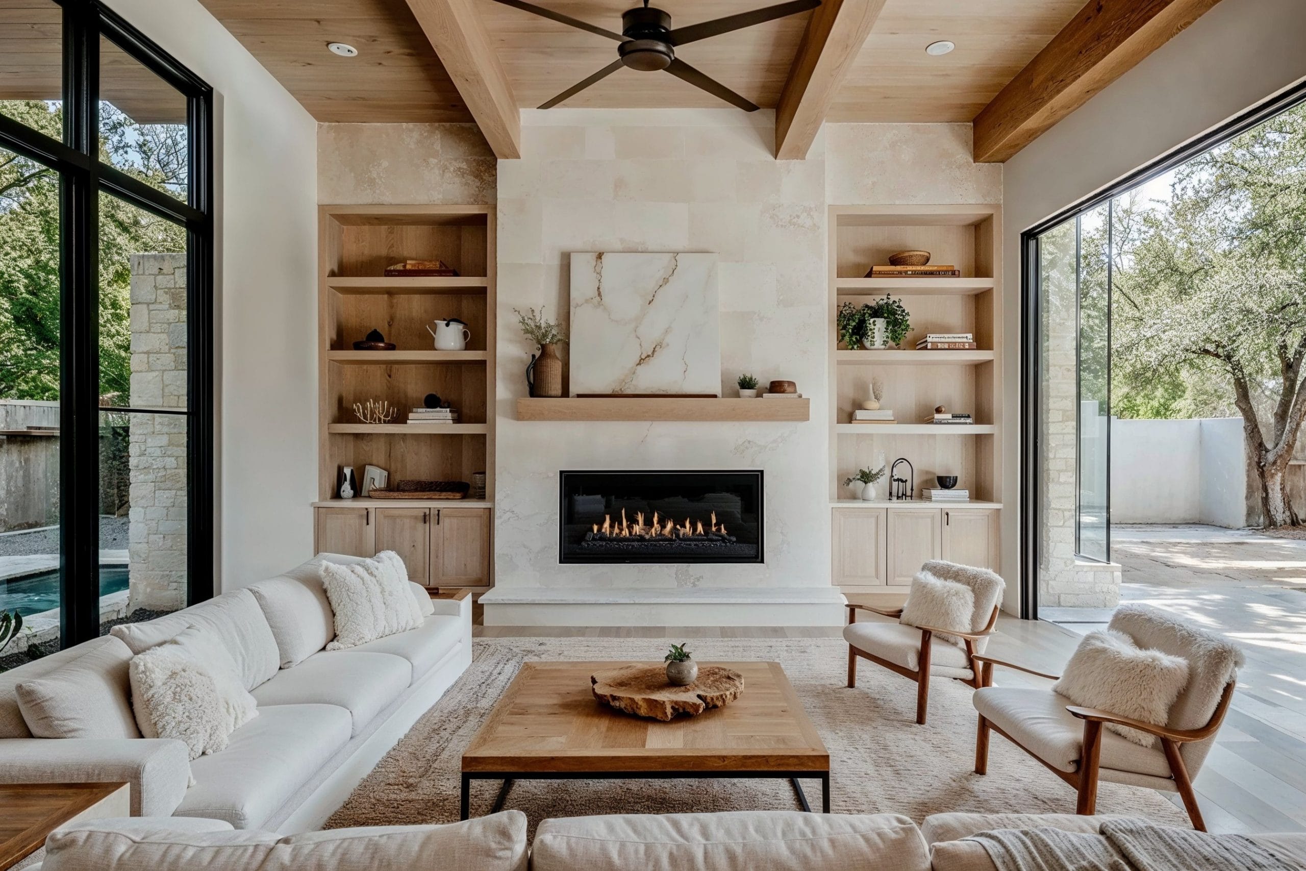
Do these colors resonate with you? I love the green walls with the raw wood beamed ceilings, and the candle colors, shown above. I also really like the cream sofa – it looks so cozy and warm.
Here is a little color psychology 101 from the London Color Institute in case you’d like to know a little more about color:
RED – Red attracts the most attention and is associated with strong emotions, such as love, passion, and anger. It’s the color of strength, power, courage, and danger. Red is vibrant, stimulating and exciting with a strong link to sexuality and increased appetites. Red is energizing and exciting, motivating us to act. It can also give confidence to those who are shy or lacking in willpower.
ORANGE – This is the hue of encouragement, optimism, and self-confidence, marking the extrovert. Orange radiates warmth and happiness, combining the physical energy and stimulation of red with the cheerfulness of yellow. Orange can inspire courage, enthusiasm, rejuvenation, and vitality. It can also have a stimulating effect, particularly on the appetite. It can also be a sign of pessimism and superficiality.
YELLOW – Yellow is the color of the mind and the intellect, resonating with the left, logical side of the brain. It is creative, the tone of new ideas and new ways of doing things. Post-it notes and legal pads were invented in yellow for a very good reason! Being the lightest hue of the spectrum, yellow is uplifting and illuminating, offering hope, happiness, and fun. It’s a warm and happy color that creates a sense of cheerfulness and playfulness, brightening people’s spirits.
GREEN – Green is of nature, of balance and growth. It is restful and secure, symbolizing harmony, healing, and stability. It also represents security and self-reliance.
BLUE – Blue is the color of trust, serenity, and peace. It suggests loyalty and integrity as well as conservatism and predictability.
PURPLE – Purple is the color of imagination and spirituality, inspiring high ideals. It can be creative and individual or immature and impractical. It is also an introspective tone, allowing us to connect with our deeper thoughts.
Please visit the London Color Institute (this page) to read a very extensive report on each color – it’s fantastic! The above is only a small portion of the body of knowledge on their site.
Have a lovely day!
Love,
Holly
(Photos: Broste Copenhagen)

