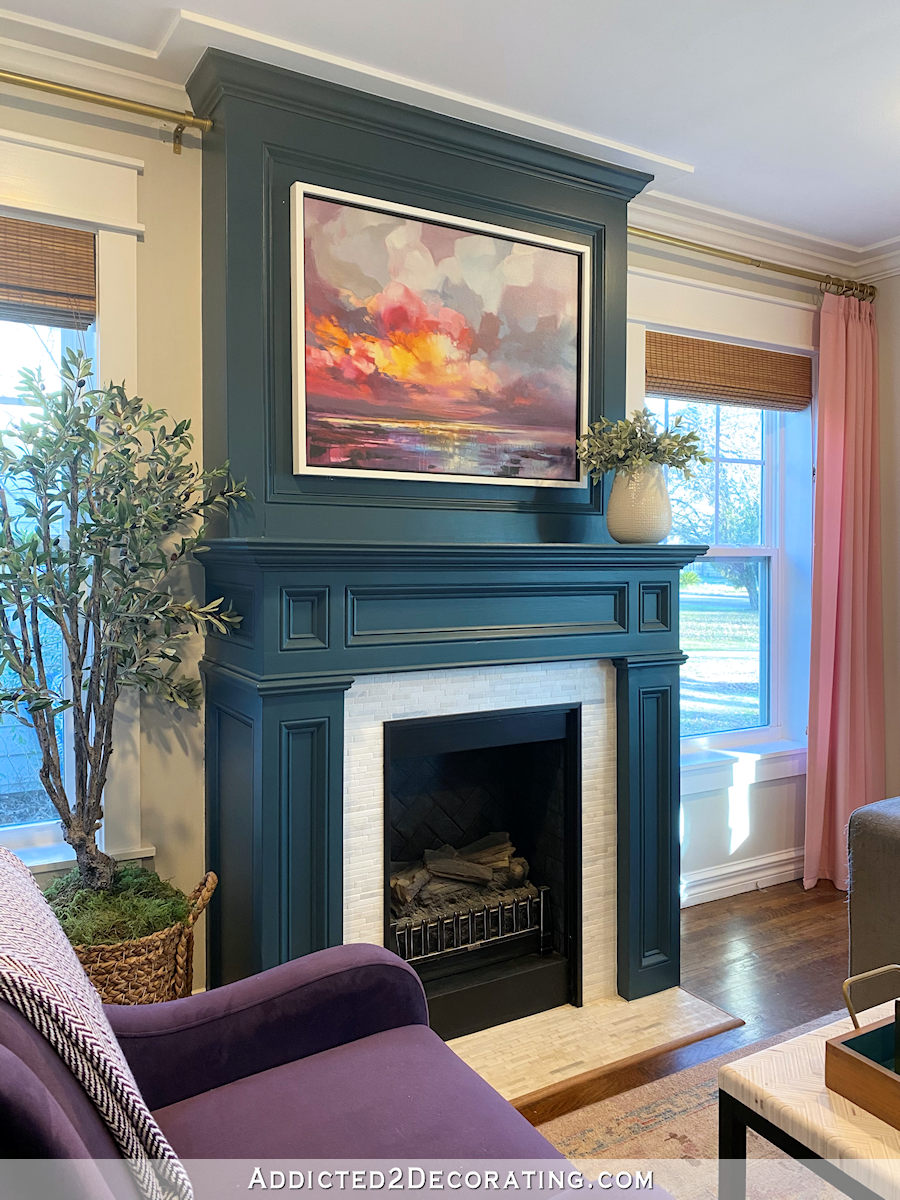
If you’re new here, and you haven’t taken a close look at our living room fireplace, you may not realize that the fireplace is fake with an electric insert. From the first moment I saw this room before we bought the house, I knew I wanted a fireplace in the room. And I also knew that it didn’t need to be real. I just wanted the pretty architectural detail of a fireplace.
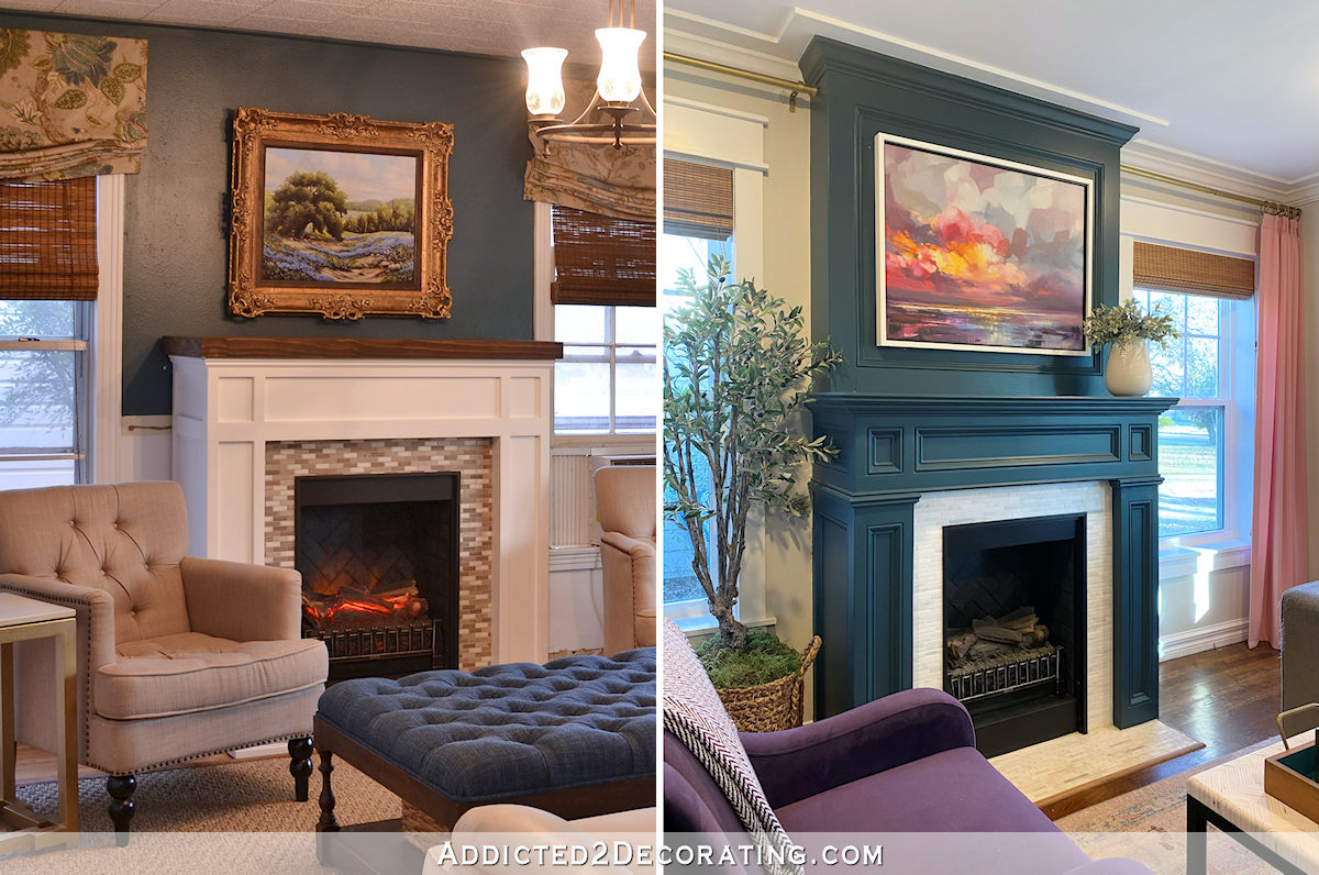
So a few months after buying the house, I built a fake fireplace to go in the room. But if you compare how it looked originally to how it looks now, it almost looks like a completely different fireplace…and a completely different room. I had forgotten just how drastically it had changed until I was looking through some old pictures last night, so I thought it would be fun to take a walk down memory lane and remember just how far this fireplace has come.
But let’s start with the prettiest view, which is the current view. Here’s how it looks as of this morning. I still need to decide exactly what I want to display on the mantel. That vase is a temporary place holder.

So if we go way back to the very beginning when we bought the house, you can see that there is no fireplace between those two windows. There was also no doorway into the kitchen on that left wall, but that’s a story for another day.
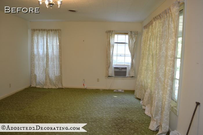
That space between the windows seemed like a perfect place for a fireplace to me. So in early 2014, I bought some MDF and trim, came up with a design, and after a few days of work, this was the first iteration of the living room fireplace.
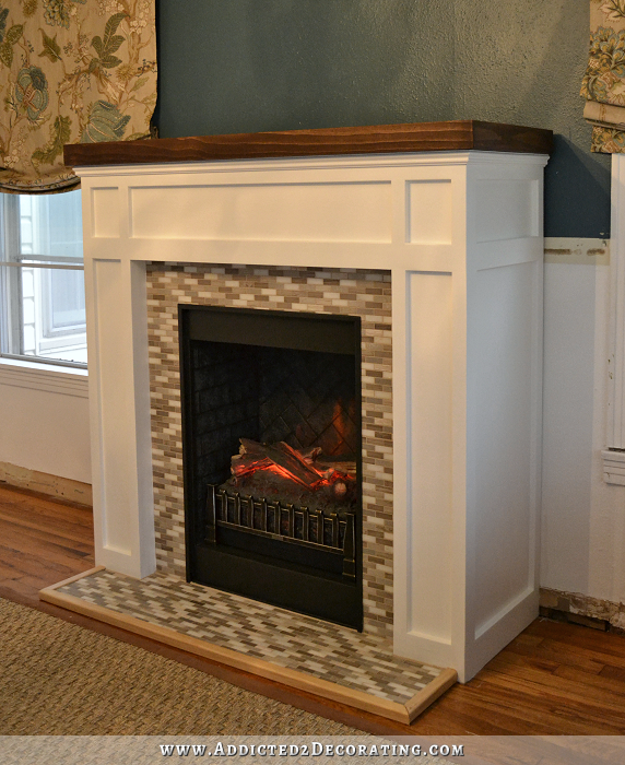
That project was pretty involved, and I broke it down into several posts. You can find those posts here…
The original fireplace was decidedly more craftsman in style, and the tile was dark and busy. I was also hesitant to install tile directly to the hardwood floor to create the look of a hearth (I’m a lot more daring in my DIY projects now than I was then), so I put the tile on a piece of 1/2-inch MDF. I never did like the look of that hearth. It seemed too high and too bulky.
When I originally built the fireplace, the living room still had the original front windows, one original side window (to the right of the fireplace) that had a window unit air conditioner, and an aluminum window to the left of the fireplace. And the ceiling was still covered in the polystyrene tiles.
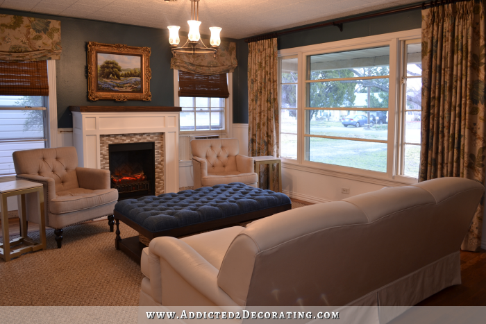
It didn’t take long for me to realize that the fireplace was a much too craftsman in style for my taste, so with the addition of some trim and a little paint on the tiles, I gave it a much more traditional look.
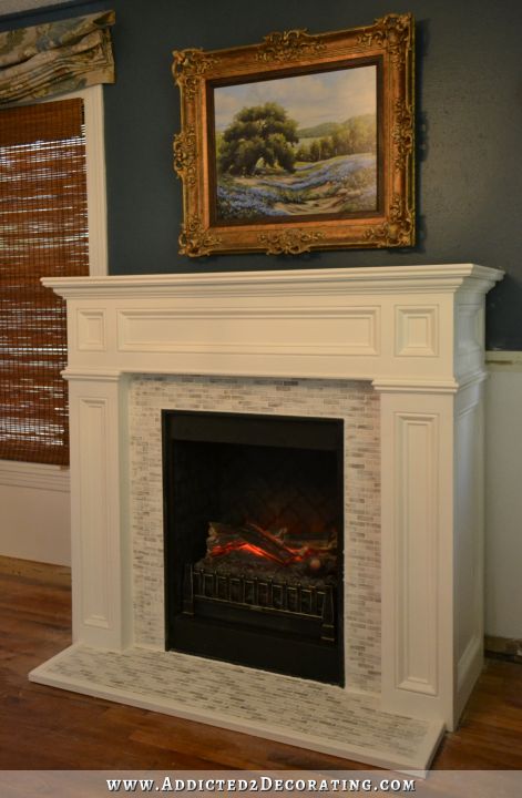
You can find those details here…
The look of the fireplace changed pretty drastically when I was finally able to build the overmantel.
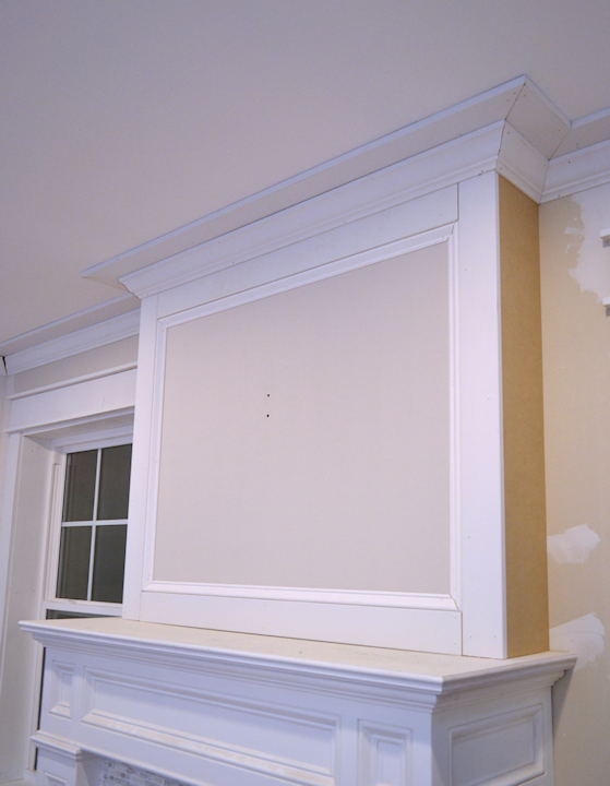
That had been the plan from the beginning, but I couldn’t build that part of the fireplace until the original polystyrene tile ceiling had been removed and the room had new drywall. Once the new drywall was in, I could finally finish the fireplace to the ceiling and add the rest of the crown molding and trim.
You can find that project here…
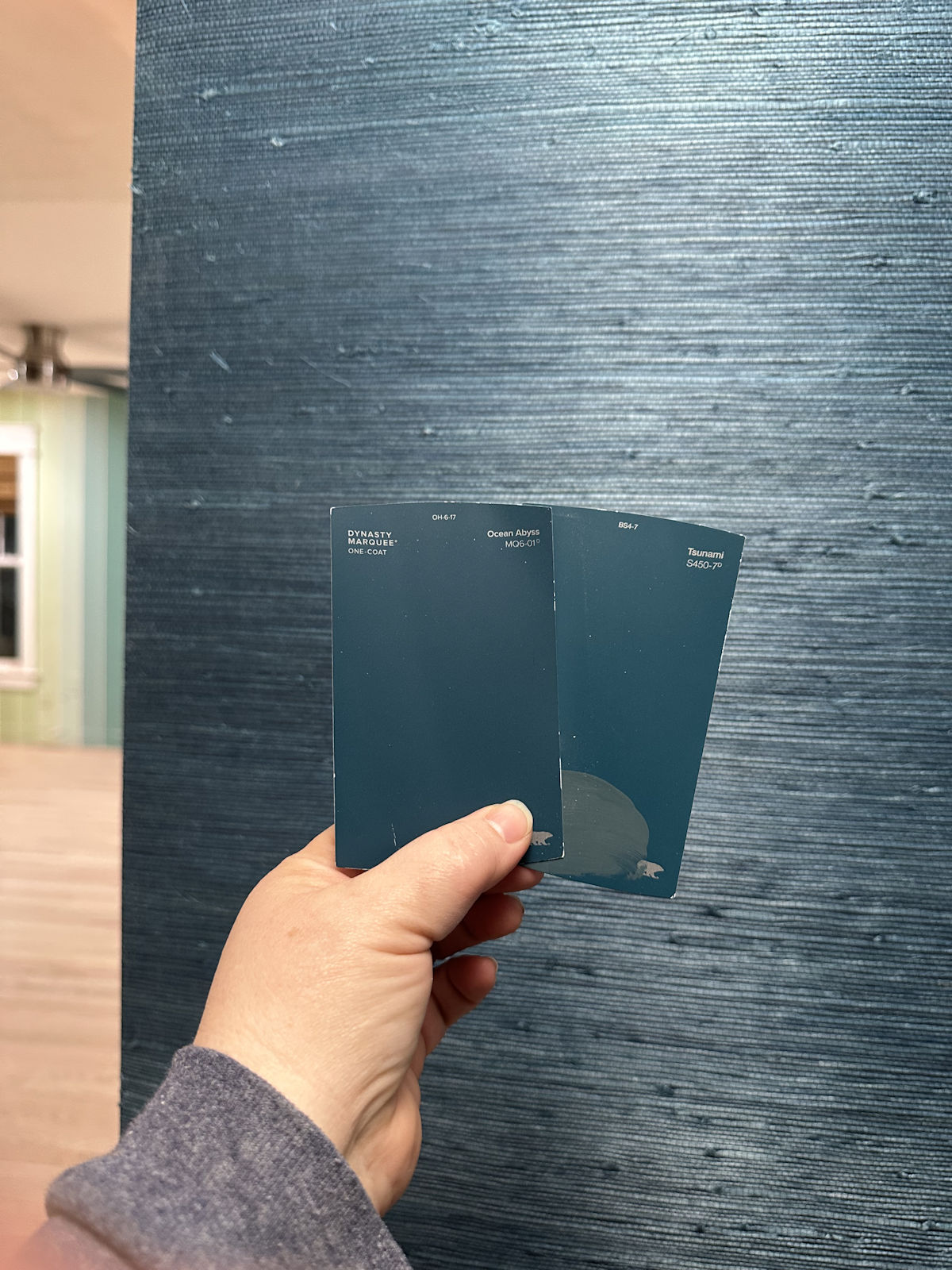
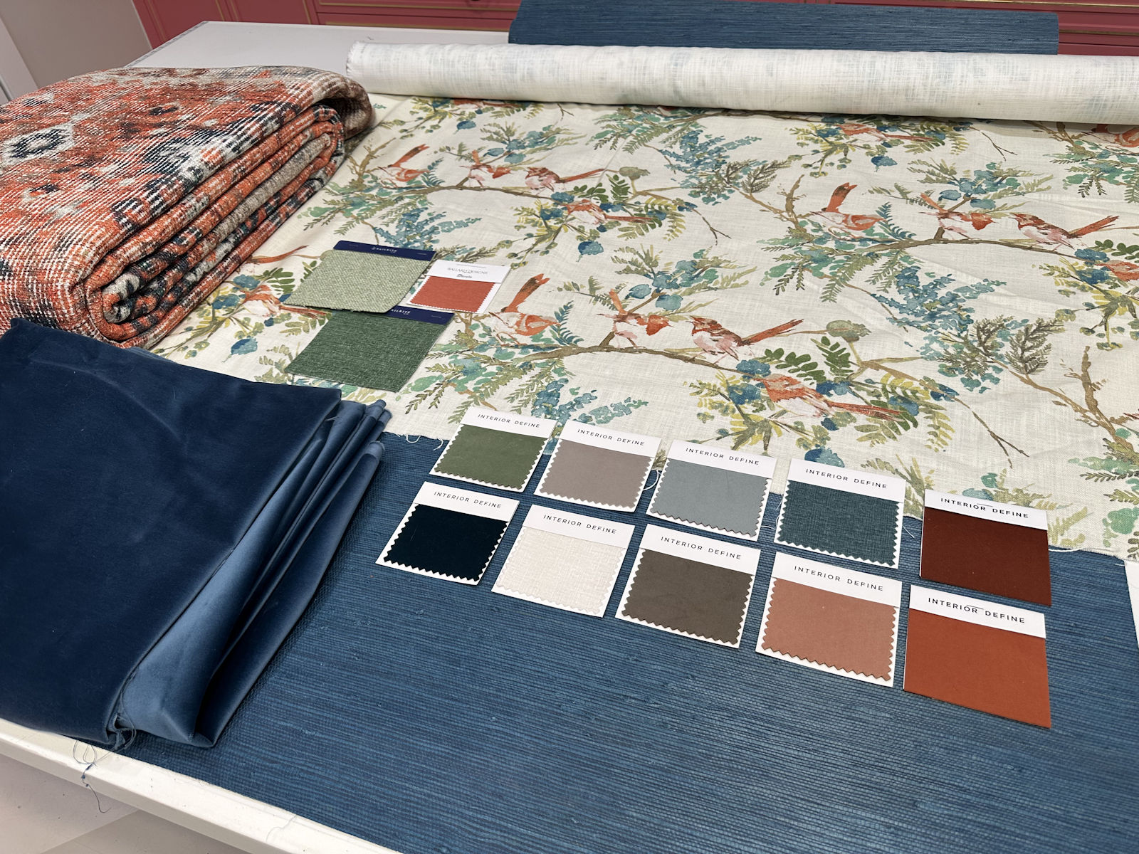
Once the whole fireplace build and all of the trim was finished, it was just a matter of finding the right color for the fireplace. I struggled more with this room than with any other room I’ve ever decorated in my entire life. So it took a long time for me to finally find the right combo of colors and decor. It was a very long road with lots of missteps that included this awful light gray…

Followed by this dark gray that I thought was really pretty, but it didn’t make the final cut.
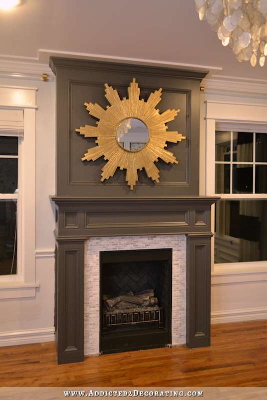
And finally, its current teal color with a new and improved tile surround and hearth tiles installed directly on the hardwood floor so that it has a much lower profile.
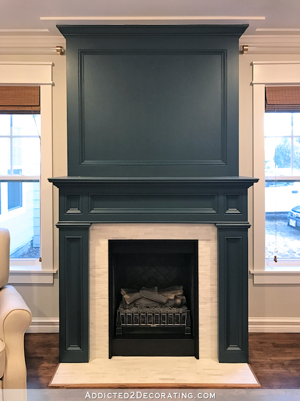
This little fake fireplace has been through quite a transformation over the years. I was very proud of the original design, and the fact that I built the fireplace myself…
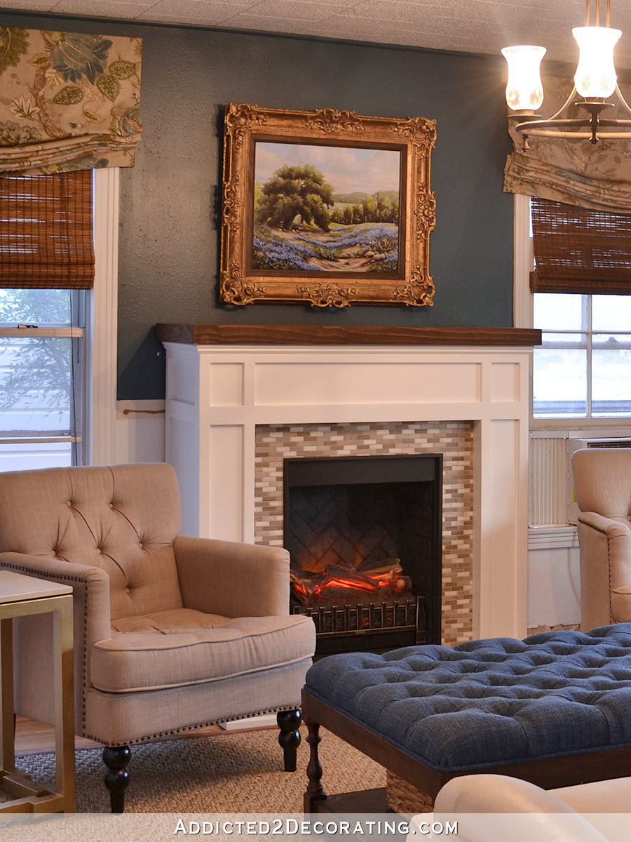
But I’m so glad that I kept on adding and tweaking until I got it just right. The current iteration is so much more fitting to my style and to the room, in my humble opinion.
