We meet in the laneway outside The Hotel Britomart in downtown Auckland. Cheshire Architects principal Dajiang Tai begins the talk in interface gestures: “So it is up and down, best operators, left and right”. He’s talking about the hotel’s amplification of the existing ‘Britomart language’ – the geometry and spatial choice the precinct offers. Basement, ground floor, first floor, rooftop: swipe every which way for “energetic” restaurants and bars and designer brand retail.
The Britomart language began more than a decade ago with Roukai Lane. Cheshire Architects and developer Cooper and Company, showed that it was possible to make the outward-facing Customs Street and Quay Street perimeter buildings of Britomart face inwards to what was, back then, essentially a mass of car parks. Today, Britomart is a hive of activity, all facing inwards to a network of narrow streets and laneways.
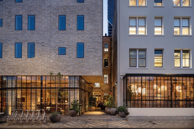
The Hotel Britomart’s laneway takes the geometry to a new level. On the Galway Street frontage, the hotel, with its cantilevered canopy entrance, is separated by a narrow laneway from the adjacent Excelsior and Stanbeth heritage buildings, housing on their raised ground floors (a few steps up) the recently relocated Café Hanoi restaurant and a soon-to-be-opened Asian fusion restaurant in the basement. Beside them is new eatery Mr Morris (in the former Café Hanoi space).
The laneway seems to end at a semi-enclosed colonnade forming the outside dining section of the hotel’s detached restaurant, Kingi, complete with fireplace and its floor level lowered to be seamless with Britomart’s bluestone paving. Here, the lane takes a dog-leg – swipe left, then right, from outside to inside, and walk through to Customs Street flanked by a wood-fired-pizza-oven kitchen and the Daily Bread retail on one side and Kingi on the other. Those who work on the office floors above also use this inside alleyway to get to their workplace.
Disconcerting at first, but also setting a new standard in public space, exuding not just historic atmosphere but also smells, sounds and sights of the city.
Samuel Hartnett
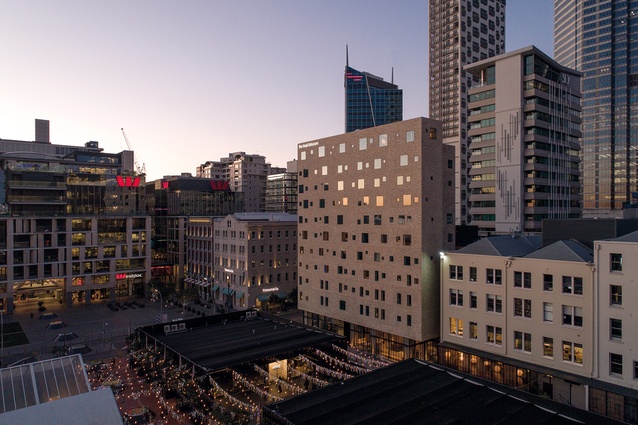
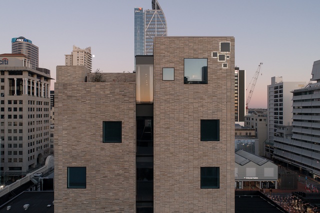
If this all feels very energetic and very Britomart, the 10-level hotel itself, with its distinctive beige, textured brick façade punctuated by an array of scattered square windows of varying sizes, seems something else – an alien, brittle, futuristic entity floating above Britomart’s urban landscape. Tai says rather than create another lightweight glass tower in the city, the firm wanted to make a building of robustness – harking back to a bygone era and the heritage context.
Given the immediate heritage brick surrounds, the material became an interface for the new building to talk to the old. The choice of thin, elongated, handmade bricks from Melbourne formed into precast panels adds another layer to the dialogue. Then came the windows. At the lower levels, they are rectangular, mimicking the window form of the adjacent heritage buildings. Then they morph into squares of different sizes, making a captivating flush finish with the brick.
Tai: “It is almost like an iPhone, sort of seamless on the edge. That is the tipping point where the building is really futuristic looking. We spent a long time removing the architecturalness of it – there are no flashings on the windows.”
The hotel is indeed very iPhone: a flat, sleek, flush façade parading simplicity but offering a complexity beneath. Tai: “You do see a lot of really good architecture as buildings but, often, they are lacking in their software and the experience.” You might argue that the contrasting combination of brick and glass follows an iPhone-like, skeuomorphic design philosophy. Like the unfurling of virtual paper across a digital screen, the building manipulates a new material medium that forges a link with the past.
The hotel opened at the beginning of October 2020, along with the ground floor restaurant Kingi, which occupies the adjoining Masonic (1885) and Buckland (late 1890s) heritage buildings fronting Customs Street. When we visit, work is still being completed on a first-floor dining area above Kingi, tentatively dubbed The Library, for the hotel’s more exclusive guests – those paying around $2500 a night for one of its suites, some of which have rooftop courtyards.
Samuel Hartnett
The Library idea kind of contradicts the hotel’s premise, which is to say Britomart itself is the hotel – that the moment you step into the precinct, you are in the hotel. “You are staying in the room to sleep in but, if you want breakfast, there is Ortolana,” explains Tai. “If you want to go to the gym, there is Les Mills. If you want to shop, there is Karen Walker; if you want to have a good night out and get your make-up done, there is M.A.C. There are all of these things that exist already that are all part of the precinct so it is almost like a deconstructed hotel.” As Tai sees it, The Library is for those guests who can afford to say sometimes they don’t want the Britomart hustle and bustle, opting instead to dine somewhere calm, quiet and exclusive. The things money can buy.
Tai admits he doesn’t really know where architecture stops: “We want it to be a complete experience. We have to pick the fabric for the chairs, choose the right plants, make sure the handles you touch are something special. The uniform that the reception staff wear is hessian-canvas-like fabric so everything is cohesive – a fully immersive experience. We just have to make sure there is nothing that is left behind.”
A big ask. Architecture in this mould includes everything from marketing materials to the look of the food menu and what the wait-staff wear. It’s an architecture obsessed with granular certainty. But the art of it is in making all that obsessive intensity seem effortless.

