Often when we think of architecturally designed homes, we conjure an image of giant concrete cantilevers, metres of marble and a show-stopping infinity pool. But while these extravagances may be the reality for a small number of fortunate homeowners, much of the real bread-and-butter work for architects and designers is at the smaller and more humble scale of alterations, additions and renovations. Clients engage architects and designers to create homes that are suited to their sites and to their modes of living. The MB Apartment by Bokey Grant Architects is a clear example of a modest commission and demonstrates that small-scale interventions can make a big impact. This well-designed renovation has retained the clients’ connection to place, while providing them with a contemporary interior tailored to their particular needs.
Mary and Ben are the new owners of this apartment, located near the harbour in Sydney’s inner west. The compact apartment, purchased in the 1990s by Mary’s grandmother so that she could be close to her children and grandchildren, is located in a nondescript 1960s brick apartment block across the road from Mary’s family home. Like most apartment buildings in Sydney from that era, it has little to no architectural merit to speak of, inside or out. The interior was a time capsule of speculative development from the mid-twentieth century: not a single thing had been altered or changed from when the apartment was built to when the client inherited it some 50 years later. Instead of selling the apartment, Mary and Ben decided to establish their first home here, reinforcing family connections to the area and opening a new chapter for their life. The question was, how could they adapt a very uninspiring interior into a home suited to twenty-first century living?
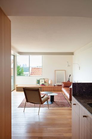
The living room ceiling opens upward, defining the space. Artworks: Mark Alsweiler (centre, with figures), Carie Fraser (far right).
Image:
Clinton Weaver
Although the apartment isn’t large, the pair knew that the services of a design professional were required to deal with its challenges. They had seen the work of Bokey Grant in a house in nearby Lilyfield and liked the clean lines and “surgical” approach that the firm had taken in dealing with an existing building. The clients wanted something that was new, fresh and reflective of their first home together – and also something that did not erase everything from the past. Jeffrey Grant, director at Bokey Grant, says that the existing configuration of the apartment – its boxy compartmentalization and flat, low ceilings – “didn’t set a good first impression.” Jeffrey’s strategy for the redesign was to “soften the edges” and “speak to the past.” These two ideas manifest themselves not only spatially but also experientially.
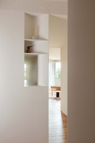
The original layout of the apartment had a pokey entrance vestibule sandwiched between a large laundry and an enclosed kitchen – the “first impression” Jeffrey wanted to change. In order to resolve this, the kitchen has been reoriented and a store room created between the new kitchen and the laundry (this room can be converted into a powder room in future). The blunt walls have been re-formed to create a niche at the entry and a viewing tunnel between the kitchen and entry. The walls have been thickened, and the spaces now appear as if carved out of them, a gesture that Jeffrey says gives the interior a sense of “gravity.” He was aware of trying to mitigate the thin and uninspiring feel of plasterboard walls that are common in apartment interiors. These bold moves create a sense of drama at the entry and provide a visual connection from the kitchen to the vestibule. The use of borrowed views extends the spatial experience of the interior, creating a sense of generosity that exceeds the compact 86-square-metre footprint of the apartment.
A viewing tunnel connects the entry to the kitchen and gives the apartment a better sense of arrival.
Image:
Clinton Weaver
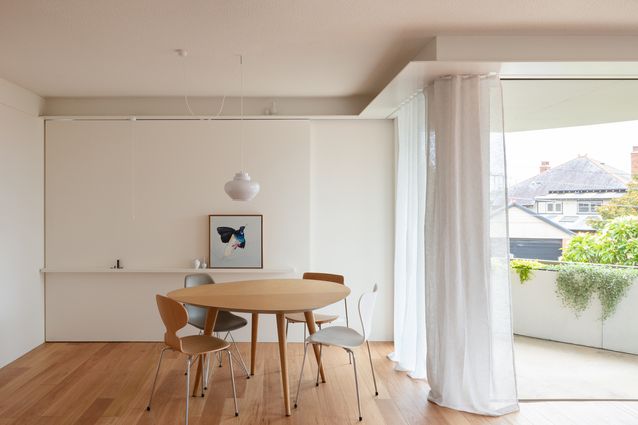
The next big move was to address the ceiling plane. As is often the case with apartment ceilings, this one felt like a low-hanging cloud. In order to create the same sense of modulation and drama that is found in the plan, Jeffrey has lowered the ceiling height in the kitchen and corridor so that the ceilings in the living room and vestibule open upward and define these spaces. The existing ceiling was finished in the much-maligned stipple paint effect. Rather than obliterate this with smooth plasterboard, Bokey Grant has kept this finish for the higher ceilings and accentuated it by applying it to the bulkhead that mediates the two ceiling heights – much to the shock of the painters! To emphasize the bulkhead, a thin horizontal blade defines the edge of the room and conceals the curtain track, doubling as a shelf. Elsewhere in the apartment, blades, benches and ledges operate as display places for Mary and Ben’s possessions.
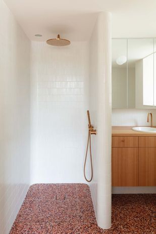
A curved shower recess features an outback-red terrazzo floor, adding a moment of drama.
Image:
Clinton Weaver
The bathroom takes its design cues, including a curved shower recess, from the entry vestibule. In order to keep costs to a minimum, service points were kept where they had been in the original apartment. As the apartment isn’t large, the material palette was kept restrained, with blackbutt timber used for floors and joinery. Moments of stronger expression are found in the outback-red terrazzo on the bathroom floor and the brown marble of the kitchen bench.
The MB apartment shows that you don’t have to go big to go bold. In the hands of a skilled design professional, modest space and budgets are no impediments to having a thoughtfully designed and experientially rich home.

