[ad_1]
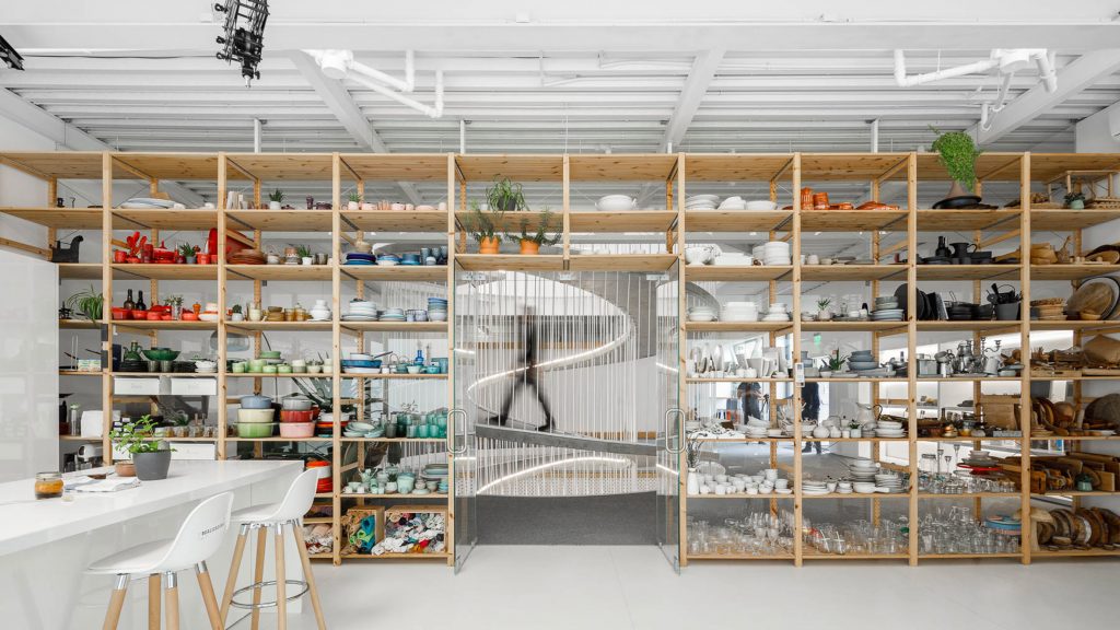
A spiralling concrete walkway and a storage wall filled with colourful ceramics are the standout features in this office for E-goi and Clavel’s Kitchen, designed by Paulo Merlini Architects.
The three-storey building is the headquarters for two companies: Clavel’s Kitchen, which creates digital content for brands in the food sector, and email marketing provider E-goi.
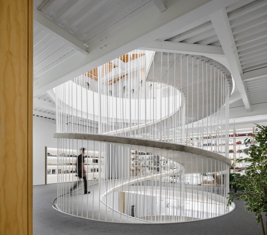
Paulo Merlini Architects designed the 2,800-square-metre workplace to be functional and flexible, but to also feel playful and creative.
“One of the most important issues in designing a company’s headquarters is to create a space that expresses and is in line with the corporate culture,” said the studio.
“Both E-goi and Clavel’s Kitchen present a rather informal type of management, although extremely professional, and asked us for a space that would express that – a fluid, equal, heterogeneous and unpretentious space.”
The building is made of two structures – one preexisting and one new – which join together.
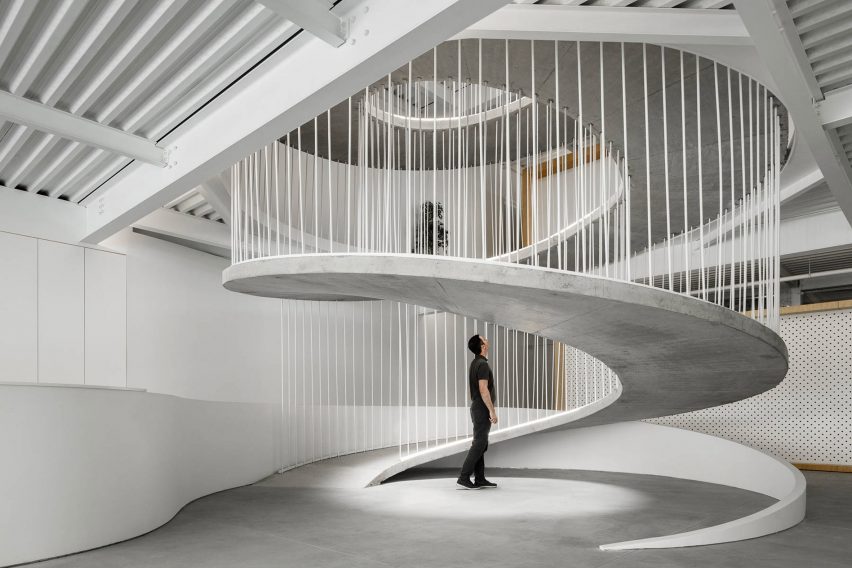
The concrete ramp forms the natural heart of the newly connected interior, providing access between floors while also functioning as a meeting place for staff.
Slender vertical bars create a balustrade, while adding to the sculptural appearance of the spiral.
There’s also a skylight above, which allows natural light to filter down through all three floors.
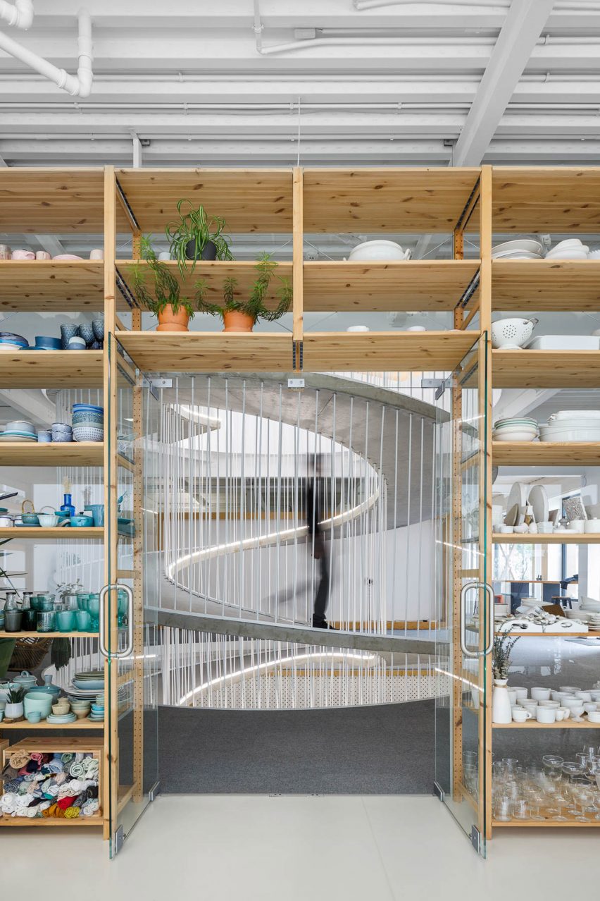
The colourful storage wall, located on the first floor, provides a striking backdrop to the spiral.
Built from wood and with a backdrop of clear glass, this huge shelving unit is filled with cooking equipment, crockery and tableware, used by Clavel’s Kitchen for photoshoots.
These elements are organised by colour, creating a rainbow effect.
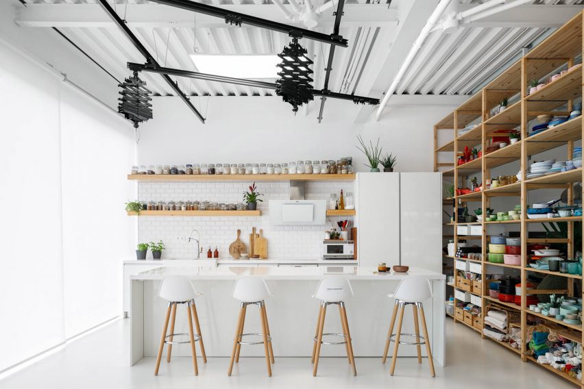
The photography studio is positioned directly in front of this wall, behind the glazed north-facing facade, so that it can benefit from natural light with minimal shadows.
Paulo Merlini Architects said this is “the best light for the type of function it offers since, reflected by the sky, it offers low-contrast lighting, remaining relatively constant during the day”.
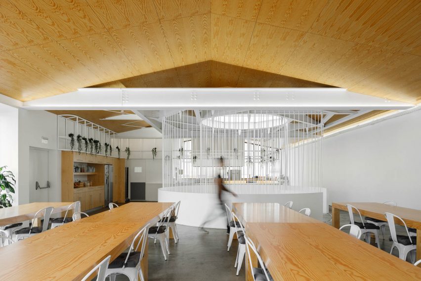
Other spaces in the office include a dining room with enough space for 100 people to eat together along with a mix of formal and informal meeting rooms and video-call booths.
These spaces are organised by a series of “wooden boxes”. Some of these are complete volumes that contain entire rooms or booths, while others are made up of partition walls or ceiling surfaces.
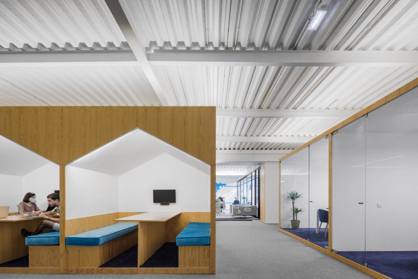
One box incorporates three house-shaped openings, with banquette seating and tables built in, while another features curtains and beanbags.
“It is the distribution of these boxes throughout the space that defines all the spatial dynamics,” said the studio.
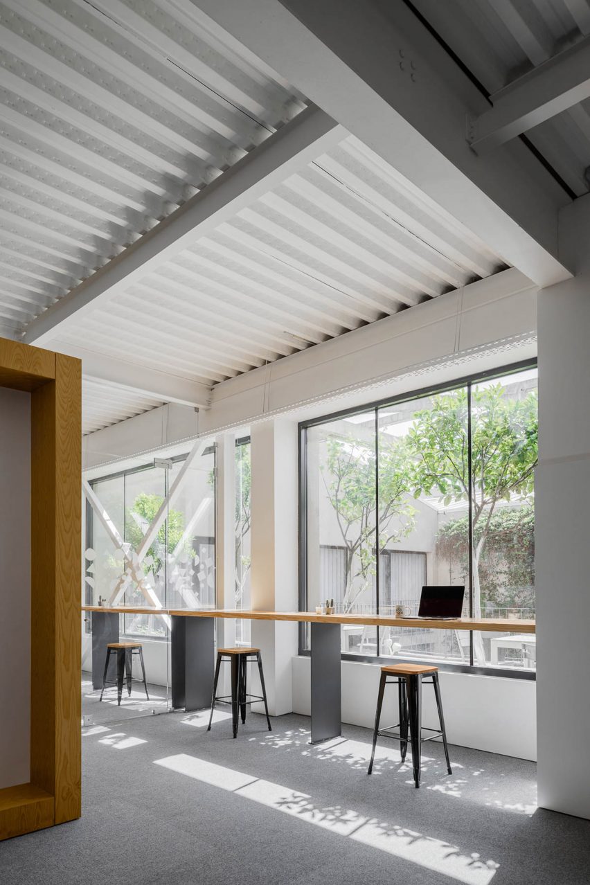
“By distributing these functions in a heterogenic way throughout the space, and by mismatching these elements in a kind of organised chaos, we guarantee spatial versatility and create a series of nooks and crannies that allow several kinds of appropriation,” it continued.
“We guarantee ample spaces where the interaction between co-workers takes place with great naturalness, and more discrete spaces where you can read a book, relax, or even have a more informal meeting.”
Photography is by Ivo Tavares.
Project credits
Architect: Paulo Merlini Architects
Project team: Paulo Merlini, André Santos
[ad_2]
Source link

