[ad_1]
Our master bathroom remodel is moving right along. They’re in there working as I type, and the subfloor is almost completely installed. That means it’s looking more like a real room, and very shortly, there will be no more dirt under the house visible when standing in the room. That’s always a good thing, right? ?
Since I’ll be building the vanity, I’ve been giving a lot of thought to exactly what we need and want, and exactly how I want it to look. Here are the various things I’ll have to keep in mind:
- Matt’s side will need to be built with accessibility in mind. This is incredibly challenging because…
- There’s no way I can live with a bathroom design in which the two sides are asymmetrical. They MUST be symmetrical for my sanity.
- Matt uses a wheelchair, but he’s tall (13 inches taller than I am). I’m obviously not in a wheelchair, but I’m short (exactly 5 feet). So we’ve determined that a finished height of 32 inches will work for both of us.
So those are the non-negotiables. What I’m not so sure about right now is whether I want that wall to have one long, continuous vanity area with a single countertop spanning from one end to the other, or whether I want it to look like two separate vanities with something different in the center (e.g., a section that’s a few inches lower with a separate countertop, or a built-in window seat).
That wall is 12.5 feet wide, so if I go the route of doing one long, continuous countertop, that’s just a lot of countertop. I don’t necessarily think that’s a bad thing. I’m just wondering if we really need all of that countertop space, or will it be a repeat of the long countertop in the kitchen where I don’t ever use it for anything (I’ve never once used that countertop when preparing a meal), so it becomes a catch-all for junk as I’m passing through the room.
Anyway, I tried to find some bathrooms with long, continuous countertops that might be in the 12.5-foot range so we could see what that might look like, and this was really the only one I found…
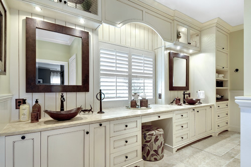
That is almost our exact setup, minus the floor-to-ceiling cabinets at the end. But ours has the two vanity areas on either end with a window in the middle. And I have no need or desire for a makeup area with a stool where I can sit down, so if we do the long, continuous countertop, the area in the middle would be all storage. I honestly can’t even imagine that we have that much stuff to store in a bathroom. But I could do some opens shelves where we could store our towels and such for easy accessibility like this…
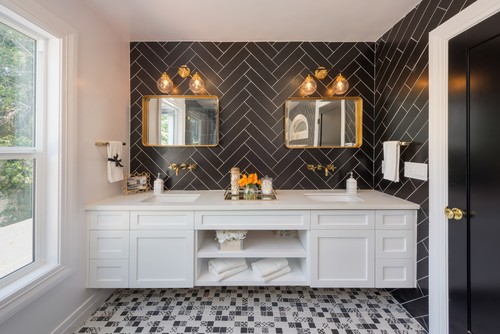
The other option is to do two separate vanity areas and have the middle section a different height or a different purpose altogether. I like this one where they just dropped that middle section down a few inches to break up what would have been a very long countertop.
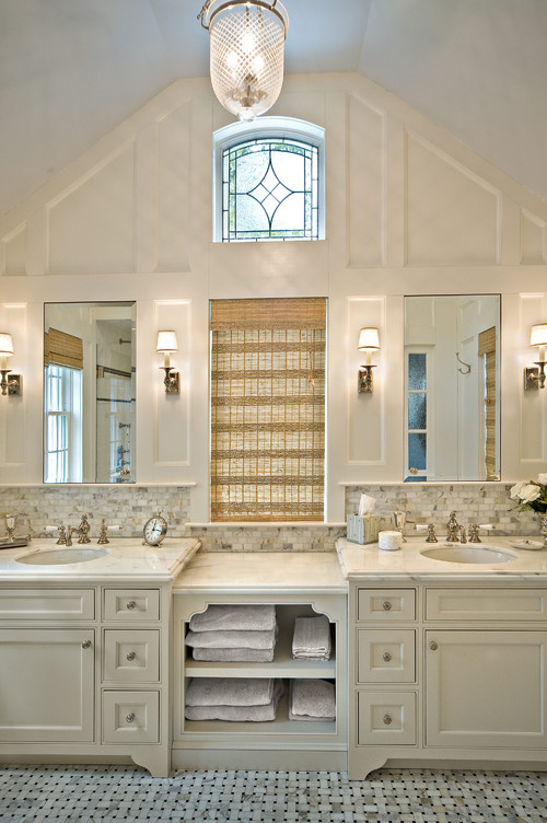
I don’t know how that would work in ours, though. I think to have that middle dropped down area look right, you’d need to start off with 36-inch-high vanities on either side, which is referred to as “comfort height.” But I can assure you there’s nothing comfortable about “comfort height” for a person who’s five feet tall. So with our vanities being 32 inches high, that center part would have to drop below 30 inches (i.e., standard table height) to make sense. It would have to be around 28 or 29 inches, and that seems really low.
Another option that doesn’t require a countertop at all would be a window seat. That would give us each a 50-inch vanity, and I could still put some storage (a shelf or a large drawer) under the seat. So that might look like this, only the window seat area would be wider in our bathroom. I think ours would be around 45 inches wide.
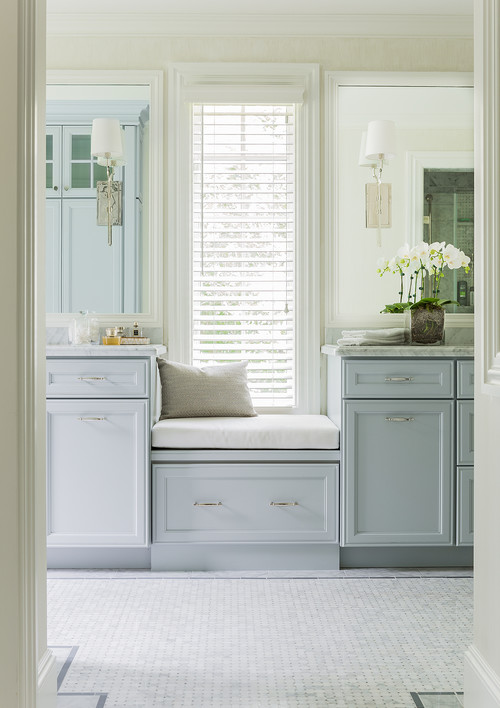
At this moment, I’m leaning towards a window seat. Y’all know that I love finding any chance to add fabric to a room, whether it’s draperies, pillows, upholstery, etc. I think fabric gives warmth to rooms that can otherwise look too hard and cold. So I really like the idea of using that space under the window to add some softness to the room. The only thing holding me back from jumping in with both feet on that idea is having fabric that close to a vanity area. I don’t know why I think that’s an issue, though. We’re adults, not three-year-olds, so I think I’m probably creating a problem in my mind that doesn’t really exist.
Now as far as the design and my need for perfect symmetry and Matt’s need for accessibility, I think I’ve decided to go with a design that has full overlay cabinet doors and drawers. Under each sink will be two cabinet doors. The cabinet doors under my sink will open to reveal actual storage. The cabinet doors under Matt’s sink will open to reveal a completely open area with leg space where he can roll right up to the sink in his wheelchair.
So in other words, imagine something like this, except there will be no toe kick (it will be more furniture style sitting on four furniture feet), and no faux drawer under the sink. Instead, the doors under the sink will go all the way up.
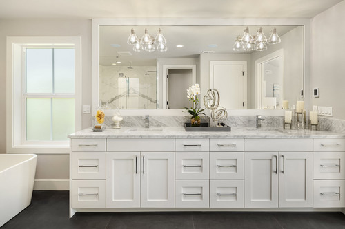
But when the doors under Matt’s sink are open, there will be nothing there except a completely open area, while mine will have actual storage.
If Matt were a little more independent, I don’t think this design would work, because in adding doors rather than just leaving that area completely open, I would be creating an unwanted obstacle for him in having to open the doors before he can pull his wheelchair under the sink area.
However, Matt is not very independent. There’s nothing that he would be doing in here that he won’t need my help with, whether it’s brushing his teeth, shaving, etc. He doesn’t have the dexterity in his hands to do any of that completely independently, so any time he’s in here doing any of those daily things, I’ll be right there with him helping him. So that means that I will always be there to open those doors for him. There would simply never be a time that he’d be in there getting ready for the day without me there to help him.
So I think that design will work in our particular case. Again, for a more independent wheelchair user, I don’t think it would work. For a more independent wheelchair user who can do all of those things independently with no help, having to navigate opening cabinet doors to get closer to the sink would be a hassle that would probably become a source of irritation. So it’s not a one-size-fits-all kind of solution for accessibility. But I think it is a solution that will work out just right for us to give Matt the accessibility he needs, while allowing me to soak in my tub and look at a perfectly symmetrical wall and maintain my sanity. ?
That’s the direction I’m heading with this right now. Of course, at this moment, the wall looks like this…
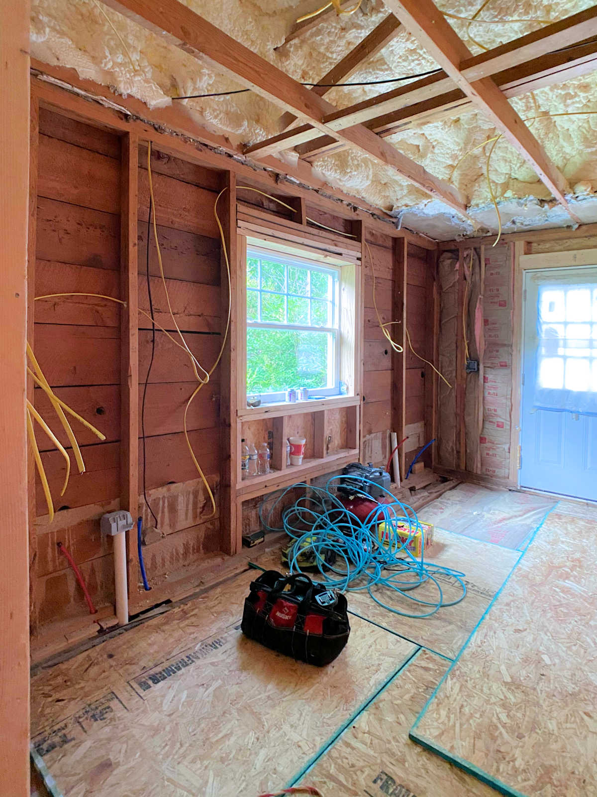
So I’ve still got plenty of time to consider these options and come up with a concrete plan. But at the moment, I like the idea of the cabinet doors under Matt’s sink to hide the empty space and keep things symmetrical, and I’m really leaning towards a window seat with either an open shelf or a big drawer underneath.
What would you do? Would you keep a long, continuous 12.5-foot countertop? Or would you create the look of two separate vanities with something like a window seat in the middle?

Addicted 2 Decorating is where I share my DIY and decorating journey as I remodel and decorate the 1948 fixer upper that my husband, Matt, and I bought in 2013. Matt has M.S. and is unable to do physical work, so I do the majority of the work on the house by myself. You can learn more about me here.
I hope you’ll join me on my DIY and decorating journey! If you want to follow my projects and progress, you can subscribe below and have each new post delivered to your email inbox. That way you’ll never miss a thing!
[ad_2]
Source link


