[ad_1]
After my original plan for the accent tile on the shower wall fell through, I gave it quite a bit of thought this weekend and came up with two new options. I’m right back to the idea of stripes (it’s just where my mind goes), and the two options are actually the exact same design, except that I’m trying to decide between horizontal or vertical. So let me show you what I’m considering.
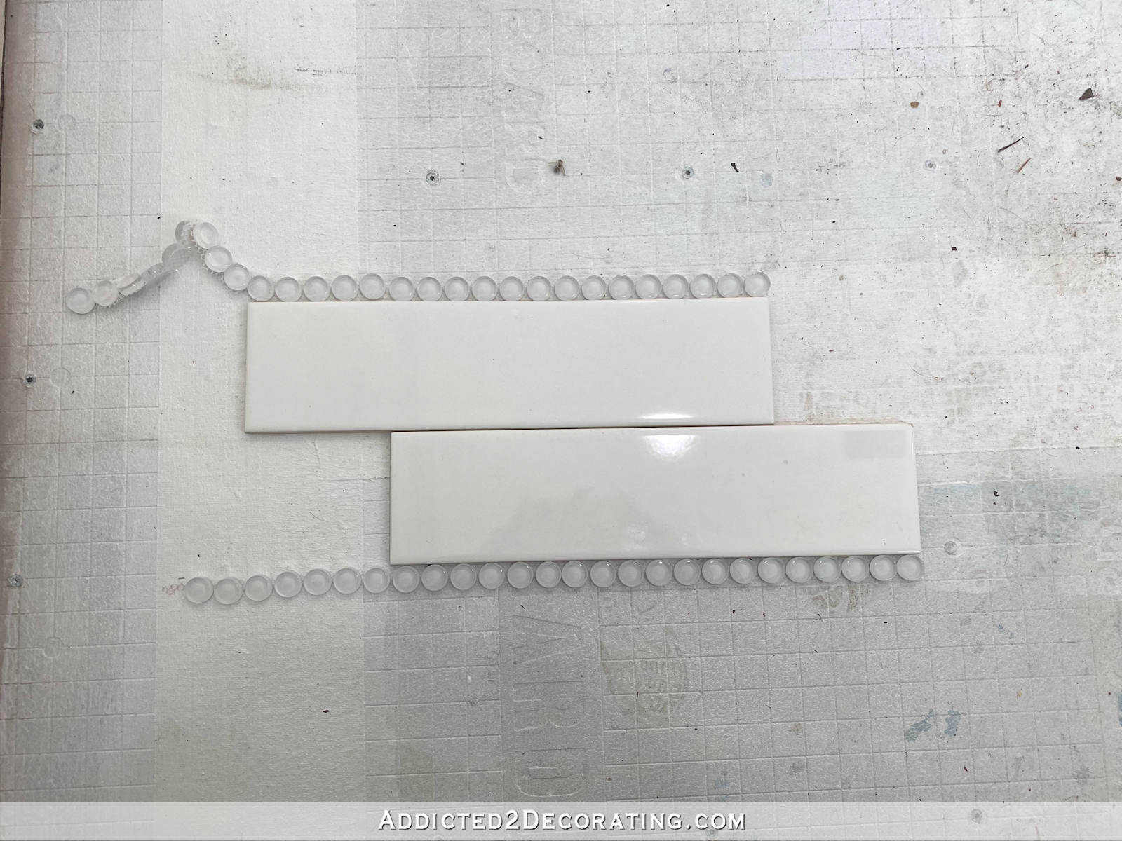
I’m going to use 4″ x 16″ white tiles along with the 1/2-inch glass penny tiles. And while I only have two of the white tiles on hand right now, my plan is to do three rows of uninterrupted tiles, and then a row of the penny tiles. But this is close enough for you to get the idea. Here’s how a horizontal design would look…

And here’s how a vertical design would look…
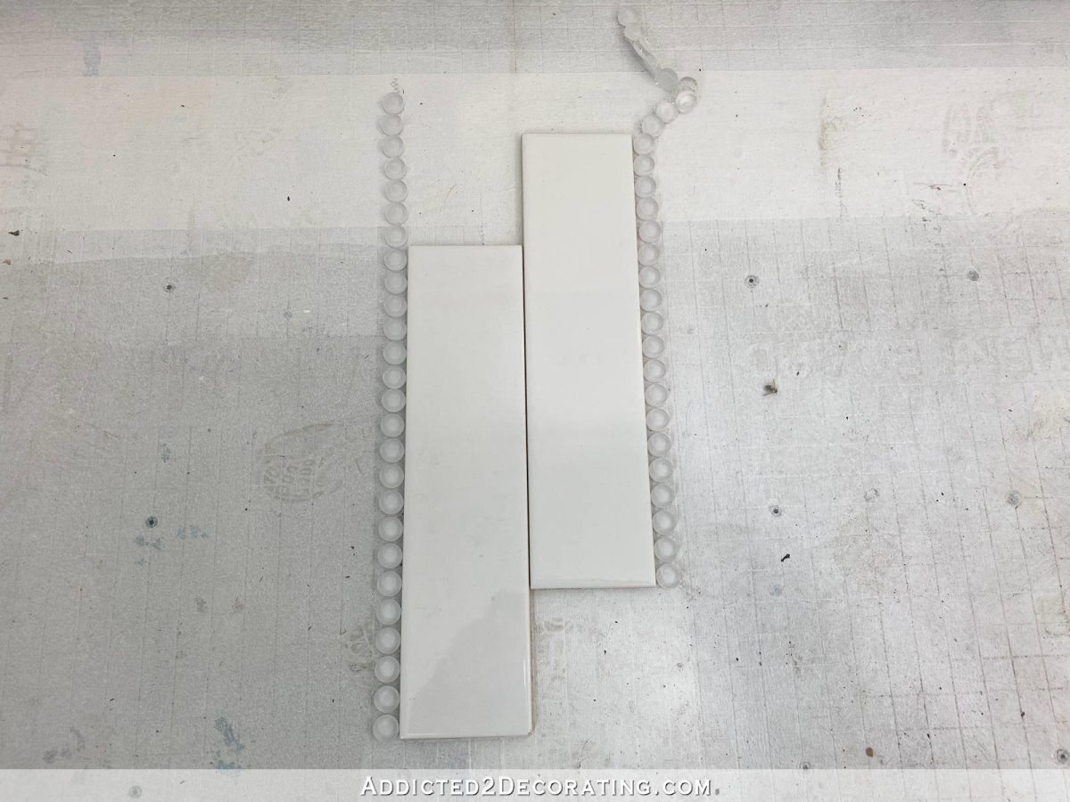
If I were to choose between vertical or horizontal just based on my own preference, and disregarding all other design plans for the bathroom, I’d go with horizontal. I almost always prefer horizontal stripes over vertical, and I almost always prefer subway tiles installed in horizontal rows (a more classic look) over vertical (a more modern look).
My issue is this area right here where the shower tile design will be separated from the bathroom walls by only a 1″ x 4″ piece of trim painted in the trim color (Behr Polar Bear) with the blue Venetian plaster walls and white wainscoting with a glass tile accent just right there on the other side of the 1″ x 4″ trim piece.

I tried to do a mock-up of the design using horizontal stripes in the shower. My concern with this design is having single row penny tile horizontal stripes in the shower on one side of the 1″ x 4″ trim, and then having a wainscoting design on the other side that includes a single stripe of five rows of penny tiles.

And there’s absolutely no way that I can line up one of the single horizontal penny tile rows in the shower with the penny tiles in the wainscoting. And I’m not really even sure if I would want or need to. I can’t do the wainscoting in the bathroom until after the vanities are built. And I simply can’t wait that long to finish the shower. I need the shower finished ASAP.
If I go with the vertical design, this is kind of what it will look like. (You’ll have to squint really hard and tilt your head a bit to see past my terrible mock-up and imagine what it would really look like.)
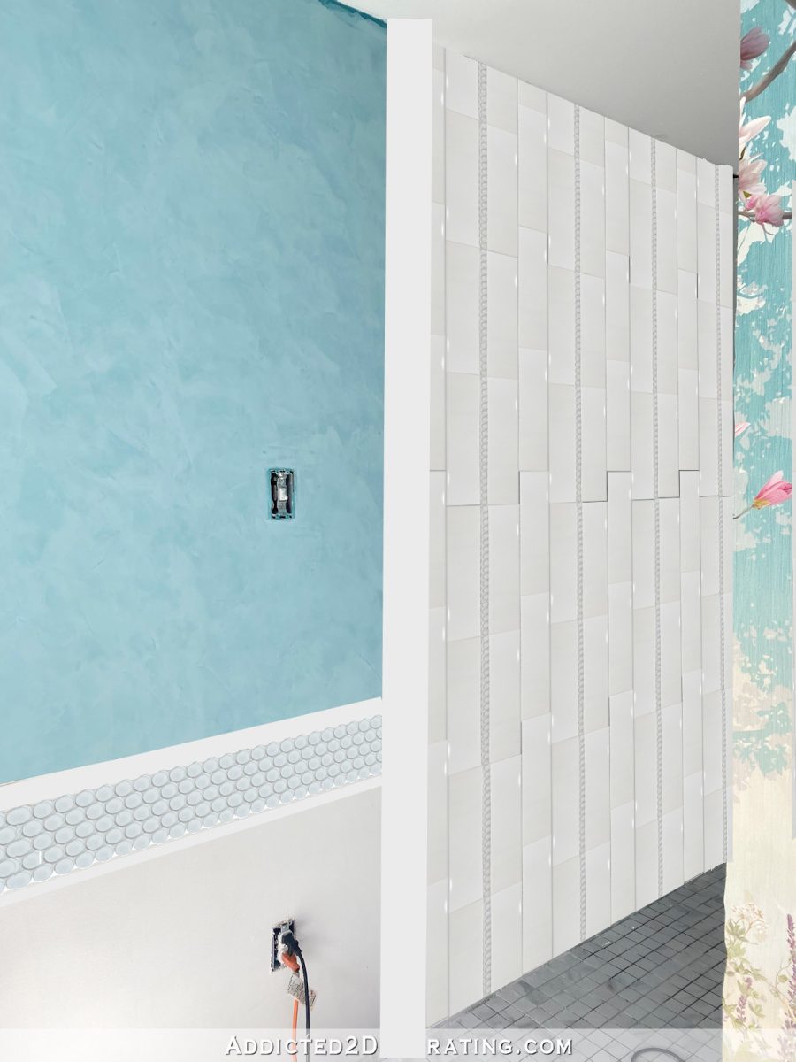
So I can’t make up my mind if that’s perfectly okay to have everything horizontal on both sides of the trim piece, where nothing is going to line up on either side of the trim. Or is that not going to be cohesive? And if that’s the case, then I’d just flip the shower wall tile design so that the stripes are vertical.
These are the kinds of details I make myself crazy over. ? I want it to look cohesive, and I don’t want visual clutter. I prefer horizontal stripes, but I just can’t decide if I’m okay with this one area where the shower wall will meet the bathroom wall. (And I’ll run into the same issue on the other side of the room where the toilet room wall meets the bathroom wall.) So maybe I should just stick with vertical stripes? I know I would love vertical stripes as well, but as far as my preference goes, horizontal edges out vertical just slightly. Any thoughts?

Addicted 2 Decorating is where I share my DIY and decorating journey as I remodel and decorate the 1948 fixer upper that my husband, Matt, and I bought in 2013. Matt has M.S. and is unable to do physical work, so I do the majority of the work on the house by myself. You can learn more about me here.
I hope you’ll join me on my DIY and decorating journey! If you want to follow my projects and progress, you can subscribe below and have each new post delivered to your email inbox. That way you’ll never miss a thing!
[ad_2]
Source link

