Architectural theorists Robert Venturi, Denise Scott-Brown and Steven Izenour famously posed that a work of architecture could either be a duck or a decorated shed. The decorated sheds were featureless buildings that had been layered with a superficial veneer of “meaning,” while the ducks were buildings that were symbolic in and of themselves. Writing during the 1970s, the authors were grappling with the phenomena of Las Vegas and its appropriated architectural icons. Since then there have been occasional ducks in the pond, but architecture has arguably been travelling down the path of decorated sheds for some time.
There is something about Seawind by Coy Yiontis Architects, however, that drags the dichotomy of the duck versus the decorated shed back up to the surface. This is certainly a building that is beautifully crafted and sensitively designed for its site, ticking all of the boxes of contemporary residential architecture, yet to know something of the clients and their influence on the design is to understand that the house is also deeply symbolic of them and their relationship, both to the house and to each other.
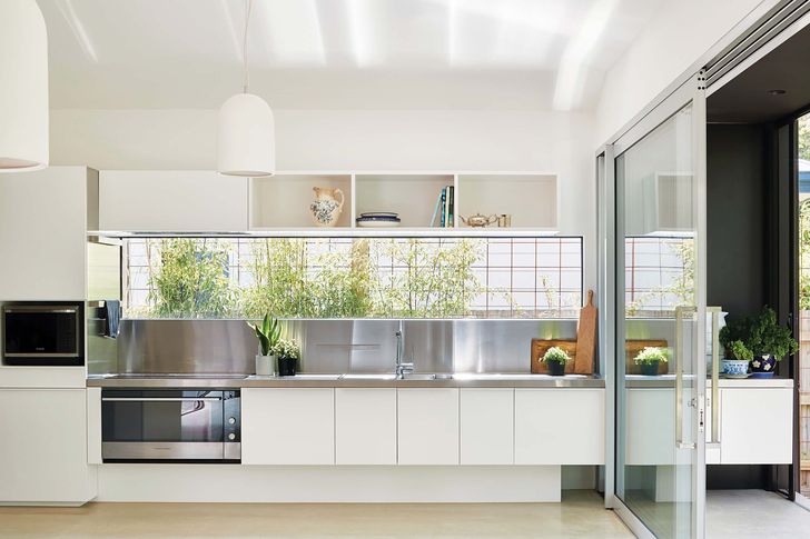
A framed view to garden plantings softens the clean lines of the kitchen, which is equipped with ample easy- to-access storage.
Image:
Shannon McGrath
Having secured a block of land in Victoria’s coastal hamlet of Balnarring, the clients came to Coy Yiontis after becoming smitten with another coastal home completed in 2016 by the practice, Humble House. Coy Yiontis director Rosa Coy notes that it took some gentle persuasion to guide the clients away from simply wanting “that house on my block” and to form an architectural response that was unique to them. The project, as it turns out, morphed into a singularly unique commission for an architect and the couple’s story soon enabled a bespoke approach to emerge.
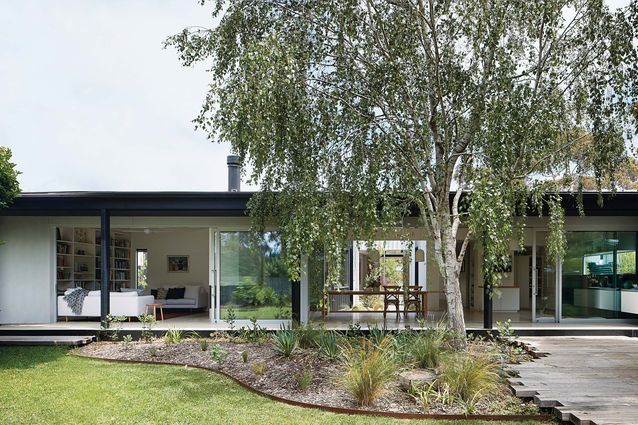
Both clients are in their 80s, have travelled extensively, have lived in major cities across the world and are both still working. On top of this, the couple had very firm views, shaped by a lifetime of living together, on how they wanted to live. The first requirement was that the house should in fact be two houses. The plan comes together at what the clients term “areas for mutual relaxation,” such as the kitchen and the lounge, but the house is effectively split into two almost self-sufficient dwellings. This allows the couple to be together and share their home but also to have their own, highly cherished private spaces that are tailored to their needs. Secondly, the house had to connect with the outdoors, and this is achieved by an internal garden space and a long, almost invisible wall of sliding doors to the rear garden.
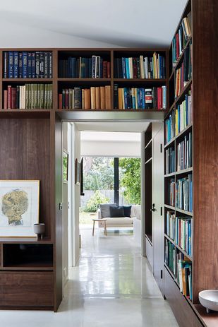
Each wing has a study from which the clients work on their own personal and professional pursuits. Artwork: Jock Clutterbuck.
Image:
Shannon McGrath
Knowing this about the brief, the separate volumes presented to the street can be understood as “his and hers” wings and not purely architectural form-making. “His” wing is the darker, more recessive volume of the two and is built around his ongoing work as an academic and a lover of books, creating a romantic sense of a library with dark timber panelling and beautifully framed views of the gardens. These are spaces into which he can burrow away and write all day. “Her” wing is its antithesis: light-filled and clad in a white sheath of metal, it takes the open airiness of her studio space and extends it throughout the rest of the volume with clean white walls and a white-toned buffed concrete floor.
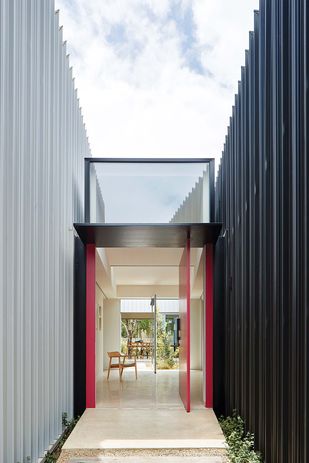
From the street, the entry into the dwelling is announced by a bright fuchsia front door (her favourite colour) that literally bridges the separate wings of the house. Greying timber boards detailed within the pitched roof forms effect a connection between the two wings through their material. However, on entering the house the separation is immediately evident, with the two volumes split by an internal courtyard garden and, beyond, a long view to the private rear garden. The effect is enhanced by the soft curves of the ceiling planes above, flooding the space with light and gently guiding visitors further into the house.
The home is split into two wings that are differentiated externally by colour and separated by a courtyard garden.
Image:
Shannon McGrath
Rosa notes that the practice strives to frame every view with purpose, avoiding mindless expanses of glass that create useless spaces. The corridor off the entry confirms this, with windows set low at floor level to provide connection to the garden spaces while also allowing for a thoughtful display of the clients’ incredible collection of artworks and cultural curios from their travels. Dead corridors are also avoided and here the corridor can be used as an extension of the art studio by simply opening up a large sliding door.
Throughout the house, the needs of the clients have been answered. Each has their own way of enjoying the ritual of bathing, with a step down bath set into the floor for her and a spot to perch in the shower for him, both clad in a stone tile they loved from a previous life. The kitchens are designed to avoid storage at impractical heights and there is nary a step in the house. In the clients’ own words, the house is “a perfect home for our third age” and is surely no decorated shed.

