When talking about the design of Mosman Minka, Cat Downie and Dan North describe their idea of curating a view, while simultaneously nurturing private spaces. The design of this house was spurred by the desire to live outside as much as possible and, consequently, the need for multiple ways to manage the elements, in particular the western sun. The pursuit of these ideas led them along a design path that was shaped not just by the immediate concerns of privacy, light and shade, but also by their own interests and experience.
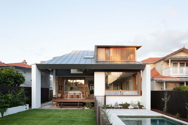
The original dwelling – a freestanding Federation bungalow in the Sydney suburb of Mosman – has been maintained toward the front to preserve the established relationship with the street. The front four rooms have been kept relatively intact, with minor interventions to bring them back to their best. However, as is often the case with houses of this type, the relationship between the rear of the house and its context was not ideal. Facing due west and with the site sloping away from the house, it was quite exposed to both the neighbours and the elements, and it was these problems that the new addition needed to address.
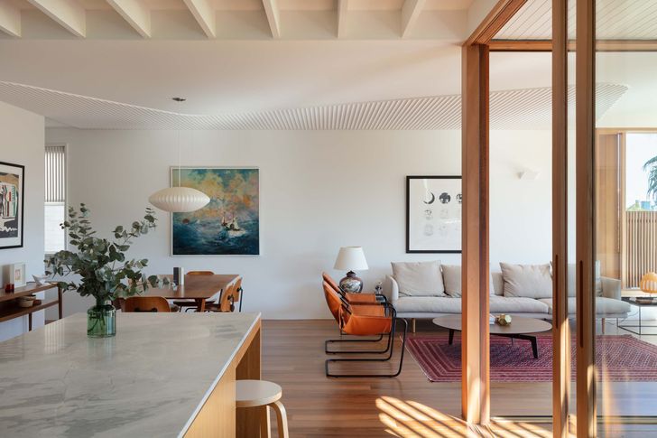
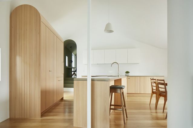
New living spaces offer a contemporary interpretation of the traditional, grid-like arrangement. Artworks (L–R): Le Corbusier Modulor lithograph, Rebecca Downie, Herzog and de Meuron and Ai Weiwei: Serpentine Gallery Pavilion 2012 print.
Image:
Clinton Weaver
Cat and Dan, co-directors of Downie North, originally investigated a courtyard house configuration for the new building component; however, the privacy issues and orientation meant that this arrangement didn’t quite suit the site. They began to investigate screens to manage privacy from neighbours and provide shade from the western sun. With a brief requiring three bedrooms and two bathrooms, the design evolved into an idea for a protective roof form that could envelop the private spaces upstairs and then slide down low to protect outdoor spaces on the ground floor.
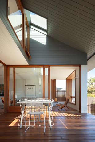
The analogy between this protective roof form and the “minka” – a vernacular Japanese housing type characterized by a large roof under which multi-level spaces are arranged – became a guide for how to organize space and control climate. Dan talks about their appreciation of “the intuitive order of the minka,” in which shared living spaces are arranged on the lower levels while loft spaces are nestled into the expressive, raking roof forms above. “You also often have deep, protective eaves, and we loved the feeling of a large roof coming down to the verandah – it directs the view to the landscape. We wanted to borrow some of this [in our own design].”
The proportions of the addition correspond with those of the original house to create a harmonious interior.
Image:
Clinton Weaver
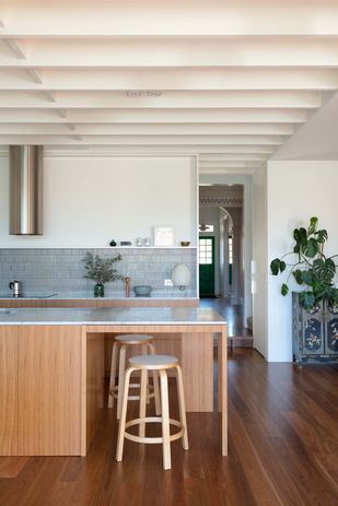
A new, zinc-clad roof is positioned behind the original bungalow roof form. Set low beneath the new roof and floating just above the ground, the new living spaces – kitchen, family and dining rooms and deck – are arranged in a quadrant formation that opens out toward the rear yard and pool. The stairs, laundry and bathroom sit between the new living areas and the original section of the house. The stairs switch up and into a hallway that acts as a bridge between the bedrooms and bathroom, terminating in a tall window that looks out simultaneously through the roof plane to the rear yard and also down into the double-height space above the deck.
Cat explains how the windows and roof openings are configured to enable rooms to borrow light and views from and through other rooms. She describes with delight how it is possible to stand in the backyard and look through the large western window, through the sliding doors of the deck and up to a picture window in one of the children’s bedrooms. It creates “incredible reflections,” she says, that bounce around the original house and through to the new spaces behind.
The protective eaves are inspired by the ‘minka,’ a Japanese housing type.
Image:
Clinton Weaver
These openings across the ground and first floors also allow the various breezes that blow from different directions throughout the year to be captured and filtered as required. Even on super-hot days, the smallest of breezes can be harnessed and focused through the house to cool the interior down to a manageable temperature.
Proportion has been carefully considered in the final configuration of the new addition. The architects took a great deal of care in studying the spatial arrangements of the original house to ensure that the addition had a real resonance with the retained sections of the original building. The proportions of the new spaces are based on those of the original house, with both arranged in a sort of offset quadrant arrangement – the offset spaces being utilized as bathroom and/or laundry spaces. This sets up a quiet harmony in the way the spaces work together to become a flexible, coherent family home.
Like the original minka houses of Japan, protected by their strong defining roof, this new home enables and celebrates a cohesive and vibrant family life, brought together by an elegant design device that has been perfectly adapted to its location and climate.

