Bursts of blue and green appear inside this centuries-old canal house in Amsterdam that has been renovated by local architecture studio i29.
i29 worked alongside a team of specialists for more than two years to revive the three-floor home, which had been severely neglected since its construction in 1675.
It now features a sequence of bright, white-painted living spaces with colourful interventions that the studio hopes will bring an “unexpected” quality to the interior.
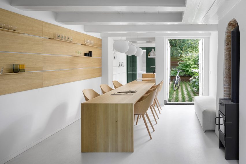
The ground floor of the house accommodates the kitchen, which has a long oak wood counter running down its centre.
One half of the counter serves as a dining table, while the other half has a stove, sink, and counter space where meals can be prepared.
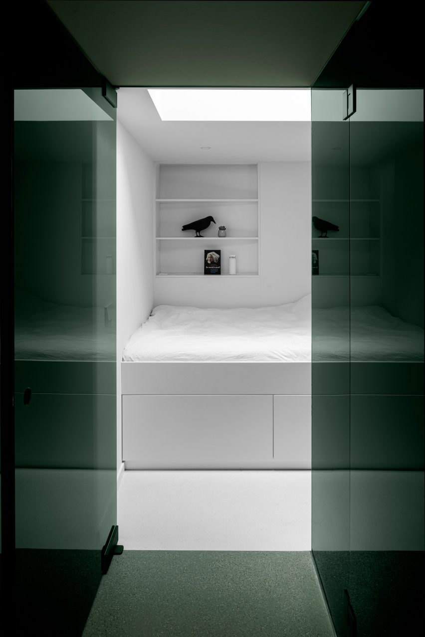
Just beyond the counter is a glossy, forest-green volume that conceals a guest bedroom, complete with its own en-suite bathroom and access door to the garden.
Towards the other end of the kitchen is an oak-lined stairwell stained dark grey. After the first few steps is a small landing that has been turned into a cosy seating nook.
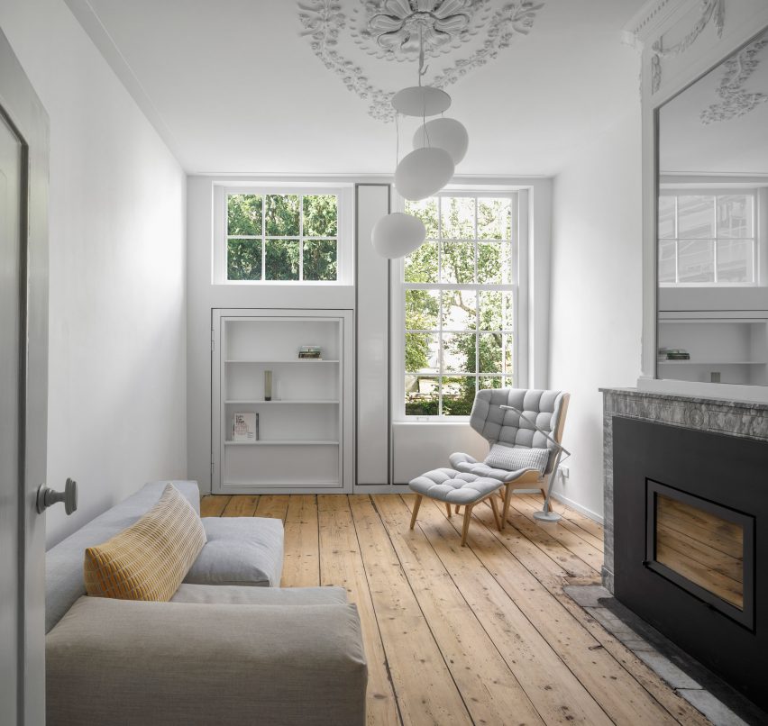
The steps eventually leads up to the first-floor living area, which has been minimally finished with a sofa, armchair and an amorphous white pendant lamp.
A wall here has also been lined with greige acoustic fabric.
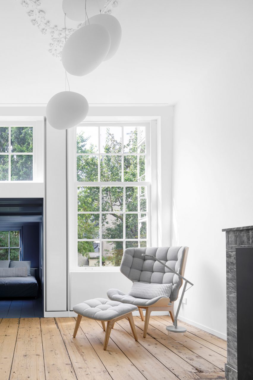
At the rear of the room is what appears to be a simple bookshelf, but it’s actually a secret door.
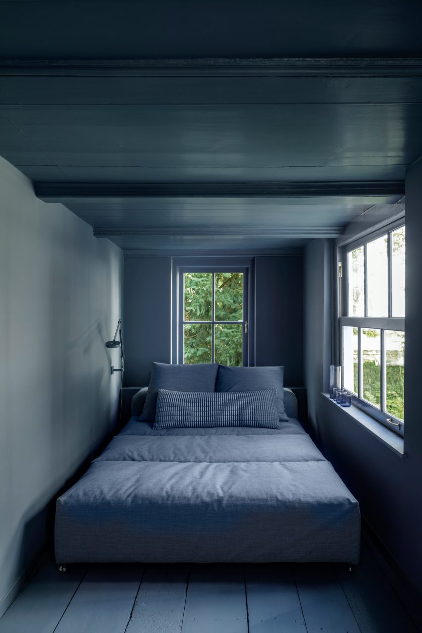
When pushed back, it reveals a serene, deep-blue snug where inhabitants can go to read and relax during the day.
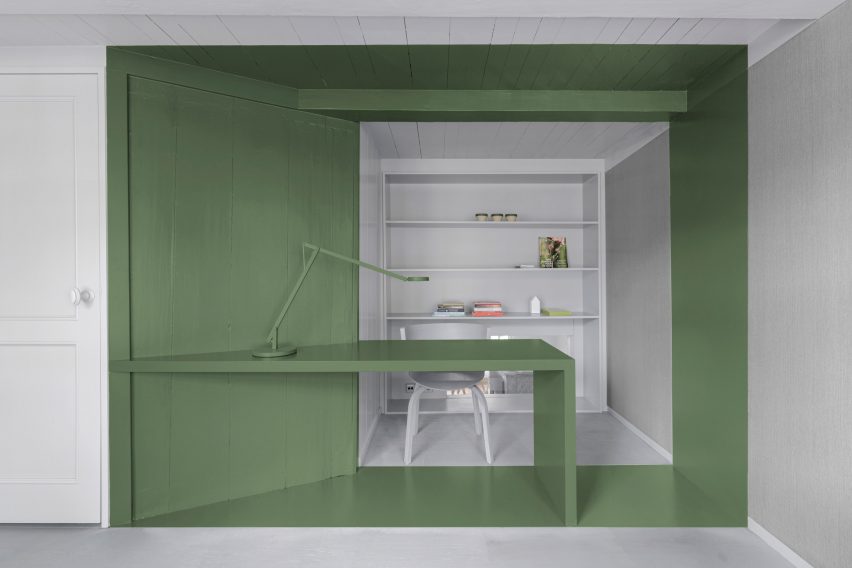
A study is also included on his level of the house.
While a majority of the space is grey, a segment of the ceiling, floor and walls has been painted sage green, as has the room’s desk and lamp.
The entirety of the third floor is dedicated to the sleeping quarters, which i29 has designed to “radiate comfort and luxury like a true hotel experience”.
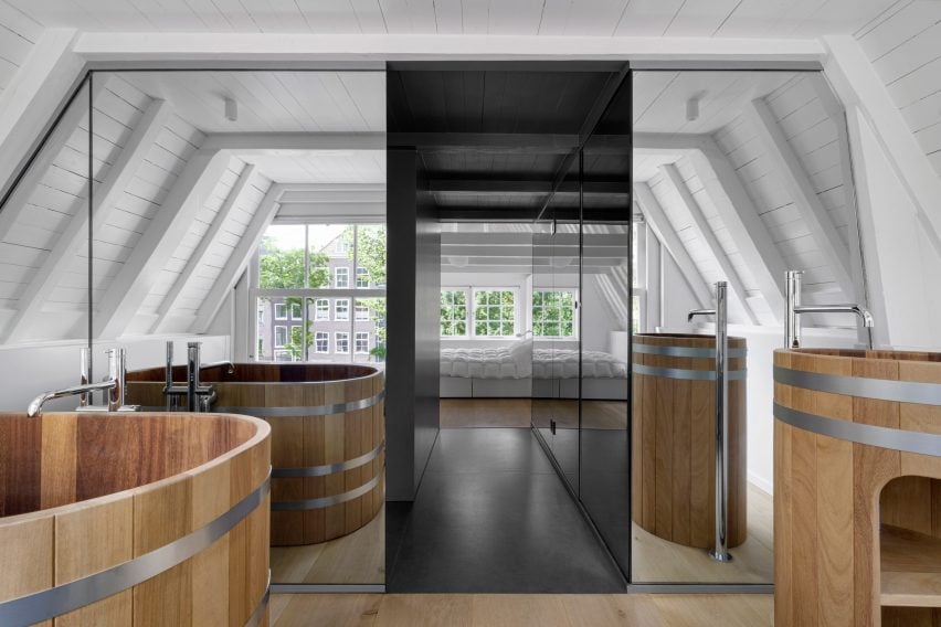
At the heart of the room is a shiny enclosure that contains the stairwell, and a shower cubicle with two-way mirror walls that allow views out to the canal that runs in front of the house.
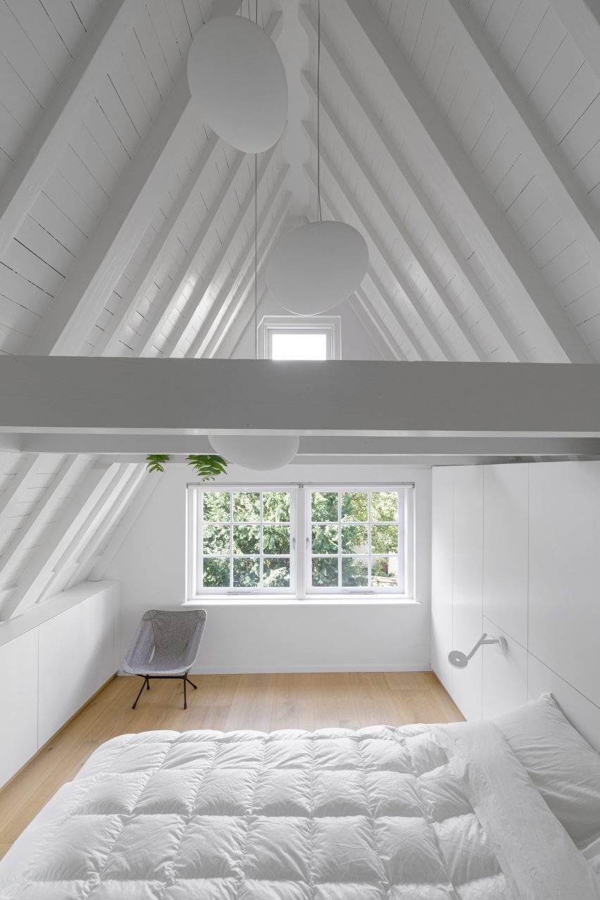
To one side of the enclosure lies the bedroom, set under the peak of the house’s original pitched roof.
On the other side is the bathroom, complete with a Japanese-style wooden tub and standalone sink.
i29 is no stranger to using bold hues; the studio recently designed a dentist in Amsterdam that features khaki-green communal areas and fresh white treatment rooms.
In 2020 the studio also revamped the Dutch capital’s esteemed Felix Meritis building, finishing its interiors with blue ombre walls, cherry red furnishings and sunshine-yellow seating booths.
Photography is by Ewout Huibers.
Project credits:
Restoration: Kodde
Contractor: G.K. Visbeen & Co
Interior builder: Schneider Interieurbouw


