I have spent so much time thinking about, and searching for inspiration for, the vanity designs in our new master bathroom. Up to this point, the only thing I was sure about was that I’m going to build the vanities. Well, I guess there were actually two things I’m sure about, because I also knew I wanted them to be walnut.
So without knowing for sure what the design was going to be, I went ahead and ordered two sheets of walnut veneer. They are so beautiful. I love the natural dark color of walnut, and these are some quality pieces of veneer.
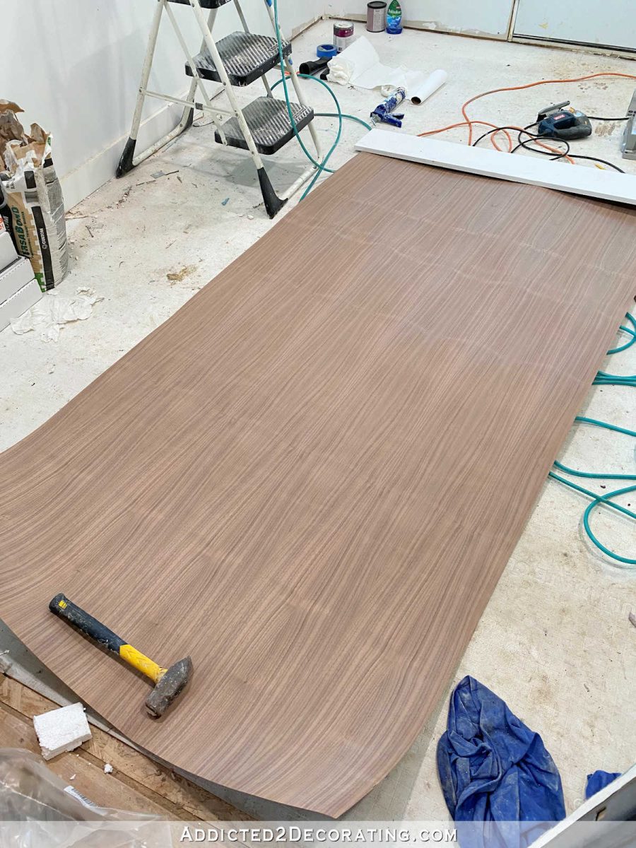
So ever since I received these beautiful pieces of veneer, I’ve been racking my brain trying to come up with a design.
It wouldn’t be nearly so difficult if it weren’t for two things. First, I have an absolute need for perfect symmetry. There’s no way that I can have two different vanities on this wall.
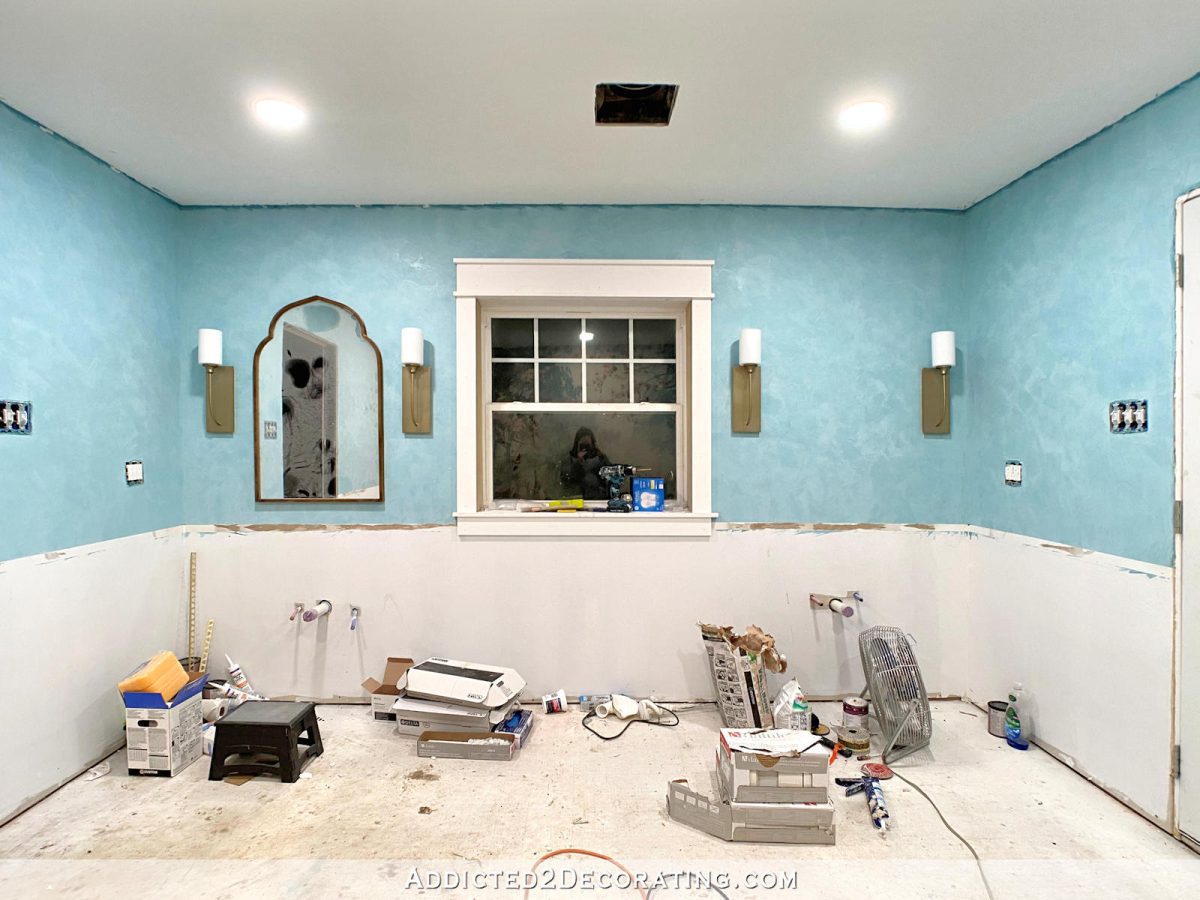
And second, Matt’s vanity needs to be wheelchair accessible.
This has been a very big challenge. Just when I think I have something figured out, I start putting my plan to paper and realize that the measurements aren’t going to work out.
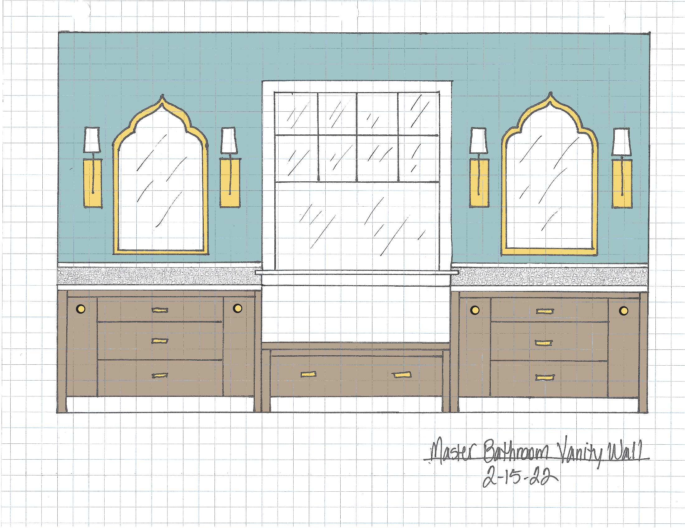
So yesterday, I sat down with graph paper and Sharpie in hand, and started drawing. Here’s what I came up with…

The basic design has skinny pull-outs on either side flanking drawers in the middle. On my vanity, the top drawer will have to fit around the sink, but I do want it to be a working drawer and not just a decorative drawer front. The second drawer will have to fit around plumbing, but that’s easy enough. Hopefully, the bottom drawer will be a full drawer.
On Matt’s vanity, to make it wheelchair accessible, the entire center section would only be false drawer fronts that open like a cabinet door. When that false front is open, he can roll up close to the sink. It’s similar to a design that I discussed a while back, but instead of two cabinet doors opening from the middle, this would open as one piece, and would open towards the wall with the window seat side of the vanity completely clear for me to get close and help him.
And then the middle window seat will have one large drawer. I think. ? I might divide that so that there’s a shallow drawer on top, and a deeper drawer on bottom.
As of this moment, I’m leaning towards the fronts being flat slab fronts with no decorative elements. I’m inspired by simple slab front vanities like this one from Semihandmade.
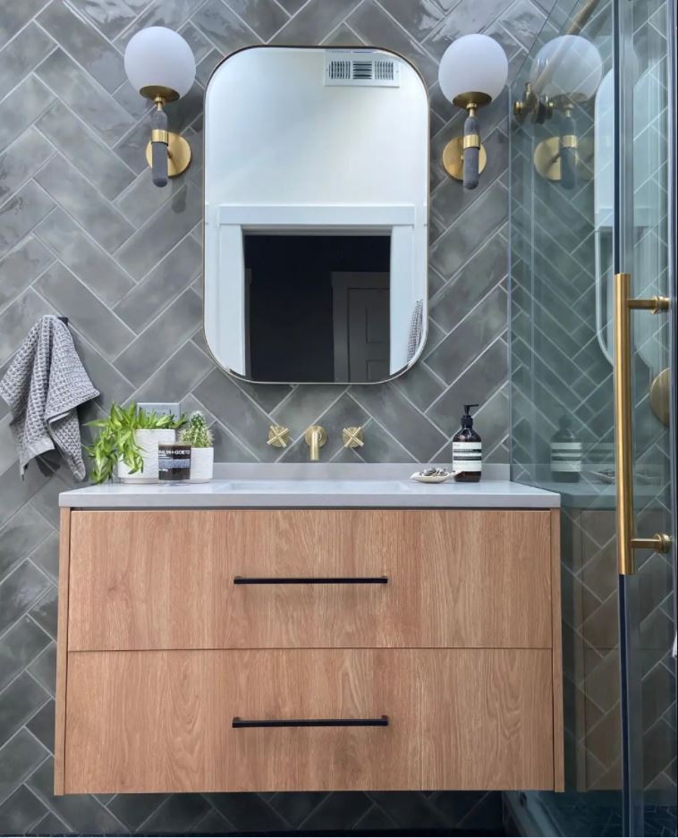
But as you can see from my drawing, our won’t be floating vanities.
While that’s the direction I’m leaning, I also love the idea of something like this. Does this remind you of anything? ?
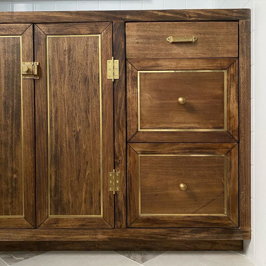
If I were to do that design, I would use Schluter strips as the brass accents. I think it would be gorgeous in our bathroom, too.
So at this very moment, I’m leaning towards flat slab fronts. But I could very easily be convinced that those are too modern, and that I need to add a little something to glam them up just a bit. ?

Addicted 2 Decorating is where I share my DIY and decorating journey as I remodel and decorate the 1948 fixer upper that my husband, Matt, and I bought in 2013. Matt has M.S. and is unable to do physical work, so I do the majority of the work on the house by myself. You can learn more about me here.
I hope you’ll join me on my DIY and decorating journey! If you want to follow my projects and progress, you can subscribe below and have each new post delivered to your email inbox. That way you’ll never miss a thing!

