[ad_1]
This week, we’re helping a family “flip” their family room to improve the space’s function and feel.
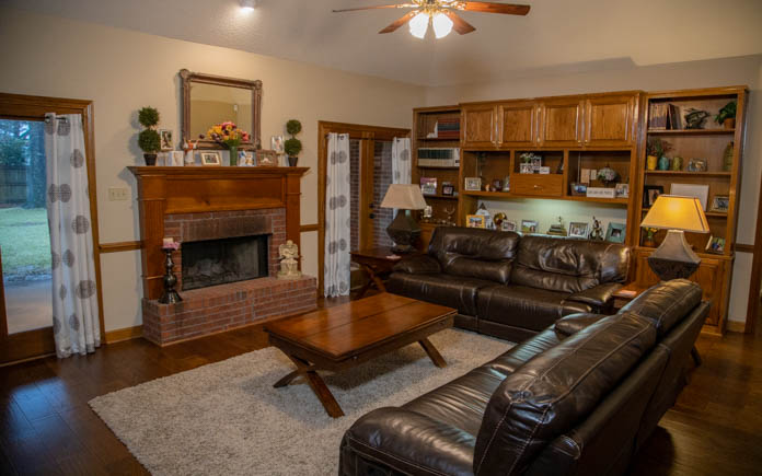
Roberto and Faith have lived in their home for 16 years. It was built in 1993 and came with a custom bookshelf-desk combo that the couple hasn’t used much.
Further, the outdated stain and shiny finish leave the room feeling dated.
And with no other space for their TV besides the wall on the other side of the room, the couch is butted up against the desk, making the room feel small.
But we’ve got some solutions!
The Projects
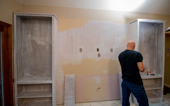
Deconstruct the Desk and Cabinets
First, we deconstruct the built-in desk and cabinets we’re removing. But we’re throwing nothing away. These cabinets can be repurposed for storage in the garage.
We save every bit of trim from the desk to use along the floor edge of the bookshelves. Because many of those pieces are made by the manufacturer, we can’t easily replace them.
After removing the cabinets, we found a pop of pink on the wall behind. Roberto and Faith had leftover paint from when they painted the family room years ago, but the color changed and doesn’t quite match what’s on the walls.
Drastic temperature changes can cause paint to change color, so it’s important to store it in a temperature-controlled space to prevent this.
To get the right shade, we do a color match. Simply take a boxcutter and carve out a square of paint from an inconspicuous spot on the wall. We chose to take a sample from next to the electrical outlet that will be behind the TV dresser.
Replace Flooring
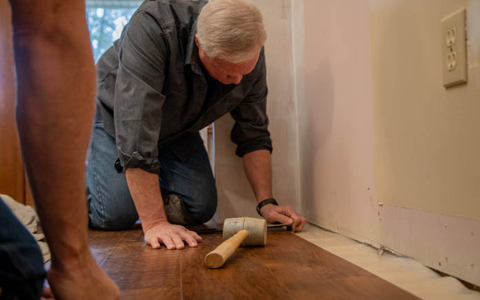
While removing the desk, we find that it’s tightly glued to the floor, so we use a pry bar to get it loose. In doing so, some of the flooring underneath it between the bookshelves gets damaged.
Fortunately, Faith and Roberto just replaced their wood laminate flooring two years ago, so they still had the manufacturer’s information.
Whenever you replace your flooring, always keep that information and purchase some extra flooring in case you need to make repairs in the future. That flooring could be discontinued, and then you’ll be stuck trying to match the flooring if you need to replace a section in the future.
One thing you don’t want on the floor is a “clickity-clack” noise. When you walk across a floating laminate floor, it will make all kinds of noise without an underlay pad.
Once we lay the pad, we stagger the flooring to match the rest of the room.
Freshen Up the Mantel and Fireplace
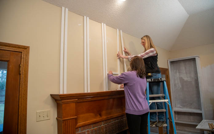
The low placement of the fireplace mantel against the tall ceiling makes the room feel short. To change that, we add batten boards above the mantel.
We’re building a faux board and double batten wall treatment above the mantel. To nail the look, we match the angle of the 1-by-2 boards to the angle of the ceiling using a bevel gauge. Then we cut the boards with a miter saw.
Since there’s no guarantee there are studs behind each batten, we caulk each board with construction adhesive after we nail them.
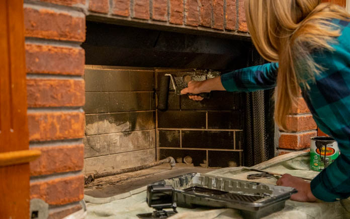
Next, we focus on the fireplace. The first step is cleaning the fireplace. We use a solution of trisodium phosphate on the bricks, which will remove the soot stains. Once the fireplace is clean, we paint the inside of the firebox with high-heat black paint.
After that, we whitewash the fireplace. We use 50 percent water and 50 percent flat-white paint. First, we wet the bricks with water so our whitewash paint can soak in evenly. The key to whitewashing is to be “consistently inconsistent” with your brush strokes.
Repurpose the Bookshelves
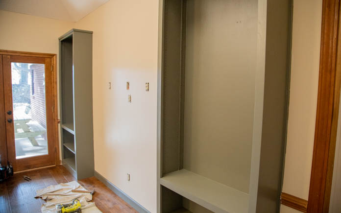
Before we can repurpose the bookshelves, we have to clear them. Next, we sand, prime, and paint the bookshelves to match the TV dresser.
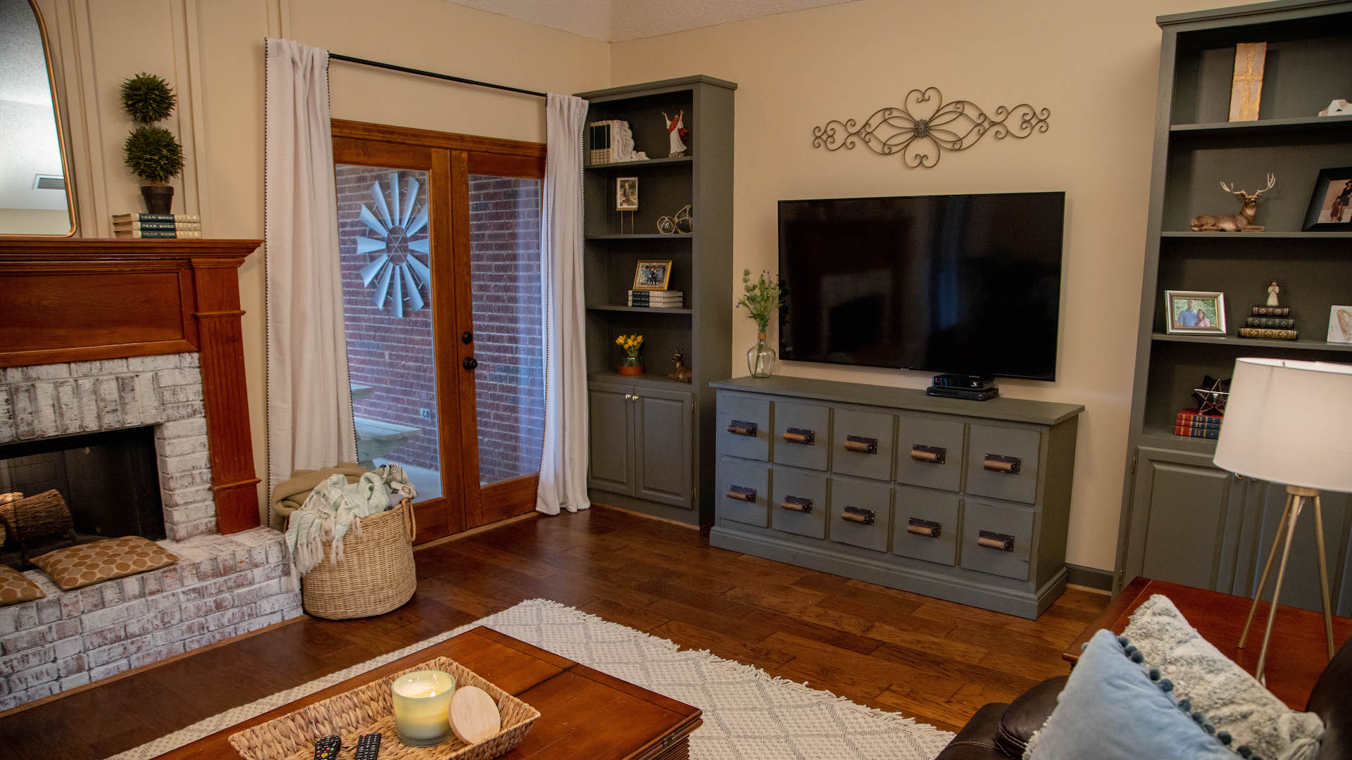
Next, we move the TV dresser from the other side of the room to the space between the bookshelves. This will create a nice entertainment center along the wall and allow the furniture to flow nicely in the family room.
We also:
- Painted the chair rail to match the walls
- Removed the chair rail next to the fireplace
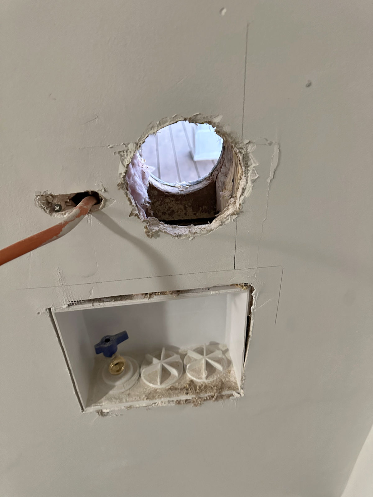
- Relocated TV hookups
- Mounted the TV with an articulating wall mount

Post-Production Thoughts
Roberto and Faith have a beautiful home and they take care of it remarkably. But the family room was giving away the age of the house.
For starters, the room’s layout was inefficient. The massive wall of dark-wood built-ins with a high-gloss finish had the 1990s written all over it.
For a large room, the space somehow felt small. And the fireplace, which should have been a focal point, also seemed small and out of proportion to the room.
But now, that same fireplace grabs your attention from the front door onward, thanks to the whitewashed bricks and the new board and batten wall treatment.
Removing the built-in desk has brightened up the room and allowed us to relocate the TV, which, in turn, allowed us to open up the room with a better layout.
Plus, changing the color palette of the bookshelves has helped bring the room out of the ’90s and into the 21st century.
And we did it all for less than $600 in materials.
Other Tips From This Episode
Products Featured in This Episode
This page contains affiliate links. If you purchase a product from these links, we will earn a small commission at no additional cost to you.
Further Reading
[ad_2]
Source link

