[ad_1]
If you showed up here today hoping to see a finished portion of the bathroom walls, I need to apologize, because I have nothing but disappointment for you today. Yes, I had planned to show you a completely finished section of the bathroom wall. I knew that if I picked up where I left off on Thursday, and continued working on Friday and Saturday, I’d have at least one portion of the wall completely finished.
But the more I looked at the section of the wall that I thought was nearing completion, the more I realized it needed some pretty significant adjustments. This wainscoting just seemed off to me. It looked completely unbalanced.
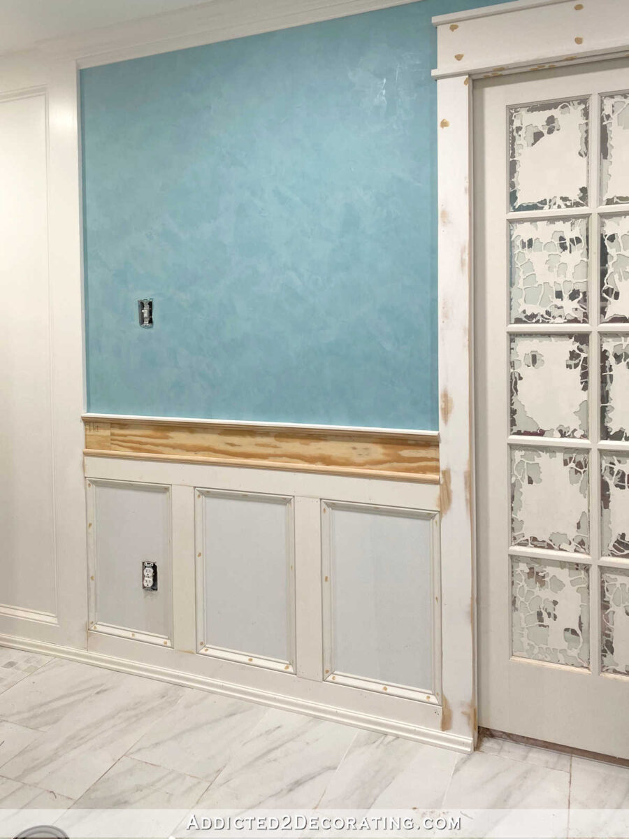
The problem is that it seemed to be too open-ended. That’s how I would describe how it looks to my eye, at least. I’m not sure if it makes sense to anyone else, though.
The fact is that on Thursday when I finished working on the wall, I knew it was off. But I thought I could push through, make a minor adjustment, and keep on rolling.
Here’s what it originally looked like on Thursday evening. Look closely at the trim that I used along the floor.

I installed that bottom trim just like I usually install shoe molding or quarter round at the floor. I stopped it where the baseboard stops. But can you see how unbalanced that panel looks?
I thought I could balance it out by removing that bottom trim and reinstalling it so that it covered the bottom of the door casing as well. It seemed weird because I’ve never installed shoe molding or quarter round on the bottom of my door casings. I always only install those trims along the baseboards. But I thought this would be a faster and easier way to bring some balance to the design.
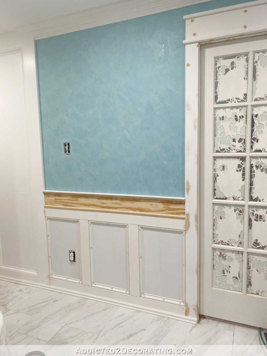
That looked a little bit better, but still not great.
I knew what needed to be done, but truth be told, I was just trying to avoid the work. I wanted to come up with a quick and easy solution that would allow me to avoid having to undo half of what I had already done.
So I decided to do a mock up using my photo editing software to see if the change was really, 100% necessary. I opened up that picture above in my photo editing software, and then I straightened out all of the horizontal and vertical lines so that I could easily make some adjustments. So here was the original design…

And here was my quick mock up of the change that I knew would bring balance to this wall.

Yep. I knew I had to do it. So I removed all of the mitered base cap trim, and all of the 1″ x 4″ boards, and started over on that part. I didn’t get the base cap trim reinstalled, but already, it looks so much better.
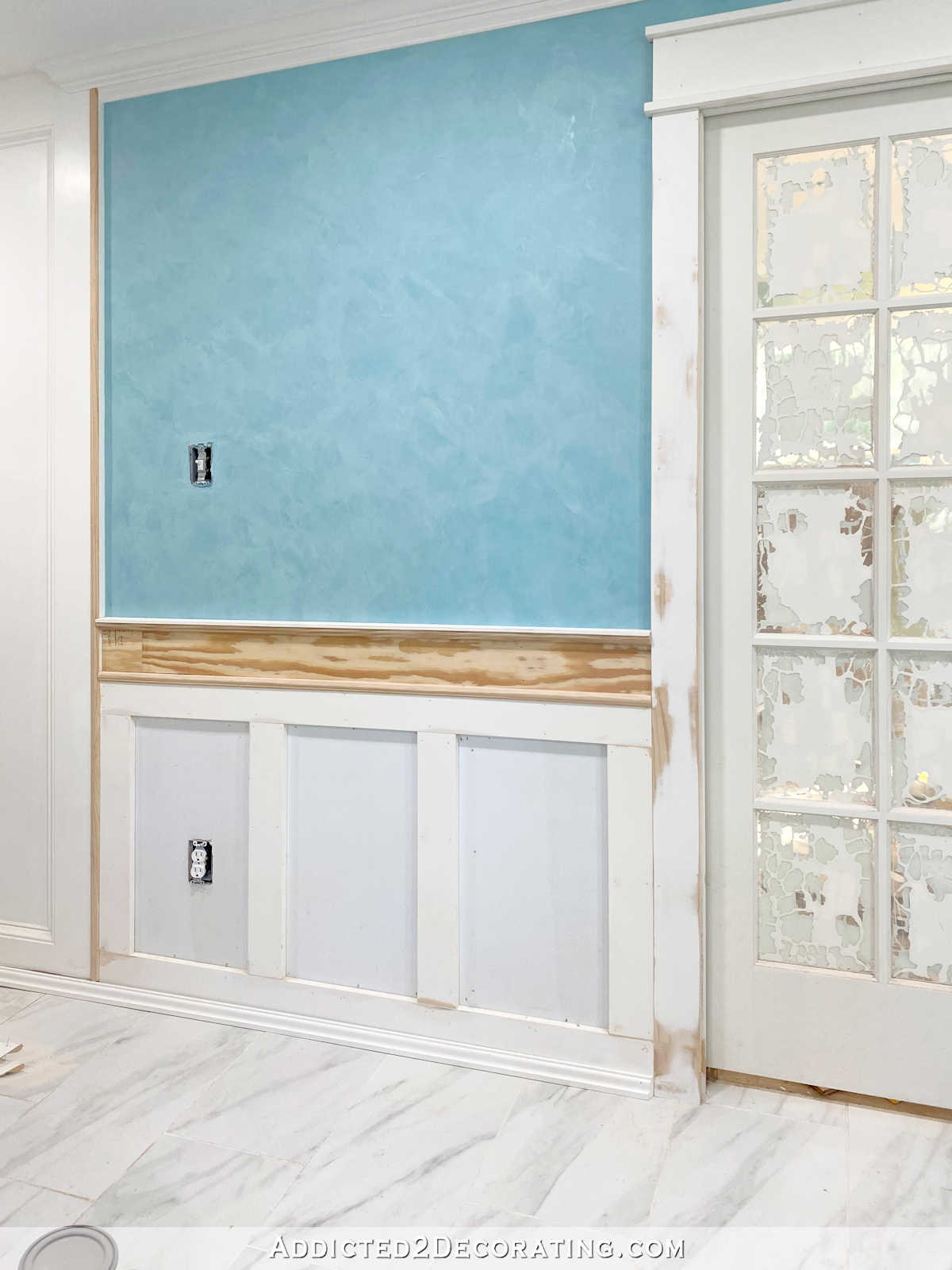
And the redo couldn’t stop with that section of wall. I had already made some progress on the wall on the other side of the door as well — the area around the vanity. And I had originally done it in that same off-balance way.
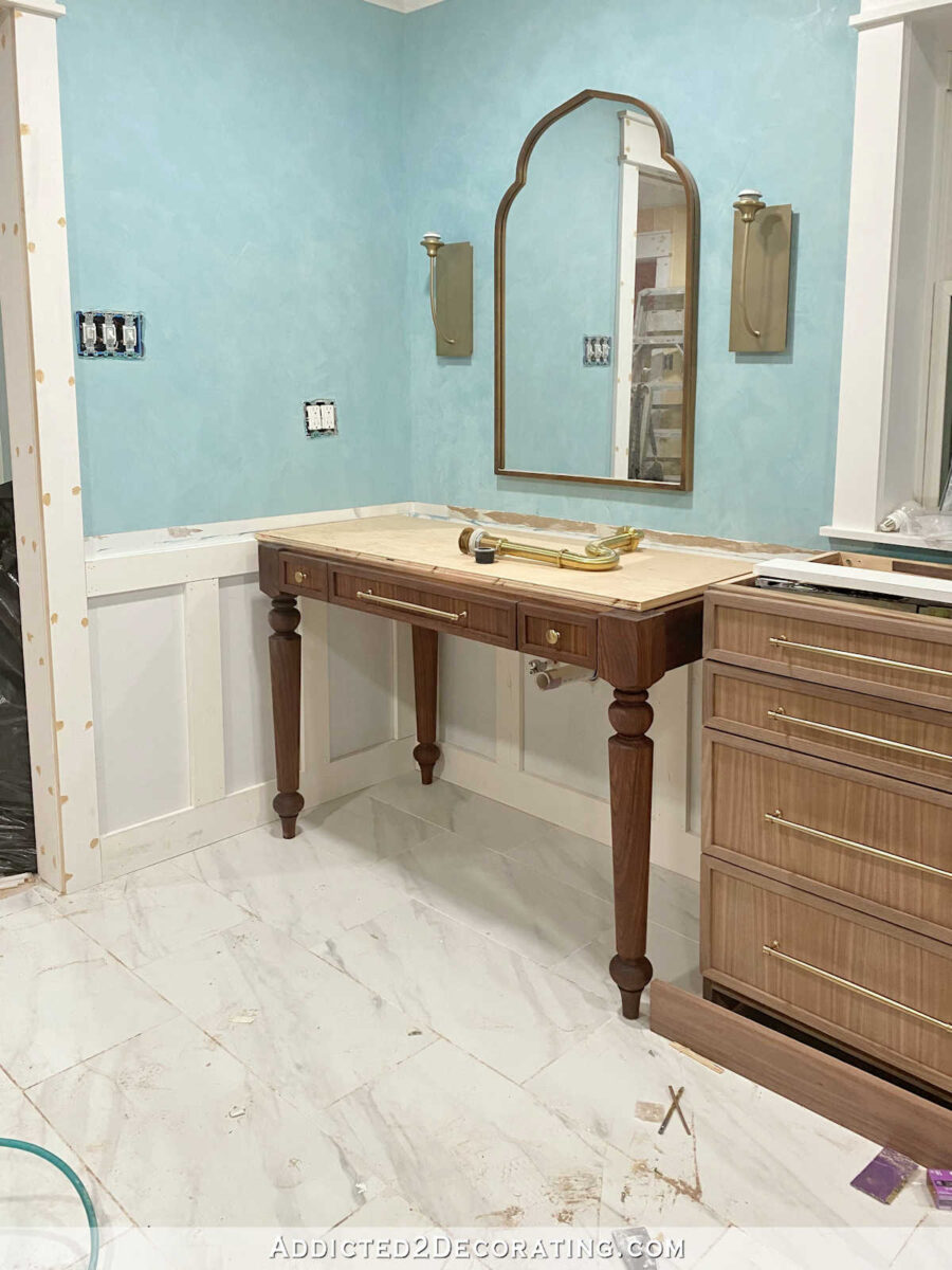
So it had to be redone as well. On this section, I did get all of the base cap molding installed and all of the nail holes wood filled. So this section is ready for sanding and caulking.
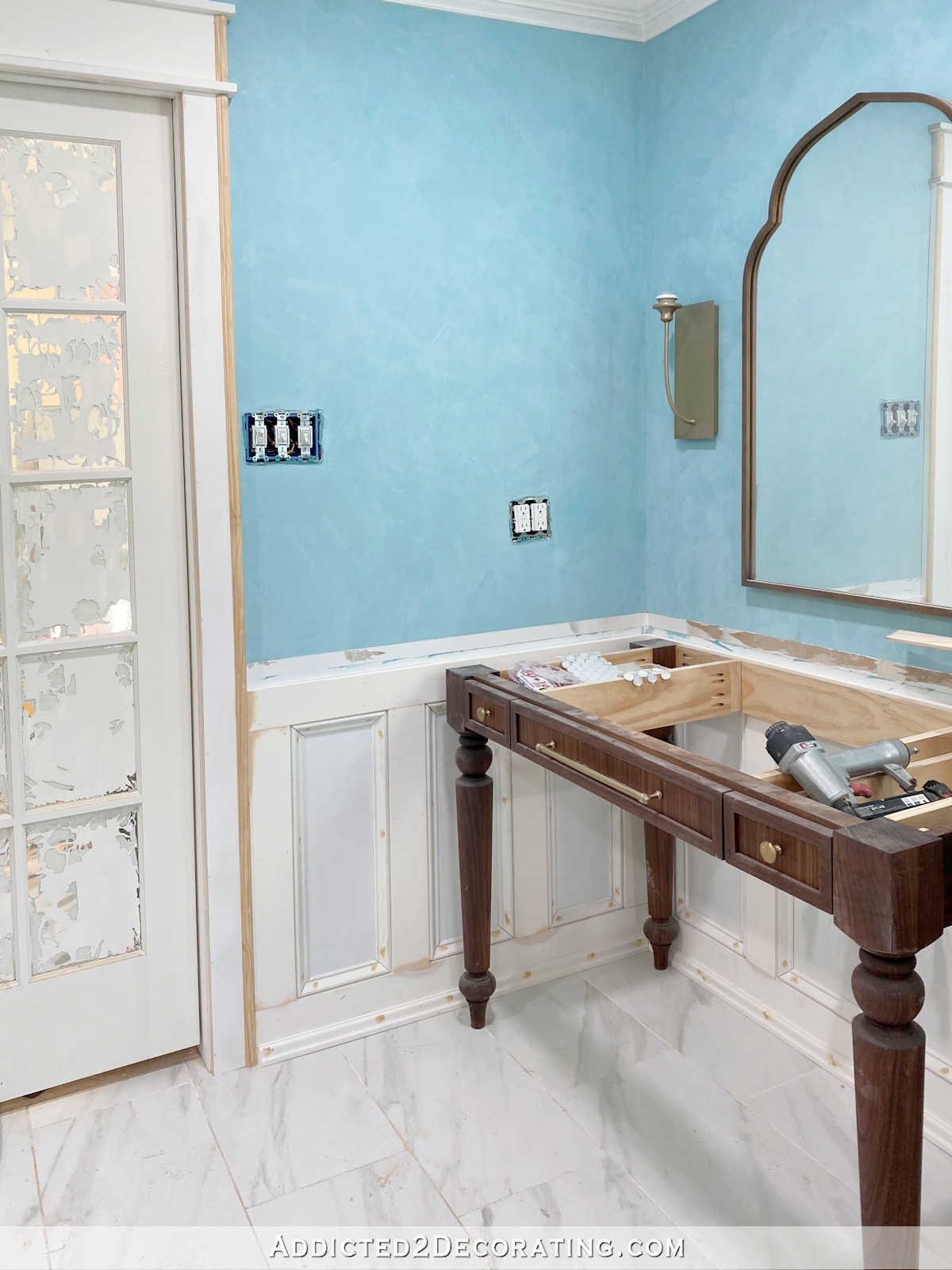
That change caused one issue that I ran into in the hallway bathroom where I did this same wainscoting. Since I used 1″ lumber on both the door casings and the wainscoting, that left me with two 1″ x 4″ pieces butted right up against each other. I really don’t like that look at all. You can see what I mean here on the left side of the door…
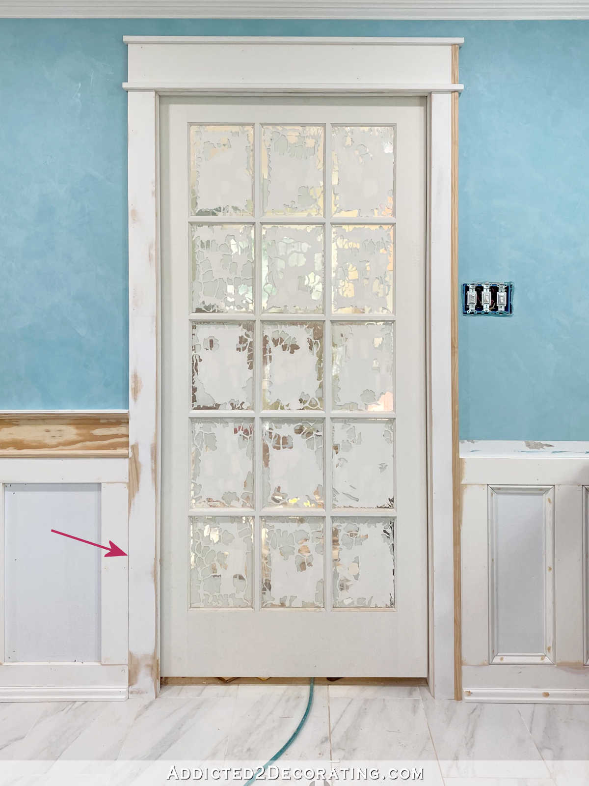
So I decided to try something a little different in here and add a small vertical piece of trim extending the whole height of the door casing just to distinguish this 1″ x 4″ piece that frames the door from the 1″ x 4″ piece that makes up the wainscoting…

I like it! It dressed up the door casing just a bit, and gives a very definite distinction between the door casing and the wainscoting. Once it’s all painted white, it’ll be a lot more subtle (obviously), but it’s just enough detail to separate the door casing from the wainscoting.
So now that that’s all worked out, I can continue with my forward momentum. It put me behind schedule (the countertop people were supposed to come this morning and measure, so that has had to be rescheduled for Thursday), but it was definitely worth it. That unbalanced wall design would have caused me to lose sleep, and in fact, it already did. That’s when I know a project has to be redone. When it starts affecting my sleep at night, something has to be done.
Here’s a little before and after of the change. See how much more balanced the new design is?
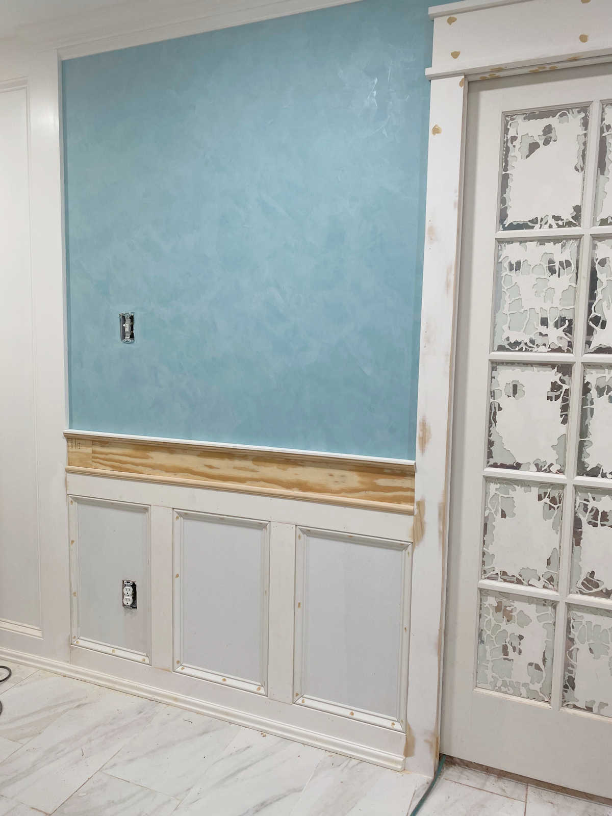
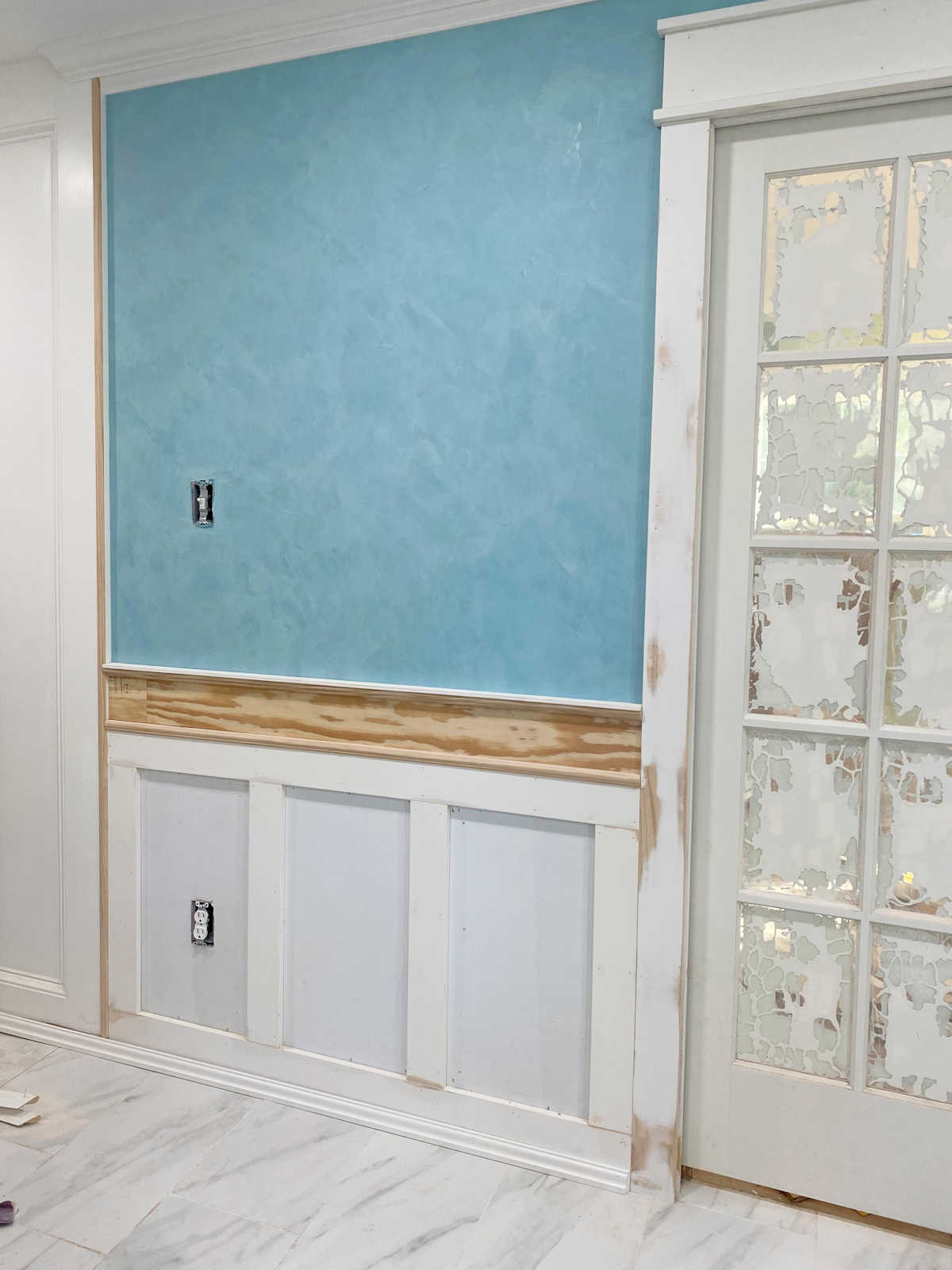
So while it caused it delay, I think it was totally worth it. It’s not always about perfectionism. Sometimes it’s just about getting it right.
If you’d like to see all of the posts about this master bathroom remodel project, you can find those here: Master Bathroom Remodel — From Start To Present (Still In Progress)

Addicted 2 Decorating is where I share my DIY and decorating journey as I remodel and decorate the 1948 fixer upper that my husband, Matt, and I bought in 2013. Matt has M.S. and is unable to do physical work, so I do the majority of the work on the house by myself. You can learn more about me here.
I hope you’ll join me on my DIY and decorating journey! If you want to follow my projects and progress, you can subscribe below and have each new post delivered to your email inbox. That way you’ll never miss a thing!
[ad_2]
Source link


