Y’all have my head absolutely spinning with your comments on yesterday’s post. But it’s not the bad kind of overwhelming head spinning that makes me want to bury my head in the sand. It’s the good kind of exciting head spinning that makes me want to spend hours and hours at my computer trying out every possibility y’all suggested. ? So I wanted to go over some of the recurring themes in your suggestions and comments.
First, let me say that I was totally and completely shocked at the response to my wanting to eliminate a huge walk-in closet in the master bedroom. I was sure I would get nothing but pushback on that idea, and I was blown away that the response was quite the opposite. While there were a few people who said they could never, ever get rid of their big walk-in closets, the vast majority of people said they could (or do, or plan to) live perfectly comfortably with a wall full of IKEA Pax wardrobes, or a standard non-walk-in, wide, reach-in closet with good organization.
So after reading all of your comments and contemplating how I want our bedroom to look and function, I’ve decided to do an entire wall of Pax wardrobes on the shared wall with the master bathroom.
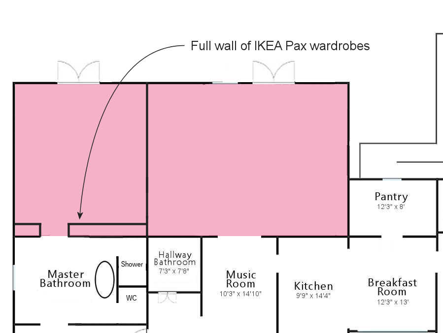
The narrow section is 40 inches wide, and the area on the other side of the bathroom door is 140 inches wide. That’s 15 feet of floor-to-ceiling closet storage space. For comparison (because many of you referenced it), John & Sherry’s Pax wardrobe wall is just under 9 feet wide. So with my newfound love of IKEA cabinets, I’m so unbelievably excited about this idea. I’ll get a ton of storage without having to sacrifice so much square footage of space required by a large walk-in closet. And as I said yesterday, I absolutely love a whole wall of built-in cabinets. I think it’ll look amazing, and it will function very well.
About that laundry room…
Many of you shared the same thought about the laundry room placement — that I should move it so that it’s right against the back wall of the hallway bathroom. First, let me show you how I had it arranged, and then explain why. This is the placement that I had proposed. (Ignore the dining table in the nook. I’m just talking about the laundry room for now)…

Since so many of you suggested it, I did consider placing the laundry room against the back wall of the hallway bathroom. I played around with that idea for quite a long time, but I just couldn’t make it work. The reason I have a problem with it is because then I’m just left with a doorway directly from the family room into the master bedroom. That seems strange to me. Very strange. At least with the laundry room where I placed it, it creates a hallway that leads to the master bedroom, which gives a feeling of separation between the two areas. Without that hallway, it’s just a door on a wall leading from the family room to the master bedroom.
Does that not feel strange to anyone else? To me it’s as strange as having a guest bathroom directly off of a family room. Those things are generally tucked away and accessible via a hallway. It’s not really standard (at least to my knowledge) to find those “private” rooms located just right off of a family room and only separated by a wall with a doorway. It seems weird to me.
So I’m not really on board with moving the laundry room so that it’s right up against the back wall of the hallway bathroom unless I can find another way to create a bit of a separation between the family room and the master bedroom.
I did come across this picture where they created a little hallway feel just using built-in bookcases and cabinets. I love how this looks…
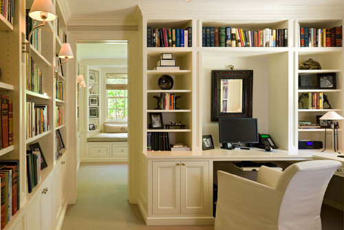
But I do need some sort of separation, whether it’s a hallway created by a laundry room (or even a laundry closet), or a “hallway” type of feel created by built-ins like in the photo above. I just simply cannot have a master bedroom right off of a family room only separated by a wall with a door in it.
So unless I can come up with another way to create that separation, I still really like the idea of putting the laundry room where I had it, and creating that little nook behind it. BUT…I do agree with most of you that the nook won’t be big enough for a dining table. That nook would be better suited for something like a reading area. I envision some comfy chairs surrounded by bookcases filled with books. Or I could even envision a game table in that area. The possibilities are endless. But whatever I use it for, it would look intentional, and not like an afterthought. I mean, that’s a good amount of space to be used for something amazing! (Never mind that weird window placement. I dragged it over there by the door and then forgot about it.)

With that area ruled out for a dining table, I don’t see that there’s any other space for a dining table in that room. If I create a passthrough from the kitchen to the family room like I had planned (which I still want to do), and put the dining table just on the other side of that passthrough, then it starts encroaching on the space available for the family room.
So what am I considering for the dining room? I can’t even believe I’m about to say this. But…the living room.
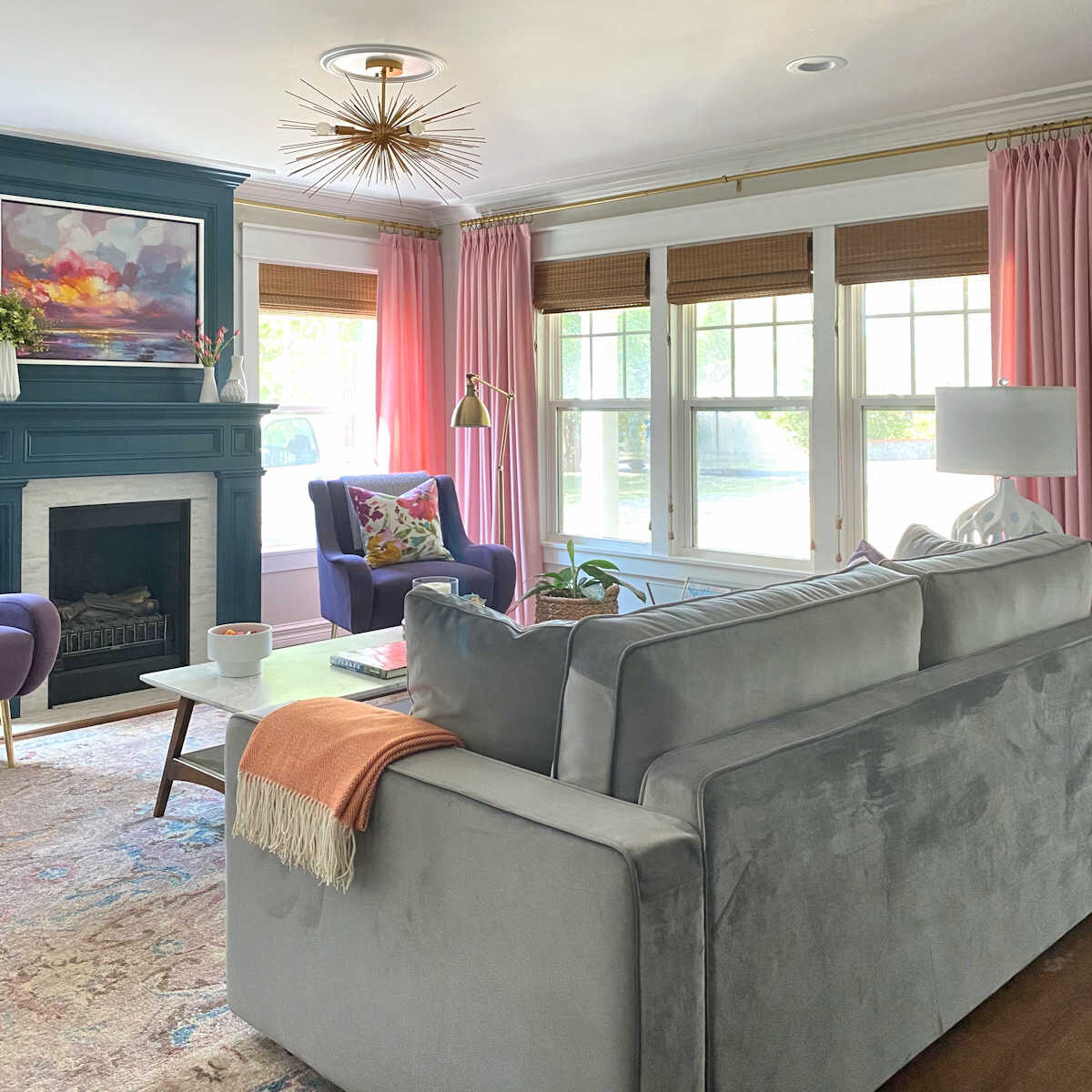
Yep, we’ve come full circle. I’m only just considering it right now. Nothing is set in stone, and I’ll talk to the architect to see if he has any better ideas.
But several of you suggested it, and obviously, having been down that road and failed miserably in the past, my knee jerk reaction was, “Oh my gosh, NO! Not again!” But the more I thought about it, the more it made complete sense.
The area available for a table and chairs measures 12’10” x 10’5″, which is plenty of room for a round-to-oval expandable table. And if I need more room for a bigger crowd, I could turn the table and expand it into the “entryway” space. And it’s perfectly situated right by the kitchen. It’s also in an area that doesn’t create any problems for Matt getting through the house. I mean, it really is perfect.
But I’ve tried this before, right? And I failed miserably, right? So why would it be different this time?
I gave this so much thought yesterday, and it dawned on me that the reason it didn’t work last time had nothing to do with the function of the room. My failure wasn’t because I was trying to turn it into a dining room. The dining room aspect of the plan wasn’t the problem at all.
The problem was that that was when I was trying to decorate my home around a green and gold kitchen.
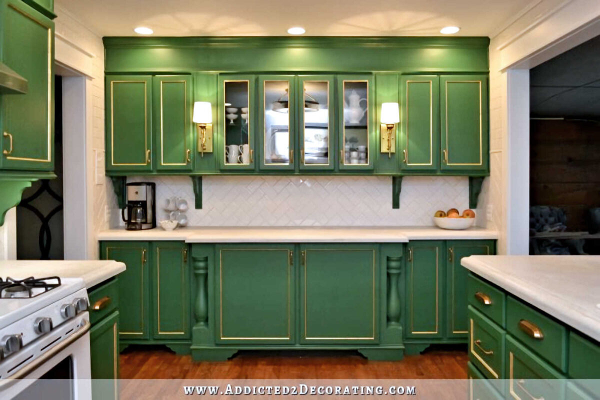
Literally NOTHING I did back then worked. How many different iterations did that room go through as a living room that didn’t work out? Many! It wasn’t just the dining room idea that failed. It was several living room ideas that failed as well.
I couldn’t even get any of my living room ideas to work until I changed the kitchen cabinets to teal, found my color palette (which took a lot of trial and error), and found the right rug (and the right rug size) to inspire me. That’s when all the pieces started falling together to create the current living room that feels so “me“.
But now I know myself much better. I know what colors I like, and what colors I don’t like. So turning this very “me” living room into a very “me” dining room at this point would be a breeze. I wouldn’t change anything about the fireplace, the curtains, the rug, or anything on the entryway wall. It would just be a matter of swapping out the chairs, sofa, and coffee table for a nice dining table and chairs. And voila! I’d have a dining room. It’s definitely the room that makes the most sense as a dining room.
I’m still just contemplating, and obviously, this can’t happen until we actually have a fully finished, fully furnished, and completely useable and comfortable family room. Until then, I’m still just dreaming and planning and considering and contemplating.
ETA: I wanted to address one more recurring suggestion, and that was to turn the music room into the dining room.
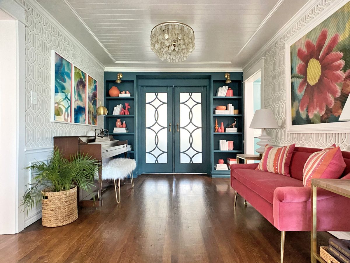
I can understand how that might make sense, and it’s obvious from the original floor plan that the builder intended this to be the dining room. But for us, this isn’t a possibility.
The music room is the most high traffic room in the entire house. It’s the main thoroughfare to get from the bedroom side of the house to any other area of the house. We pass through this room countless times every single day.
To interrupt that flow of traffic with a big dining table and lots of dining chairs would just be awful. I would personally hate it and find it to be a huge annoyance, but Matt (in his wheelchair) would find it virtually impossible to get through that maze. Just imagine him trying to wheel himself from the bedroom, into this room with a big table and chairs in the middle, around the table, and into the kitchen. That would almost be cruel.
So that’s just not even an idea I’d consider. When you’re trying to take an old house and redesign it for someone who’s in a wheelchair, things can be challenging, but I always have to keep in mind how he’ll get from one room to another. And I never want to create barriers for him.

Addicted 2 Decorating is where I share my DIY and decorating journey as I remodel and decorate the 1948 fixer upper that my husband, Matt, and I bought in 2013. Matt has M.S. and is unable to do physical work, so I do the majority of the work on the house by myself. You can learn more about me here.


