[ad_1]
Drawing as Practice
National Academy of Design
519 West 26th Street, Floor 2
New York
Through December 16
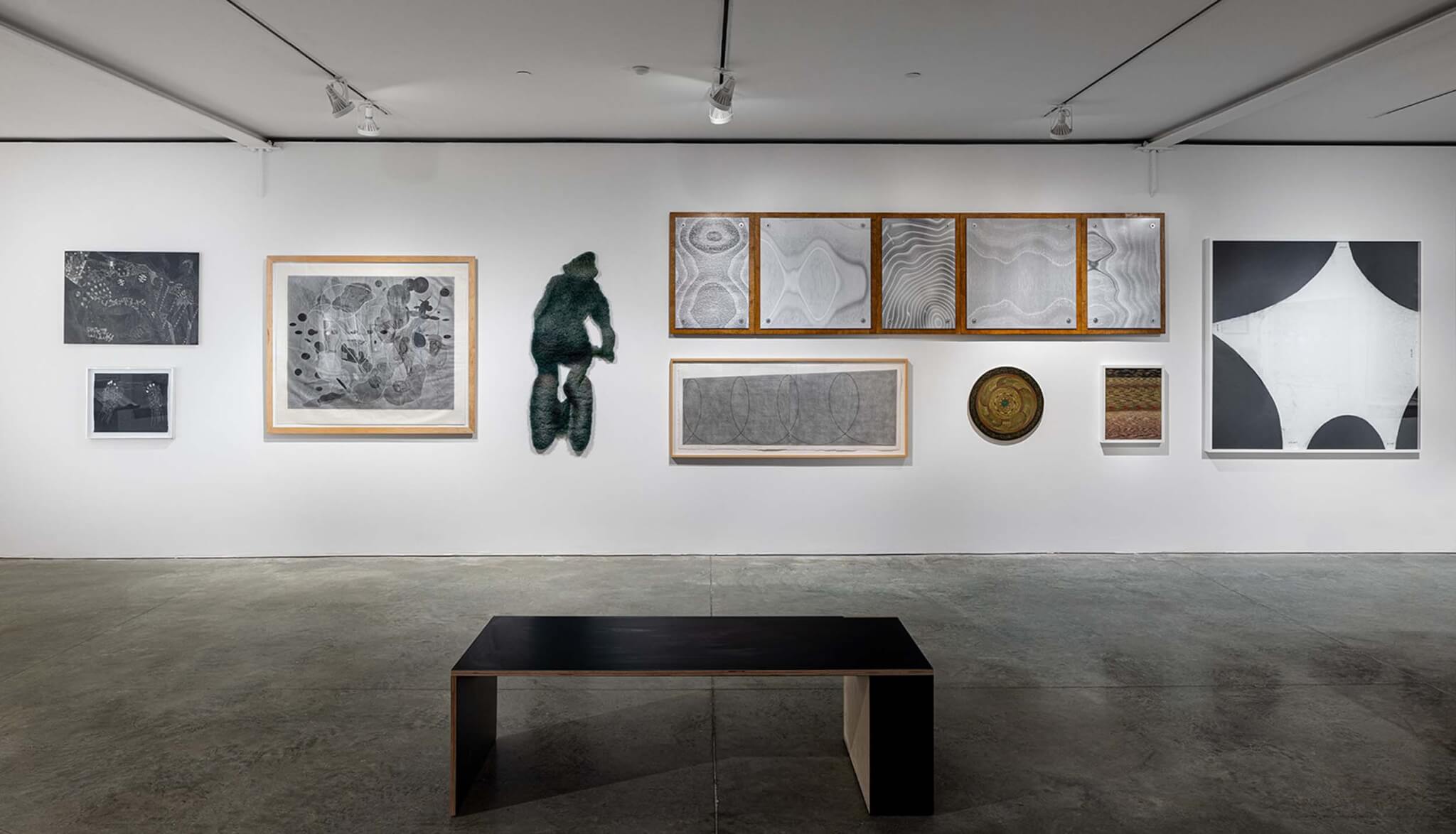
What is a drawing? Ink on paper is probably a drawing. So is a charcoal sketch. But what about embroidery, sculptures, and videos? According to the National Academy of Design, these things can be drawings too. This provocation is the driving force behind Drawing as Practice, the inaugural exhibition at the National Academy’s new Chelsea location, which aims to redefine not just the drawing but the institution’s own identity.
After selling its Beaux Arts mansion on Fifth Avenue in 2016, the National Academy finally has a new home. It’s no longer alongside the institutions of Museum Mile but among the contemporary galleries of Chelsea. “We traded parquet floors for concrete,” said chief curator Sara Reisman of the Bade Stageberg Cox design. Now located in a second-floor space accessible only by elevator, the white box gallery is divided into three intimate areas. The minimal, planar language of the walls echoes the clean lines of custom plywood vitrines and seating. The architecture respectfully allows attention to focus on the densely packed exhibition of more than 100 works that question the boundaries of the viewer’s assumptions and thrust the historic institution into contemporary art and architecture discourse.
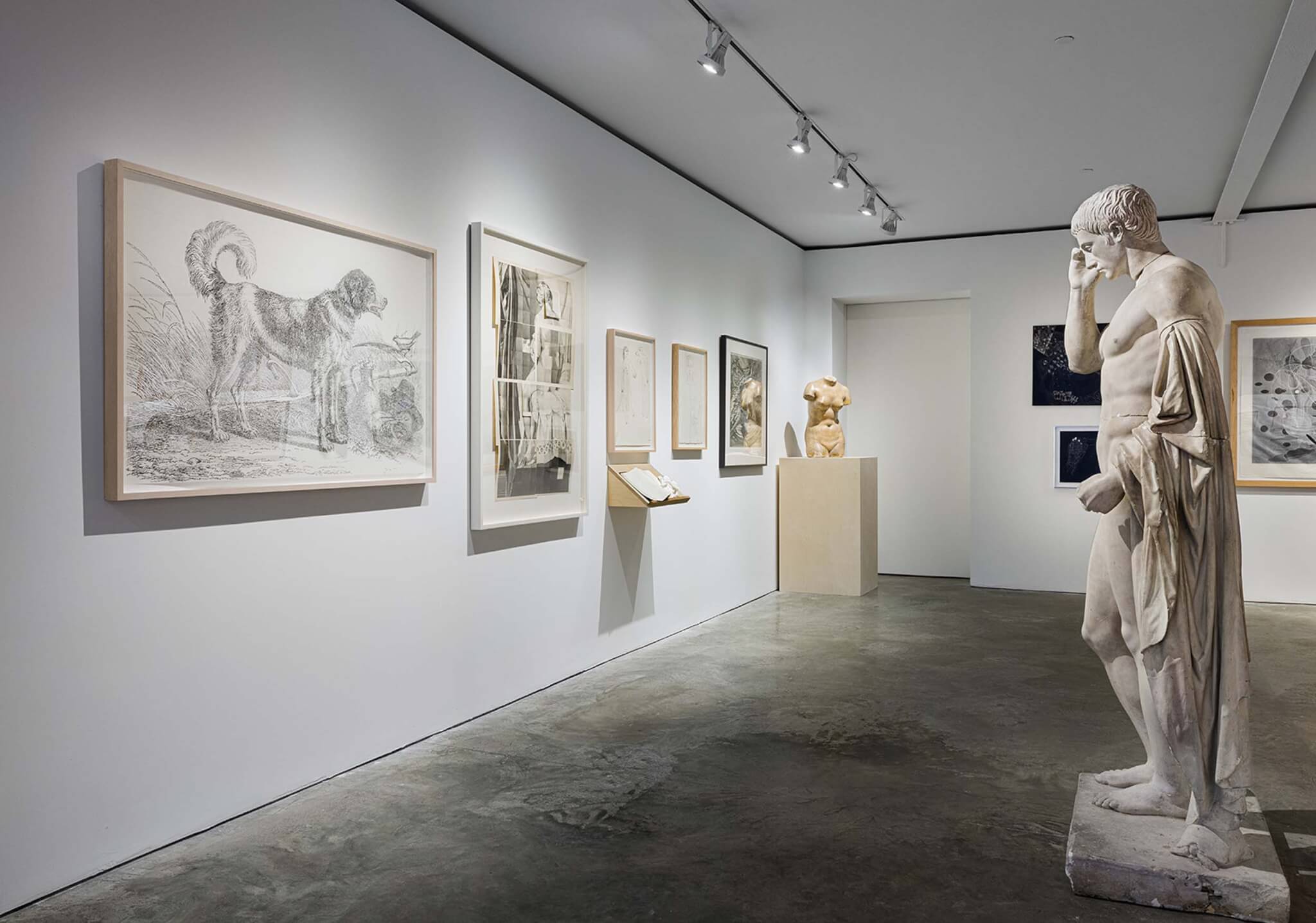
When the National Academy was founded in 1825, drawing fulfilled a practical need for artists and architects to make studies en plein air before returning to their canvases and paints in the studio. Drawing techniques were taught through instructional classes, which the National Academy’s school, among other institutions, offered to academicians and outsiders alike. In the nearly 200 years since, the tools have changed, and so has art. Not only can artists buy paint in tubes (prior to their introduction in 1841, artists mixed their own paints) and snap iPhone photos as references, but drawings as both a medium and subject matter have evolved too.
By framing drawing as a part of “practice,” the curatorial team invites visitors to situate the act of drawing within the broader context of an artist’s or architect’s work. The drawing might be a study along the way to a final work, though this linear relationship is complicated by the inclusion of works that are final products in their own right.
With both the subject matter and the method at play, the drawing can become a tool of communication and protest. An ongoing collaboration between Jenny Polak and Dread Scott is represented by two works, Passes: Sugarcane and Dividends (2019) and Passes: Délivré (2023). The former shows a figure encrusted in cowrie shells, a currency that supported the West African slave trade, while the latter juxtaposes delivery workers and burning cane fields, a nod to the Haitian Revolution. That Polak and Scott share gallery space with relatively innocuous drawings like Moseley Isaac Danforth’s Cast of Venus with Student Sketching in Background (c. 1827–1837) is a testament to the lofty ambitions set forth in the exhibition.

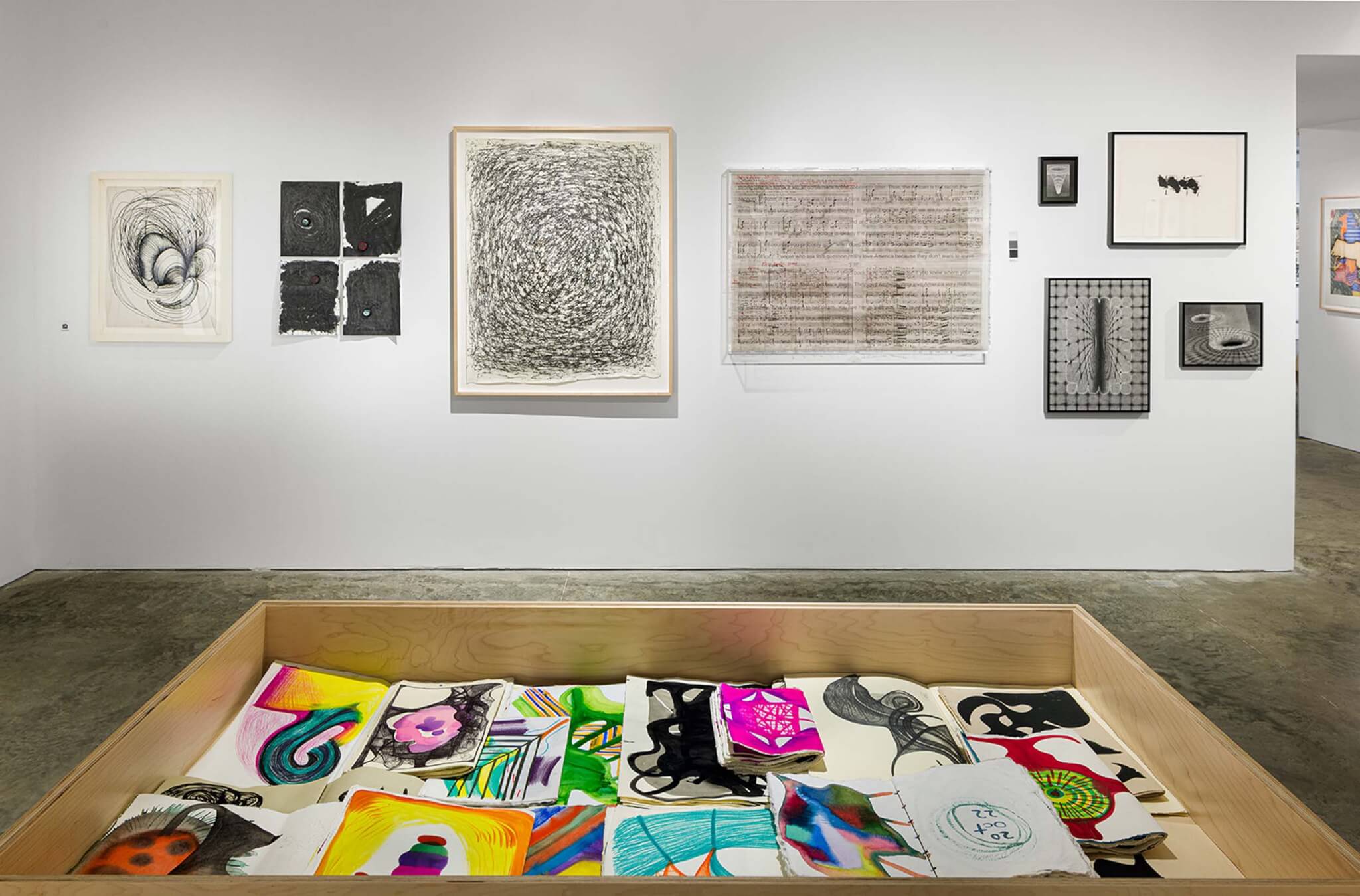
The overwhelming variety of works on display is at times difficult to reconcile; it pushes the viewer to grasp for fleeting moments of continuity, often embedded in the wordplay of the exhibition’s name, Drawing as Practice. A working title, Drawing as Process, hints at the importance of a continuous line of inquiry. (This is in stark contrast to the MoMA’s definition of a drawing, which emphasizes the one-off nature of a work.)
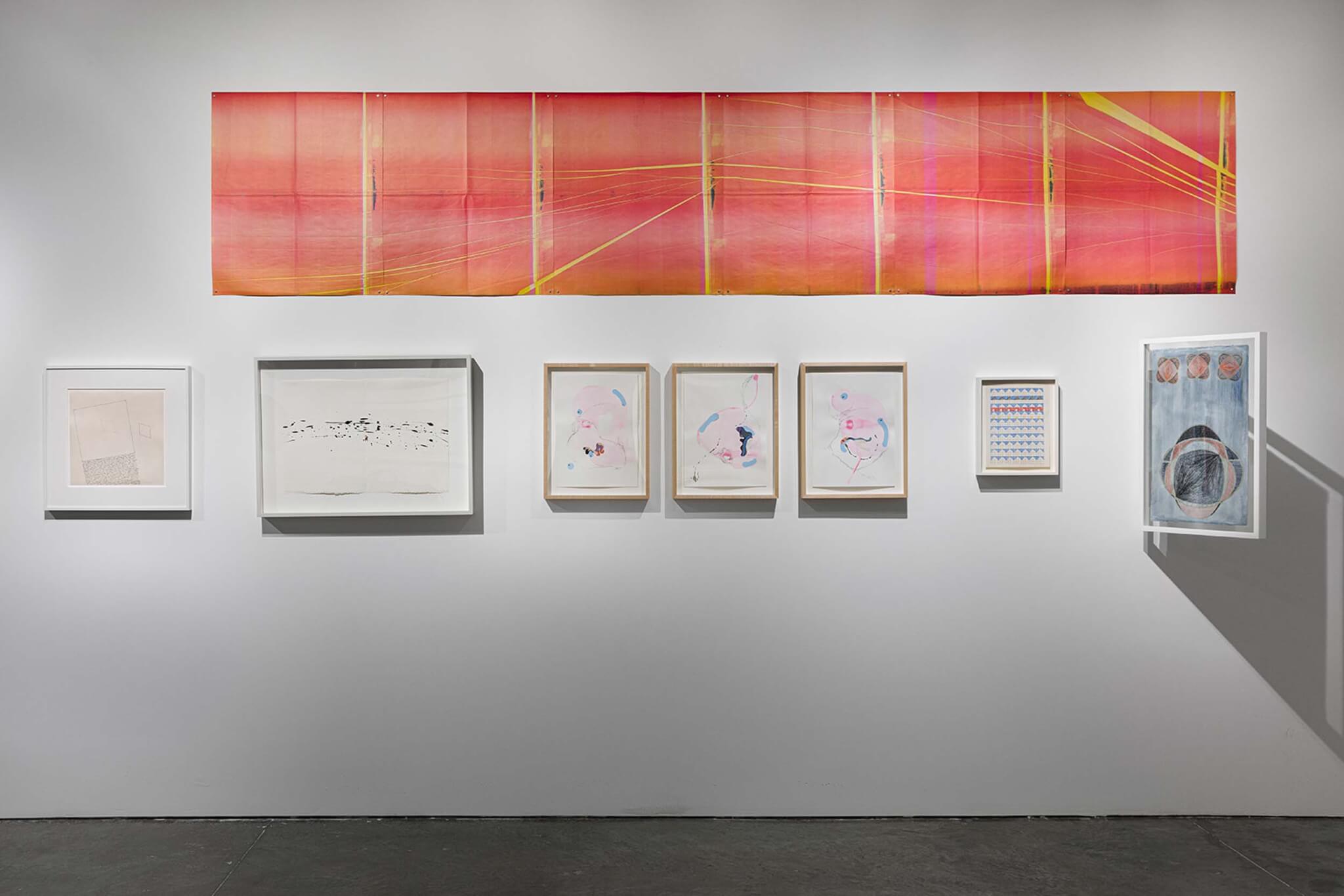
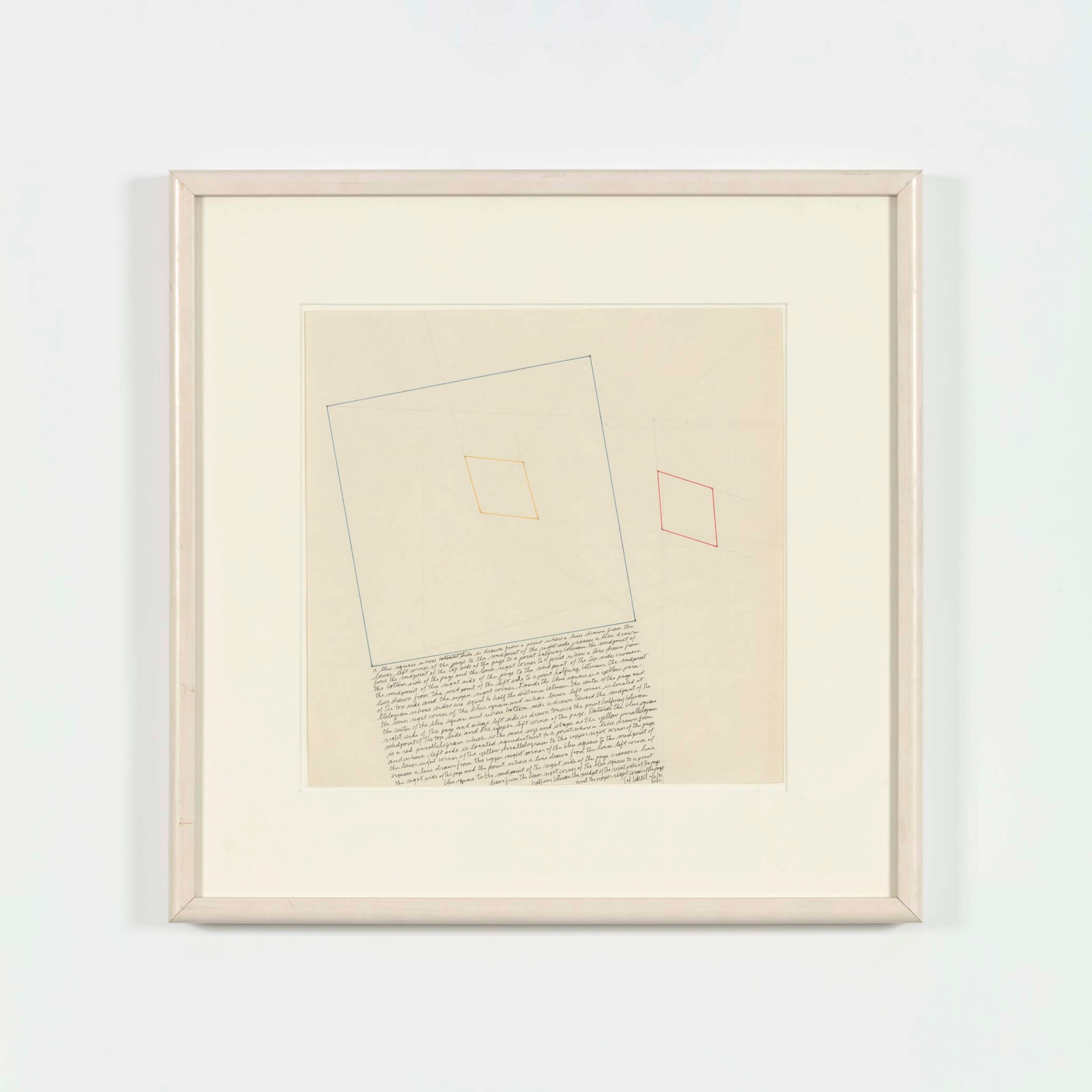
Reisman is more focused on the many ways that the act of drawing fits into a larger creative process instead of its physical characteristics. Take, for example, Sol LeWitt’s The Location of a Blue Square, a Red Parallelogram, and a Yellow Parallelogram (1976). Its inclusion makes more sense if you are familiar with his instructional drawings—written instructions for others to execute drawings—and casts a new light on the historic drawings of the National Academy’s school that were made in an instructional setting, sharing a model for technical practice. There’s a common conceptual thread.
The question of “practice” is complicated by the quotidian use of the term among architects to distinguish between the physical construction of buildings and theoretical explorations of ideas. Within an architectural practice, the drawing is never the final work, just the representation of the thing that will become a built work of architecture. Billie Tsien’s Façade Study Model (2008) for the Barnes Foundation presents compelling ruminations on composition and material, but they are intrinsically tied to the final thing, the building. With no mention of the Barnes Foundation and no image of the facade that was built, the visitor cannot read the drawing in its context of Tsien’s work. Instead, context is offered in nearby drawings, like James Wines’s Nature’s Revenge: NYC 2050, View from the Lower East Side (2022), a work that is a not a proposal for some building or intervention but a visual representation of an idea.
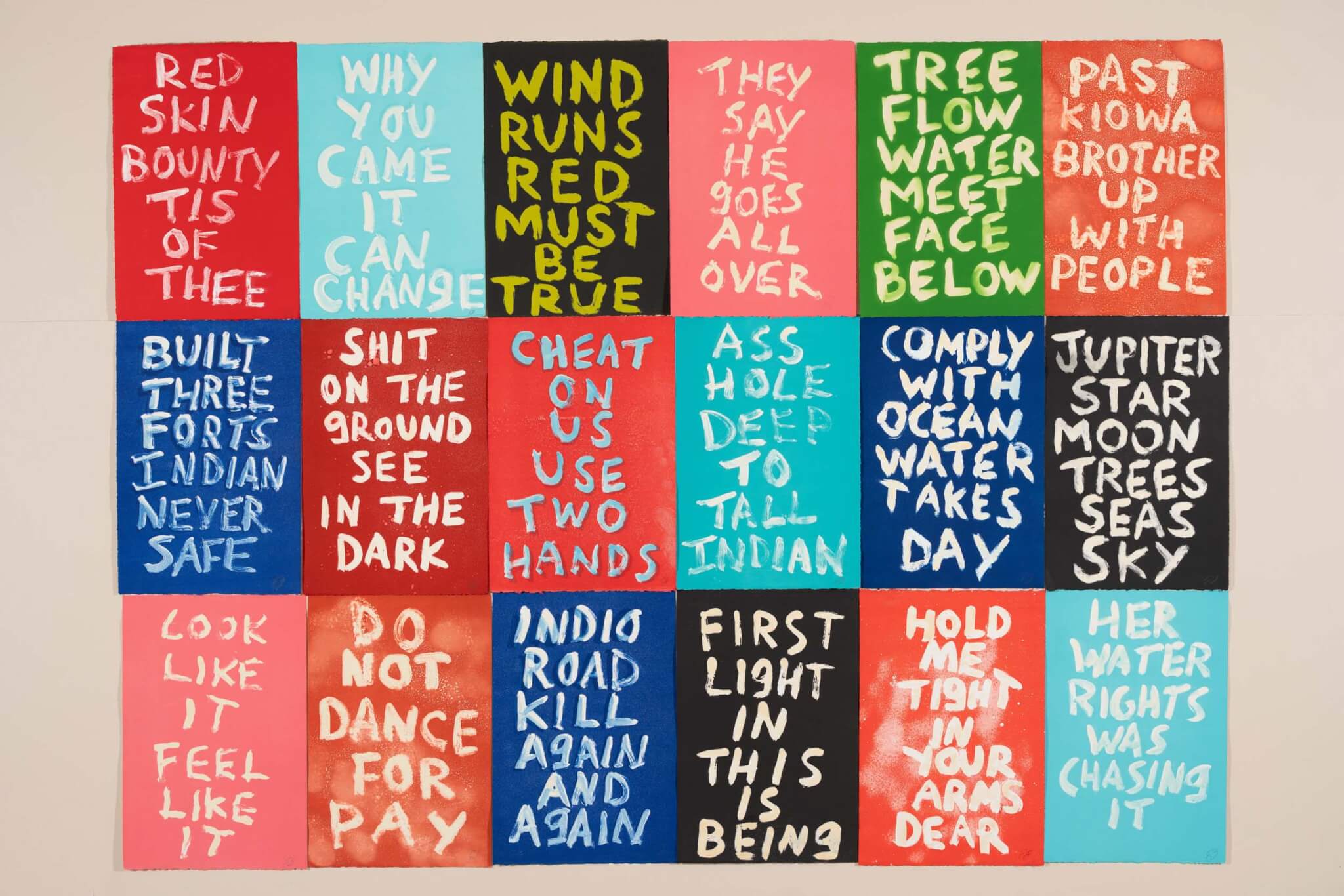
The most explicit relationship on display between a drawing and its corollary works is Katie Schimert’s watercolors (Dione, 2021, and The Sea Resting Against the Earth, 2021) and ceramics (Thalassa, 2021, and Hestia, 2021). The line-like ribbing of the ceramic works is clearly in conversation with the layered lines of the watercolors. The interplay between the 2D and 3D representations becomes apparent and succinctly illustrates the exhibition’s intention.
Otherwise, this reading lies primarily in Reisman’s essay in the exhibition brochure, which meticulously relates each grouping of works back to the field of drawing, often by providing relevant history and context. Helpful as this is, an essay is a demanding way to engage with an exhibition. Most critical to navigating Drawing as Practice is perhaps a visitor’s personal knowledge of the artists’ and architects’ works beyond the gallery walls. The exhibition demands a critical eye and caters to an audience already familiar with the art and architecture, fitting for an organization run by artists and architects.
Drawing as Practice itself is an instructional exhibition of sorts. It takes a common term, drawing, and deconstructs it from a variety of angles. Where it falls short, the exhibition feels scattered and unfocused: There is a lot to deconstruct. But this is also the show’s greatest strength. It raises a lot of questions, offers few answers, and embraces the complexity and multiplicity of the topic. In short, it is very hard to come away from this exhibition without questioning what makes a drawing.
Lane Rick is an architect and founding principal of Office of Things. She supports her work through research, drawing, and writing.
[ad_2]
Source link

