[ad_1]
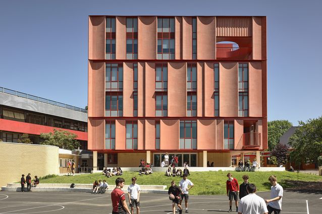
The most recent addition to Mount Alexander College, a secondary school on unceded Wurundjeri Country in Naarm’s/Melbourne’s inner-north, is a five-storey, brick-red beacon that establishes a series of meaningful visual and physical connections with the existing campus, wider suburb, and CBD beyond. Responding to the college’s innovative pedagogical approach and values, the mid-rise, vertical-school building also foregrounds a sense of longevity and stability through its materiality and careful references to context. Designed by Kosloff Architecture in close consultation with the school community and project stakeholders, it provides an impressive range of engaging and adaptable learning and administration spaces, while consistently looking past the edges of its condensed campus.
One of the oldest state schools in Victoria, Mount Alexander College sits on the site of Flemington National School, which was established in 1858. In 2016, the school moved to a vertical class model, developing a focus on co-designed, bespoke curricula options for each student and emphasizing student agency. Following the completion of the new facilities, it is working towards an enrolment of more than 900 students – a 50 percent increase from 2019.
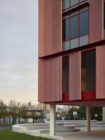
The building never truly expresses its five-storey structure, as the precast concrete panels on the facade appear to group floors together.
Image:
Derek Swalwell
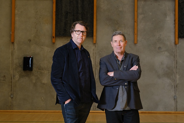
Julian Kosloff and Stephanie Bullock, co-founders and directors of Kosloff Architecture, have worked on a number of projects with the Victorian School Building Authority (VSBA) in recent years. They understood the need for the new spaces to support specialist programming and the school’s innovative structure without compromising the building’s ability to react to changing needs in the longer term. “Pedagogical approaches vary significantly, and Mount Alexander College responds directly to the school’s highly student-led curriculum focus, while a simple column grid and the utilization of the external precast panels as load-bearing elements frees the building up to be adapted and modified internally in the future,” Bullock says.
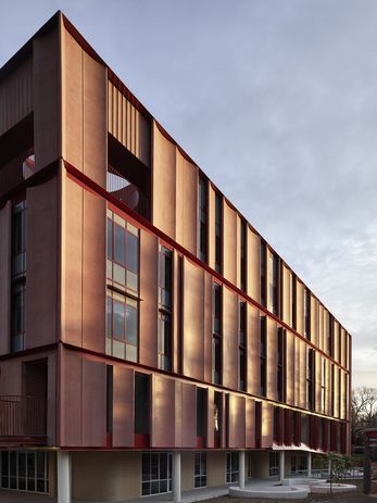
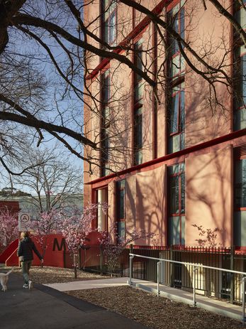
The building runs across the site on an east–west axis, reaching out towards Mount Alexander Road and the Melbourne CBD, but digging down at the Wellington Street boundary and reconfiguring the school’s main entry to this more pedestrian-friendly residential edge. Connections to the red-brick character of the suburb become further apparent here, with the red-clay hues of the project’s precast concrete facade recalling – without replicating – the material qualities of colonial heritage structures, including the small substation on school grounds, and the police station and former fire station further down the street.
The school’s main entry was relocated to a more pedestrian-friendly residential edge.
Image:
Derek Swalwell
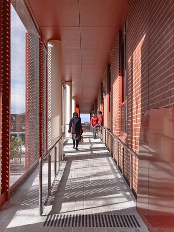
The concave forms that wrap around the building volume gently push and pull, playing with overall scale and proportion while subtly pinching at corners and softening edges. The western elevation leans into the visibility of the structure in the landscape. Even at its most prominent points, however, the building never truly expresses itself as a five-storey structure. Instead, the panels establish giant orders, spanning across and grouping together the second and third floors, as well as the fourth floor and plant area on the roof terrace above. The blond brick of the project’s ground floor retreats under the main facade, creating covered connections between curved amphitheatres, landscaped areas, and visual and performing arts studios. In this way, the building embraces civic-scale elements without losing sight of the scale of the campus and the residential character of its western edge.
The strength and clarity of the facade belies the high level of efficiency built into the system, in terms of both construction and overall solar performance. As Kosloff explains, seemingly free-flowing variations in panel geometry were generated using just five precast concrete moulds “that were shifted, rotated and flipped to create a series of permutations and combinations that respond to precise sun-shading and frame key views.” An overall window-to-wall ratio of 21 percent, with 3 percent to the south facade, results in efficient energy use and occupant comfort.
The main entry is via a ramp from the street along the northern edge of the building’s first floor.
Image:
Derek Swalwell
The main entry is via a ramp from Wellington Street along the northern edge of the building’s first floor, leading into the foyer and accompanying administrative spaces. Beyond the foyer, the bespoke, vertically integrated nature of Mount Alexander College’s curriculum begins to register more clearly, from spatial planning decisions through to smaller details like signage. Rather than being restricted to single-age classes, students can design their own curriculum and choose from many electives based on their interests and needs. Most of the building’s upper levels, as well as the ground floor, contain a mix of general classrooms and specialist science, robotics, art and design facilities. These teaching and learning spaces wrap around central common spaces and circulation, taking advantage of natural light and views at the edges of the plan. The only visible reference to student year levels is the inclusion of a senior common room on the fourth floor.
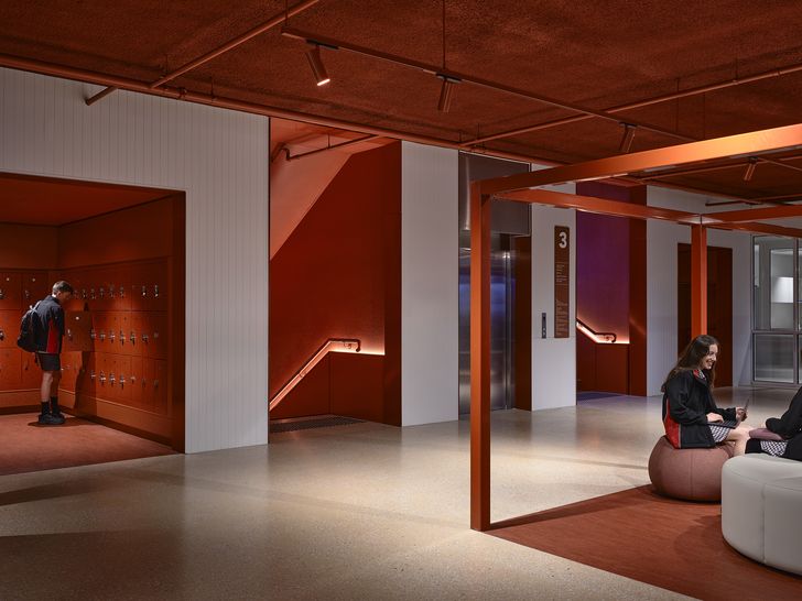
On the upper levels, steel frames and flooring variations mark out places for group work without constricting the space.
Image:
Derek Swalwell
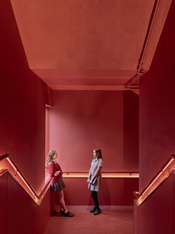
Early in our discussion, Bullock spoke about the practice’s intention for the project to reflect the aspirations and values of the school curriculum by being “more aligned with a tertiary institution than a secondary school environment.” A crucial aspect of this strategy involved not allowing the architecture to “talk down” to students but, rather, to support the emerging sense of autonomy and agency that the school aims to foster. Upon reflection, I wonder if I underestimated the extent to which this kind of idea could be made legible within the experience of the building. Perhaps I assumed that the beautifully detailed, fluted facade might encase a well-designed but somewhat standard set of secondary school spaces. Instead, Mount Alexander College delivers on the promise of its exterior, containing a central core that is deeply atmospheric – almost theatrical. The beating heart of the building, the core’s internal stair is a moody red thread that is as serious and deep as it is bold and rich.
The bold red internal stair at the building’s core constitutes its “beating heart.”
Image:
Derek Swalwell
At each of the project’s upper levels, the red stair meets common areas that connect to classrooms around the edge of the plan. Rust-red steel frames mark out places for group work without closing down the space, while small, upholstered alcoves carve out moments for individual students. The building’s classrooms, studios and labs are white, bright and lively, but by no means playful in the traditional sense. Without pulling too much attention away from the interior, views from class- rooms to the east take in the Wellington Street tree canopy and surrounding suburb, while longer views to the south- east connect back to the city skyline.
Learning areas continue outdoors and beneath the building, while views to the CBD remind students of the wider world.
Image:
Derek Swalwell
Writing recently about the potential for urban schools to operate within broader social infrastructure networks, Jos Boys and Anna Jeffery identified a series of design opportunities for architects, policymakers and communities. 1 These opportunities speak more directly about security concerns and the physical barriers to community engagement in urban schools. Nevertheless, the notion of “building ‘bridges’ not fences” seems particularly relevant to ways in which educational architecture might support secondary school students to position themselves in relation to broader contexts as part of their daily experience. By prioritizing moments of connection and identity at Mount Alexander College, Kosloff Architecture’s approach makes a case for the kinds of bridges that are built when students are encouraged to look beyond the edges of their campus – and perhaps even beyond their time at secondary school – to see themselves as active participants in both their education and their community.
— Alex Brown is an architect and senior lecturer at Monash Art, Design and Architecture. Her research explores twentieth-century and contemporary art–architecture relationships, as well as architecture and radicality from the 1960s onwards.
[ad_2]
Source link

