

[ad_1]
A couple of weeks ago, I ordered ten fabric samples for the recliner that I want to order for the reading corner in our bedroom, and those samples finally arrived a couple of days ago. And you know what? All ten are beautiful! But there were a couple I could rule out immediately, and then some others that were fairly easy to rule out for various reasons.
But I’m getting ahead of myself. First, let’s go back to the mockup I did of the bedroom so we can all be reminded of the end goal for this room. And once again, I’ll remind you that the wood bed frame in this mockup isn’t what I envision our bed frame looking like. I just needed a quick and easy copy-and-paste bed frame from that specific angle, and that’s the best I could find.

So yesterday, I laid out all of the selections I have so far for the room on my work table in the studio — the rug on the top left, the headboard fabric on the top right, the velvet drapery fabric on the bottom left, and the grasscloth wallpaper on the bottom right.

The other three fabrics are samples of accent fabric I may use for various things like pillows on the bed, although I may not use those exact fabrics. I haven’t made final decisions on accent fabrics yet, and I’d certainly want to add a teal to those colors to bring the teal onto the bed as well.

And here are those selections with the ten fabric samples that I ordered for the recliner. From left to right starting on the top row those are: celadon, platinum, spa, scuba, terracotta, peacock, blanc, mink, bloom, and coral.
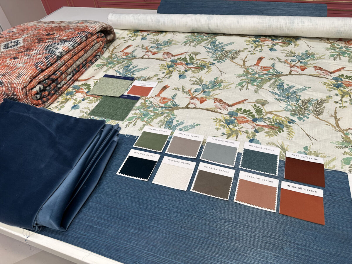
I immediately ruled out the darkest and the lightest samples. The peacock is a really dark teal, but I think I have enough teal. The blanc, while beautiful, would disappear against white wainscoting. I’d also be afraid of having something so light in color that would show dirt and stains easily.

So right off, I was able to narrow it down to eight samples.

I went back to the Interior Define website to view all eight of those colors on the Jude recliner that I plan to purchase (affiliate link). Here they are in order as they’re shown above.


Again, I have to remember that the recliner will go against the creamy white wainscoting with the teal grasscloth on the top portion of the wall. So the color I choose will need to contrast nicely with the creamy white and not the teal. With that in mind, I ruled out several more. Spa is too light. Suba is too much teal. Terracotta is too dark for my taste. Mink is too blah. And bloom is too pink.
That left me with three — celadon, platinum, and coral.

You can let me know what you think, but of those three, there seems to be a clear winner to me.

The celadon is actually the color I was rooting for the whole time. I was really hoping the green would complement the other greens nicely, and I think it does.
So I think I have a winner, right?
UPDATE: Since I don’t have a mockup of the reading corner in our bedroom, I decided to copy and paste the recliner in the coral and celadon onto the mockup I have of the headboard wall. Of course, that’s not where the recliner will go, and the scale is completely off. But at least it gives an idea of how each one would look with the selections I’ve already made.
Here’s the celadon…

And here’s the coral…

The chair won’t actually be sitting on the rug, although it may touch the rug just a bit. And now, after seeing these, I’m torn. I like both of them equally, I think. I might actually be leaning slightly towards the coral. Ugh!
The A2D Daily update for today:
UPDATE #2: I had requests for mockups with other colors. Here’s the terracotta:

And the spa:

And the platinum:

UPDATE #3: My mom made a good point (and sent a picture  ). She pointed out that the room seems to be divided in two with the teal at the top and the orange/coral at the bottom. So adding a coral chair will just continue with that separation. She suggested in order to join the top teal half and the bottom coral half, I should consider using a teal chair and then adding a orange/coral and cream lumbar pillow, and maybe a throw, etc. She sent this picture…

That’s not an actual fabric swatch option from the Interior Define website. She just altered the color in Photoshop for illustrative purposes. The color on the chair below is the closest color I could find on the website. This color is called French. I just ordered a swatch.


Addicted 2 Decorating is where I share my DIY and decorating journey as I remodel and decorate the 1948 fixer upper that my husband, Matt, and I bought in 2013. Matt has M.S. and is unable to do physical work, so I do the majority of the work on the house by myself. You can learn more about me here.
[ad_2]
Source link


")


