One of the questions I’ve asked myself often is “Why do architects wear black?” Cordula Rau’s amusing book of the same title (Springer Verlag, 2008) asked architects to reflect on this very question with a variety of candid responses ranging from the existential to the absurd. Sitting in one of the ochre-toned meeting rooms at SJB’s Surry Hills office, I ask director Adam Haddow the same question about architectural offices: “Why are they always white?” Responding as Konstantin Grcic did to Rau’s question, Haddow laughs and says, “I don’t know!” The reason I posed this question to Haddow was that on a cold rainy day, the warmth and joy of the colour-filled SJB offices couldn’t have been a more positive and welcoming environment.
Trying to dig a little deeper I reposition my approach and posit, “What does the use of colour in SJB’s offices say about the firm, particularly in relation to its approach to design?”. Haddow situates SJB as a practice that operates within the realm of “crafted modernism.” He sees this as an approach that takes the “clarity of planning” that underpins modernism while maintaining the “joy and delight” that comes through the incorporation of details, colour, furnishings, art and connection to nature. Haddow refers to the experimentation of colour used in early-modernist painting, architecture and sculpture to argue that colour and modernism are inherently compatible.
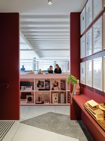
Custom pink storage units provide areas for informal discussion, as well as a place to display models, brochures and project updates.
Image:
Anson Smart
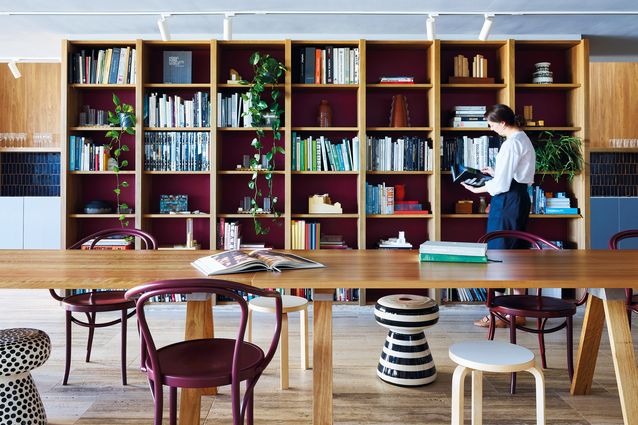
The colour palette for the project is based around russet reds, ochres, pinks, blues and greys. Haddow gestures to a eucalypt out the window, recalling how he grew up with nature and continues to draw his inspiration from the colours, textures and materials found there. Spotted gum is used for all the timber joinery items in the office and the custom upholstery for soft furnishings are imprinted with a flowering gum motif. Haddow points to the collaboration with the local fabric designers at Utopia Goods as an example of crafted modernism. The spaces within the studio feel relaxed and comfortable, just enough informality so as not to feel intimidating yet still with a level of sophistication to know that you’re here for work. The arrival level houses the reception, meeting rooms and new multifunction event space. The materials and reference library has been integrated into this space so that it’s easily accessed and given a sense of communal ownership. A new ochre-red staircase joins the event space to the lower level work zones. Access to natural light was paramount in the design of the workspace, and no matter where you are on the floor you can easily make connection to the exterior. All the workstations are sit-stand, meaning that re-teaming and changing positions is not such a sore issue. Dusty pink has been used for the joinery, while service cores and zoning partitions are punched out in bolder colours. Returning to the discussion of colour in the workplace, Haddow clarifies his position: “A workplace should be comfortable, inclusive and colourful, but it shouldn’t feel like your home.”
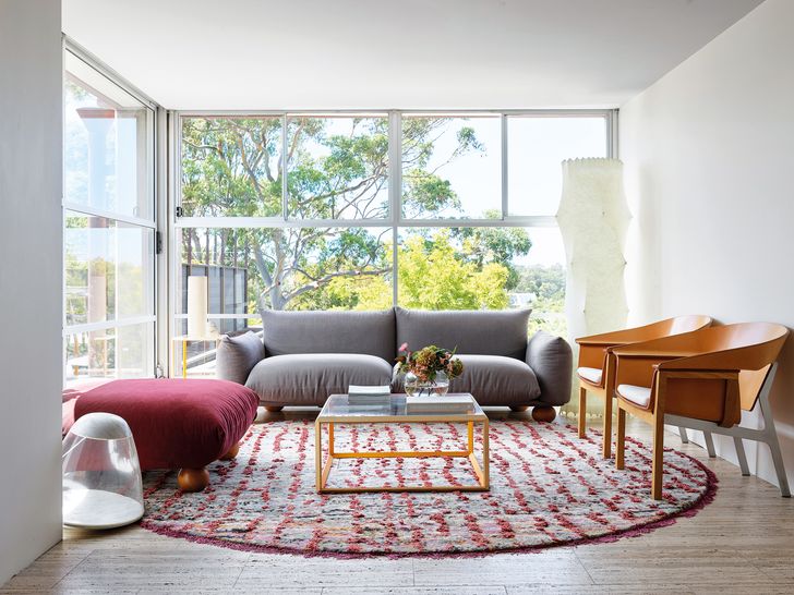
Domestic touches create a comfortable space that still retains a level of sophistication, as seen in the waiting area.
Image:
Anson Smart
The normally bustling office is sparsely populated during my visit in the midst of COVID-19 lockdown laws. Walking around the space, it is easy to keep a 1.5-metre distance as so many of the team are working from home. I ask Haddow what impact COVID-19 will have on workplace design. He believes that rather than being a place of obligation, a workplace will be somewhere for “conversation and innovation.” He sees the future workplace as being able to provide a sense of structure that working from home can’t. He is adamant that people “don’t want to come to work and it feel residential.” More than ever, people need a distinction between their homes and their workspaces, meaning the design of both spaces will become of increasing importance.

