


There’s a lot to be said for the classic look of white walls. What’s especially attractive about Sherwin-Williams Alabaster is that it’s a creamy white color with enough depth to make it interesting. Read on for my full review of this color and lots of photo examples and comparisons to other popular white colors!
If you’ve been around here a while, you know I am a BIG fan of painting interior walls white. Why? Because if you are a color lover like me, nothing makes colorful artwork and decor pop and stand out quite like white walls will. That’s why I transitioned to white walls about 4 years ago and I haven’t looked back!

Sherwin Williams Alabaster is Popular For a Reason
Needless to say, I’ve looked at a lot of white paint samples and have tested more white paint color paint samples than I can remember. One of the white colors that I kept hearing about and seeing when I was hunting for white colors was Sherwin-Williams Alabaster color (a/k/a SW 7008). It was color of the year in 2016 and its popularity has remained strong since then.
After exploring Alabaster myself, I can tell you that I totally understand why it is such a popular choice. It’s a beautifully balanced white that isn’t too cool or too warm making it a great choice for interiors and exteriors. In fact, when we painted the exterior of our old home, we chose Sherwin-Williams Alabaster color. It was the perfect choice for us because it was the soft, creamy white we were looking for.


What Undertones does Alabaster Have?
If you have never heard the term undertones before, I talk about it in this detailed post about how to choose paint colors for your home. The short version is that undertones are the parts of the color you don’t really “see.”
If you have ever wondered “is Sherwin Williams Alabaster warm or cool?” you are essentially wondering out its undertones.
The undertones of Alabaster are subtle. Alabaster doesn’t lean strongly towards any one color and has both a yellow/beige (warm) and a touch of grey (cool) base. Put in more simple terms, it has a greige undertone. In my opinion, all the best neutrals have a balance of warm and cool undertones like this.
But what does that mean when you look at Alabaster on walls for example? What your eye sees is a soft, creamy white with a bit of warmth that isn’t too stark or clinical (like the walls of a hospital or office). Some people may call it an off-white or a cream color, but I would disagree with both of those labels. When you view Alabaster on its own, it’s just a lovely soft white. I love how it looks on the shiplap walls in this foyer.

Alabaster’s Light Reflectance Value
One thing that people often fail to think about when it comings to choosing paint colors is a color’s light reflectance value (LRV). Alabaster has an LRV of 82 (the brightest, purest white has an LRV of 100). The LRV of Alabaster is fairly high and means that it will reflect back a lot of light into the room. That makes it a great choice for any room that you want to feel bright and airy.
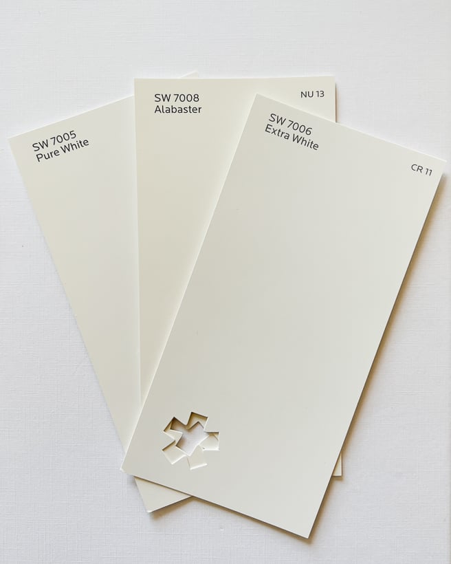
SW Alabaster vs. Other White Paint Colors
Note: I took the photos below on the brightest white surface I could find to give you the most accurate color representation. But remember, the colors you see will vary depending on the screen settings of the device you are viewing this post on. That’s yet another reason that it’s so, so important to test paint colors in your own home before choosing one!
You’ll see what I mean about Alabaster being a warmer white when you compare it to SW Extra White or Pure White by Sherwin Williams. Both Extra White and Pure White are cooler and look more blueish than Alabaster. When you look at Alabaster next to these “true whites” or next to a bright white piece of paper you may think it looks a bit yellow–that is the warmth of the color.

A lot of people also consider Benjamin Moore White Dove alongside Alabaster, and they are very similar. To my eyes Alabaster is a bit warmer than White Dove by Benjamin Moore–I see a slight hint of pink in White Dove. White Dove has a higher LRV of 85, which means it will have more of a “true white” appearance than Alabaster. You can see them side by side in the photo below.

But does Alabaster look yellow in practice? Absolutely not. When you view Alabaster all by itself, it just reads as a beautiful white color.
More Examples of Alabaster In Real Homes
If you are like me, you want to see photos of Sherwin Williams Alabaster white in real homes! So I’ve gathered up lots of inspiration for you. Just remember, Alabaster will look different in every home so be sure to read my tips for how to choose paint colors so that you are making sure it will work in your home with your particular lighting before you make your final choice!
Examples of Alabaster on Walls
You can see in the photos below what a pretty shade of white Alabaster is when used on walls. And I love that it’s versatile enough to be used in everything from a farmhouse-style home AND a more modern contemporary home.
Examples of Alabaster on Trim & Cabinets
For people that prefer a softer white for their trim color, Alabaster may be a good choice! You can see Alabaster trim with gray walls in the photo below.
Alabaster is also a popular choice for painting kitchen cabinets and other accents like built-in bookcases. You can get a sense of how Alabaster looks on kitchen cabinets below. (By the way, see how different Alabaster looks in this photo taken at night with interior lights turned on?!)

It’s beautiful on the built-in lockers below.

Should You Use Alabaster In Your Home?
If you are looking for a white neutral color, I would definitely consider Alabaster! With its high LRV it will make a room feel bright and airy, which a lot of people (myself included) are looking for. It’s a versatile color that is a great choice for everything from a living room to a bathroom. It’s a slightly warm white, which will make it feel much cozier and softer on the eyes than something like Sherwin Williams Extra White. That makes it a beautiful backdrop for most rooms and all kinds of decor styles.
If you are considering a white wall color, my best advice is to grab samples of several whites including Alabaster! Make sure to follow my recommendations in this post about how to choose paint colors for painting samples on at least TWO different walls in the same room because it will look different depending on how the light hits them. You can either buy paint samples to paint on yourself or try the newer peel & stick paint samples that most stores including Sherwin-Willams sell! Just cut them in half to try on different walls. Just never, ever, ever pick a paint sample based on the paint swatch or photos on the internet alone. It’s a recipe for disaster.
Other posts you may enjoy:
If you are looking for design guidance that goes way beyond just picking paint colors, be sure to check out my design system Designer in a Binder®!
Designer in a Binder® is the simple system I have used for years and years to design spaces in my own home. A couple of years ago, I finally put it all down on paper so that others can use it as well! In it I walk you through all the important stuff like choosing items that are the correct scale, space planning, mixing patterns, choosing colors and more! I give easy-to-understand guidance on all of this in Designer in a Binder®! We have over 9,000 happy customers so far! Click HERE to learn more.


