The streets and laneways of Brunswick are full of clever urban infill projects. A walk around the neighbourhood reveals some innovative insertions and adaptions to one of Melbourne’s more diverse suburbs. It’s a challenging and rewarding context for an architect to work in, and MRTN Architects’ addition is a mini tower house that’s a little microcosm of urban life.
House for Eva and Matilda is just that: a home for business owner Eva and her daughter Matilda. The site is small – just under 90 square metres of former backyard, subdivided and supported by an appropriate zoning that allows for mixed-use development. Small, mixed-use zoning is a bit of a lost art; it’s the type of planning approach that supports dwindling typologies such as the shop-top house, the small factory and the converted warehouse.
This house is a hybrid of house, tiny apartment building and shopfront office. In addition to the main residence, which occupies the first and second floors, the building contains a ground-floor studio that is rented out and helps to fund the mortgage, and a street-facing office that serves as Eva’s workplace. Finished in 2019, this great little building seems designed for the post-pandemic era that was to come. Working from home in a well-connected neighbourhood proved to be a great asset during Melbourne’s long COVID-19 lockdowns.
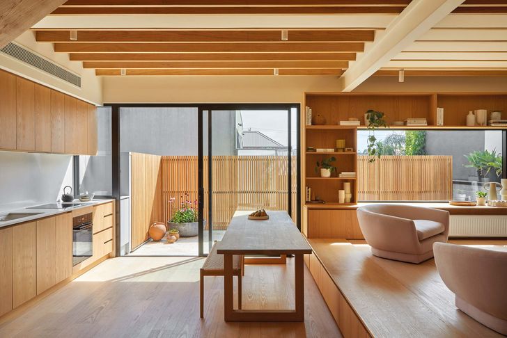
A built-in bench is a space-efficient seating option, provides additional storage and defines kitchen, living and dining zones.
Image:
Dave Kulesza
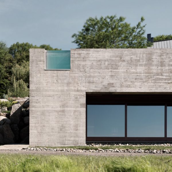
The house’s architectural sensibility appears to be suited to a semi-industrial context – an exterior palette of metal roof sheeting and concrete block – yet it is also reminiscent of the compact urban houses of Japan, where density is achieved as much by small lots with individual houses as by apartment towers in city centres. Antony Martin, director at MRTN Architects, reflects on the way the house sits in the street: “I feel like the house has a civic presence with its south-facing main facade. And that its three storeys allow it to not be a house but rather something more akin to a public building.”
The house is organized effectively over three levels, with the main living spaces on the first floor. Here, a generous room makes the most of the site’s width and its rear, northerly orientation. An elevated courtyard sits above the studio apartment. The ground floor is given to the studio, garage, entry and home office, which has a small shopfront onto the street, seen through a floating stair.
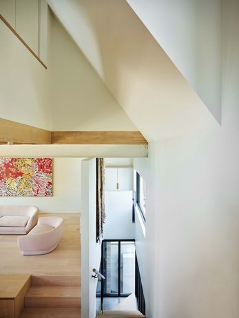
The stair winds up behind the street facade, drawing in light and enhancing the sense of volume. Artwork: Minnie Pwerle.
Image:
Dave Kulesza
From the street, the house is set back about a metre – enough to create a sense of garden and a softer edge to the glazed shopfront that connects the interior to outside. A covered external space creates a threshold for entry into both the house and the studio apartment. It’s a compact space, lined with blockwork on one side and travertine tiles underfoot, and it brings the street into this micro town, acting like the smallest of laneways.
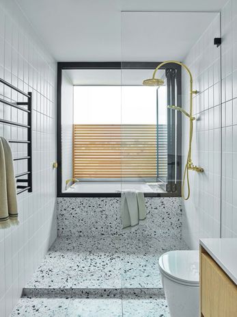
Two bedrooms on the second floor are separated by a bathroom (with a clever external bath balcony), with all three rooms enjoying a northern orientation. The levels are linked by stair that winds its way behind the main street facade. The composition of windows is determined by this stair, bringing in light and glimpses to the south from the first-floor living spaces.
If the material sensibility is overtly metallic and solid outside, internally the house is a warm delight of timber and natural light. Oak floorboards span the split level of the main living space, while timber veneer joinery provides essential storage in the kitchen and living spaces. It’s a jigsaw of spatial opportunity, with every bit of available space used. Despite this, the interior still fells generous. A void above the stair creates a sense of vertical space and diffuses southern light into the living areas, and exposed structural timber beams bridge the living area, maximizing the ceiling height.
In the second-floor bathroom, a “balcony-bath” permits an outdoor bathing experience.
Image:
Dave Kulesza
The use of a long “seat step” in the living area separates the kitchen and living areas. Though it may seem counterintuitive to create a fixed element in the centre of the room, the seat minimizes the need for additional dining chairs and accommodates further storage in drawers beneath it. It also demarcates the compact space into three distinct but connected zones.
Getting the spaces right was like a Tetris game, with many forces at play on such a small site. Antony explains, “Once we were in the design process, the constraints of the program, the planning envelope and the large power pole out the front determined the design. My role was to address these problems and to accommodate what Eva needed.”
Small sites like this don’t often become a house. This is an outcome that requires a different way of thinking about design, the use of spatial tricks to make compact spaces feel more generous, and mastering the art of making elements do more than one job at a time. House for Eva and Matilda is a building that teaches us how to make small infill sites work for overlapping uses – an apt lesson at a time when our homes have also by necessity become places of work.
Meet the owner of House for Eva and Matilda by MRTN Architects.

